5 Classifying data
5.1 Data types
We now have a dataset and a good sense of the variables included. Scanning the spreadsheet reveals information on nearly 150 countries. This is what you would find for the Netherlands, for instance.
There is a mix of text values like Europe and numeric values like 81.8. You probably already have a sense of what could be done with some of the data points. Perhaps find the average for the inflation rate or count the number of countries that are in Europe.
Statisticians and data scientists take a more refined approach by splitting things into categorical variables and numeric variables, each with its own set of subcategories. The designations are important because they help us understand which type of analysis is appropriate.
“Broadly speaking, when you measure something and give it a number value, you create quantitative [or numeric] data. When you classify or judge something, you create qualitative [or categorical] data.” Minitab blog post from 2017
You identify how a variable fits into a given data type by answering the following questions:
| Categorical | Categorical | Numeric | Numeric | |
|---|---|---|---|---|
| Nominal | Ordinal | Interval | Ratio | |
| Is the order of the unique values meaningful? | No | Yes | Yes | Yes |
| Is there equal distance between possible values? | No | No | Yes | Yes |
| Is there a “true zero?” | No | No | No | Yes |
Let’s take a closer look:
Is the order of the unique values meaningful? Three apples is obviously greater than two apples. On a 5-point satisfaction scale, it makes sense that Good is greater than Poor. But Blue is not greater than Green (unless perhaps if you are measuring color intensity).
Is there equal distance between unique possible values? Although Outstanding is greater than Good, the distance between the two points isn’t universally quantifiable because it likely differs among different people. On the other hand, the distance between two meters and three meters is the same as between four meters and five meters.
Is there a “true zero?” A variable like height in centimeters has a true zero. Zero inches represents the absence of any height. In contrast, a temperature of zero degrees Celsius doesn’t mean the absence of heat.
We’ll now spend time highlighting each data type and the common (and appropriate) techniques that go with each one.
Some relevant readings:
- Data Types in Statistics from Towards Data Science.
- What is the difference between ordinal, interval and ratio variables? Why should I care? from GraphPad
5.2 Categorical
5.2.1 Nominal
This is a relatively short chapter because there isn’t much to say about nominal variables, which are a subcategory of categorical variables.
Nominal variables are the only data type with “No” answers to all key questions described in data types.
- The order in which you put them is not inherently meaningful.
- There is no notion of distance or direction between them.
- There is not a true zero.
Let’s revisit our CountriesClean dataset.
## Rows: 142
## Columns: 14
## $ country       <chr> "Angola", "Albania", "Argentina", "Armenia", "Australia", "Austria", "Azerbaijan", "Buru…
## $ country_code  <chr> "AGO", "ALB", "ARG", "ARM", "AUS", "AUT", "AZE", "BDI", "BEL", "BEN", "BFA", "BGD", "BGR…
## $ region        <chr> "Middle East & Africa", "Europe", "Americas", "Europe", "Asia Pacific", "Europe", "Asia …
## $ income_level  <fct> Lower middle income, Upper middle income, Upper middle income, Upper middle income, High…
## $ college_share <dbl> 9.3, 59.8, 90.0, 51.5, 107.8, 86.7, 31.5, 4.1, 78.9, 12.5, 7.1, 24.0, 71.5, 40.2, 87.4, …
## $ inflation     <dbl> 27.2, 0.4, 50.6, 1.5, 3.4, 1.7, -0.2, 0.8, 1.7, -0.3, -0.6, 4.5, 5.3, 2.6, 6.6, 0.2, 4.2…
## $ gdp           <dbl> 99013511554, 14872299622, 437813398154, 13996188672, 1450499018770, 448761534683, 589370…
## $ gdp_growth    <dbl> -0.6, 2.2, -2.1, 7.6, 2.2, 1.4, 2.2, 1.8, 1.7, 6.9, 5.7, 8.2, 3.7, 2.7, 1.2, 0.3, 1.1, 3…
## $ life_expect   <dbl> 60.8, 78.5, 76.5, 74.9, 82.7, 81.7, 72.9, 61.2, 81.6, 61.5, 61.2, 72.3, 75.0, 77.3, 74.2…
## $ population    <dbl> 31825295, 2854191, 44938712, 2957731, 25364307, 8877067, 10023318, 11530580, 11484055, 1…
## $ unemployment  <dbl> 6.8, 12.8, 10.4, 16.6, 5.3, 4.8, 6.0, 1.4, 5.7, 2.0, 6.4, 4.2, 3.8, 18.4, 4.6, 6.4, 12.0…
## $ gini          <dbl> 51.3, 33.2, 41.4, 34.4, 34.4, 29.7, 26.6, 38.6, 27.4, 47.8, 35.3, 32.4, 40.4, 33.0, 25.2…
## $ temp_c        <dbl> 21.6, 11.4, 14.8, 7.2, 21.7, 6.4, 12.0, 20.8, 9.6, 27.6, 28.3, 25.0, 10.6, 9.9, 6.2, 25.…
## $ data_year     <dbl> 2019, 2018, 2020, 2017, 2020, 2019, 2020, 2018, 2020, 2017, 2019, 2020, 2020, 2020, 2018…
How many nominal variables do you think are in the dataset?
Selecting the correct response reveals which nominal variables are in the dataset. Let’s take a closer look at one of them — region.
Frequency counts
Counting values is the most common analysis with nominal variables. Each of the 142 records of country-level data has a corresponding region. Before we count, it is often helpful to identify the unique values (also called labels) within a given data series. In this example, we find four unique values.
Next, we count the number of occurrences of each value label from the entire region column. There are a number of ways to do this. Within spreadsheets COUNTIF() and Pivot Tables are the most common approaches. Watch the video below to see such Google Sheets solutions.
We count each occurrence and get our first sense of the distribution of values. The Middle East & Africa region has the greatest number of countries, while the Americas has the fewest.
This can be done in Google Sheets the following way. Note that I use F4 as a shortcut to add dollar signs in front of some formula references. This creates an absolute reference that reduces further steps when making several similar formulas.
Visualizing with a bar chart
Although we’ll get into visualization later, it is important to say that a bar or column chart is usually the most effective way to show frequency counts.
Relative frequency
Finally, we look at relative frequency or the proportion of a given unique value to the whole. To find this we simply divide the frequency count by the total number of records.
Proportions are a nice way to standardize and help with communication. Instead of saying the Middle East & Africa region has 52 countries represented (is that high or low?), we can say that countries in the region represent 37 percent of all countries included.
5.2.2 Ordinal
Now, let’s take a look at ordinal variables. They provide a layer of information beyond nominal variables, their categorical counterparts.
Ordinal variables have an innate ordering to their values. Examples include:
- Custom satisfaction surveys: Disagree | Neither Agree Nor Disagree | Agree
- Level of education completed: Primary School | Secondary School | University
- Age range: Younger than 18 | 18 to 35 | 36 and older
Although the first two likely make sense, you might wonder why Age range isn’t a numeric variable. This is technically an interval scale. Because each label represents a range of possible values, we can’t accurately measure the distance in between. For all examples we find a natural ordering from low to high.
Turning again to our CountriesClean dataset:
## Rows: 142
## Columns: 14
## $ country       <chr> "Angola", "Albania", "Argentina", "Armenia", "Australia", "Austria", "Azerbaijan", "Buru…
## $ country_code  <chr> "AGO", "ALB", "ARG", "ARM", "AUS", "AUT", "AZE", "BDI", "BEL", "BEN", "BFA", "BGD", "BGR…
## $ region        <chr> "Middle East & Africa", "Europe", "Americas", "Europe", "Asia Pacific", "Europe", "Asia …
## $ income_level  <fct> Lower middle income, Upper middle income, Upper middle income, Upper middle income, High…
## $ college_share <dbl> 9.3, 59.8, 90.0, 51.5, 107.8, 86.7, 31.5, 4.1, 78.9, 12.5, 7.1, 24.0, 71.5, 40.2, 87.4, …
## $ inflation     <dbl> 27.2, 0.4, 50.6, 1.5, 3.4, 1.7, -0.2, 0.8, 1.7, -0.3, -0.6, 4.5, 5.3, 2.6, 6.6, 0.2, 4.2…
## $ gdp           <dbl> 99013511554, 14872299622, 437813398154, 13996188672, 1450499018770, 448761534683, 589370…
## $ gdp_growth    <dbl> -0.6, 2.2, -2.1, 7.6, 2.2, 1.4, 2.2, 1.8, 1.7, 6.9, 5.7, 8.2, 3.7, 2.7, 1.2, 0.3, 1.1, 3…
## $ life_expect   <dbl> 60.8, 78.5, 76.5, 74.9, 82.7, 81.7, 72.9, 61.2, 81.6, 61.5, 61.2, 72.3, 75.0, 77.3, 74.2…
## $ population    <dbl> 31825295, 2854191, 44938712, 2957731, 25364307, 8877067, 10023318, 11530580, 11484055, 1…
## $ unemployment  <dbl> 6.8, 12.8, 10.4, 16.6, 5.3, 4.8, 6.0, 1.4, 5.7, 2.0, 6.4, 4.2, 3.8, 18.4, 4.6, 6.4, 12.0…
## $ gini          <dbl> 51.3, 33.2, 41.4, 34.4, 34.4, 29.7, 26.6, 38.6, 27.4, 47.8, 35.3, 32.4, 40.4, 33.0, 25.2…
## $ temp_c        <dbl> 21.6, 11.4, 14.8, 7.2, 21.7, 6.4, 12.0, 20.8, 9.6, 27.6, 28.3, 25.0, 10.6, 9.9, 6.2, 25.…
## $ data_year     <dbl> 2019, 2018, 2020, 2017, 2020, 2019, 2020, 2018, 2020, 2017, 2019, 2020, 2020, 2020, 2018…
The only ordinal variable in the dataset is income_level. Similar to nominal variables, we count cases for each unique value (frequency) and calculate their proportion to the overall number of responses (relative frequency).
We find that low income countries are the least common.
Assigning integer values
Here is where things differ. Due to the innate ordering associated with ordinal variables, we have the ability to start measuring central tendency in a new way.
You can see that we assigned the following integer value mapping to align with the natural ordering.
- Low income = 1
- Lower middle income = 2
- Upper middle income = 3
- High income = 4
Now that we have a number associated with each value label, our analytical opportunities expand.
The most typical measure of summarizing data and its central tendencies is the average or arithmetic mean. BUT STOP: You should not take the average of values from ordinal variables!
Recall that we don’t know the definitions that grouped each country into one of these income buckets. Even if we did, we wouldn’t know the exact figure for each observation, only the final bucket to which they were assigned. Therefore we do not have equal distances between each unique label and the average will be misleading.
Median
However, we can look at the median, the middle observation. The median of the integer values from income_level is 3. A median of 3 indicates that an upper middle income value sits at the middle of the distribution. This is a useful piece of information that goes beyond what the frequency counts showed where both middle-income groups were represented in equal number.
Other descriptive statistics
The median is also the 50th percentile. We’ll cover percentiles another day, but for now just believe that ordinal variables can be summarized by a five-number summary that includes a mix of descriptive statistics.
- Minimum: 1
- 25th percentile: 2
- Median (50th percentile): 3
- 75th percentile: 4
- Maximum: 4
These new statistics also lead to range (maximum minus minimum) and interquartile range or IQR (75th percentile minus 25th percentile) values.
I think these concepts are easier to understand with numeric variables, which is where we’ll start next time. Until then, if you are interested, you can see how the figures above were calculated.
5.3 Numeric
5.3.1 Interval
We now move into numeric variables and begin with interval variety. These are characterized by:
- Is the order of the unique values meaningful? Yes
- Is there equal distance between unique possible values? Yes
- Is there a “true zero?” No
There are only two variables in our CountriesClean dataset that are interval variables. Can you tell which ones? Refer back to the data dictionary if you need more clarity on what’s included.
## Rows: 142
## Columns: 15
## $ country <chr> "Angola", "Albania", "Argentina", "Armenia", "Australia", "Austria", "Azerbaijan",…
## $ country_code <chr> "AGO", "ALB", "ARG", "ARM", "AUS", "AUT", "AZE", "BDI", "BEL", "BEN", "BFA", "BGD"…
## $ region <chr> "Middle East & Africa", "Europe", "Americas", "Europe", "Asia Pacific", "Europe", …
## $ income_level <chr> "Lower middle income", "Upper middle income", "Upper middle income", "Upper middle…
## $ college_share <dbl> 9.3, 59.8, 90.0, 51.5, 107.8, 86.7, 31.5, 4.1, 78.9, 12.5, 7.1, 24.0, 71.5, 40.2, …
## $ inflation <dbl> 27.2, 0.4, 50.6, 1.5, 3.4, 1.7, -0.2, 0.8, 1.7, -0.3, -0.6, 4.5, 5.3, 2.6, 6.6, 0.…
## $ gdp <dbl> 99013511554, 14872299622, 437813398154, 13996188672, 1450499018770, 448761534683, …
## $ gdp_growth <dbl> -0.6, 2.2, -2.1, 7.6, 2.2, 1.4, 2.2, 1.8, 1.7, 6.9, 5.7, 8.2, 3.7, 2.7, 1.2, 0.3, …
## $ life_expect <dbl> 60.8, 78.5, 76.5, 74.9, 82.7, 81.7, 72.9, 61.2, 81.6, 61.5, 61.2, 72.3, 75.0, 77.3…
## $ population <dbl> 31825295, 2854191, 44938712, 2957731, 25364307, 8877067, 10023318, 11530580, 11484…
## $ unemployment <dbl> 6.8, 12.8, 10.4, 16.6, 5.3, 4.8, 6.0, 1.4, 5.7, 2.0, 6.4, 4.2, 3.8, 18.4, 4.6, 6.4…
## $ gini <dbl> 51.3, 33.2, 41.4, 34.4, 34.4, 29.7, 26.6, 38.6, 27.4, 47.8, 35.3, 32.4, 40.4, 33.0…
## $ temp_c <dbl> 21.6, 11.4, 14.8, 7.2, 21.7, 6.4, 12.0, 20.8, 9.6, 27.6, 28.3, 25.0, 10.6, 9.9, 6.…
## $ data_year <dbl> 2019, 2018, 2020, 2017, 2020, 2019, 2020, 2018, 2020, 2017, 2019, 2020, 2020, 2020…
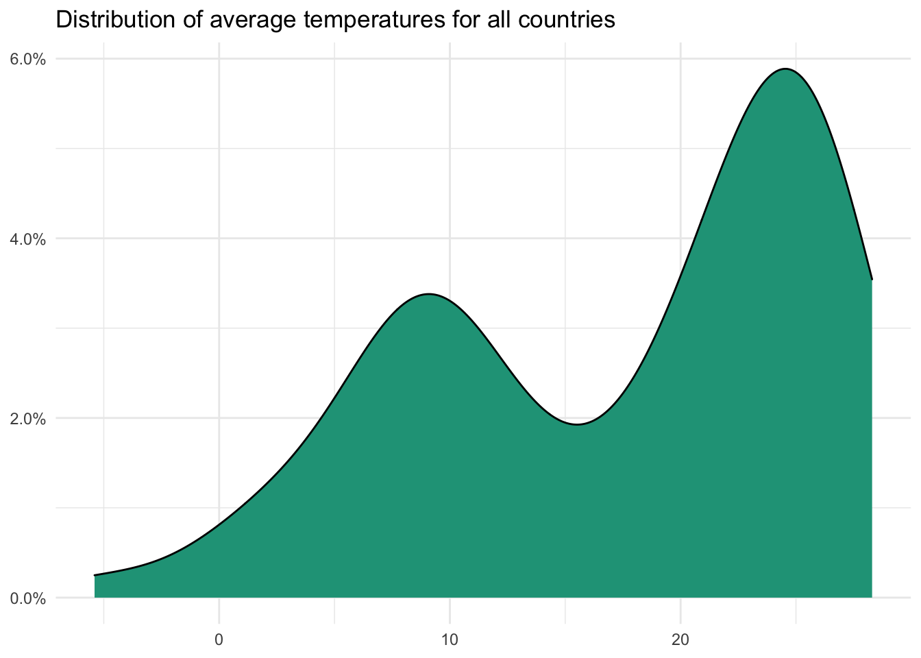
## $ ordinal_rank_income <int> 2, 3, 3, 3, 4, 4, 3, 1, 4, 2, 1, 2, 3, 3, 3, 3, 3, 3, 1, 4, 4, 4, 3, 2, 2, 1, 2, 3…The two interval variables in the dataset are temp_c and data_year. They differ from the remaining numeric variables because they do not have a true zero. While unemployment of 0 implies the absence of unemployment, a temperature of zero degrees Celsius (temp_c) does not mean the absence of heat.
Does this distinction really matter? For many purposes, no. The main thing you shouldn’t do with interval variables, that you can do with ratio variables, is use the ratios between the values. We’ll cover that soon.
For now, let’s return to the five-number summary that we first looked at with ordinal variables. Summarizing temp_c:
- Minimum: -5.4
- 25th percentile: 9.65
- Median (50th percentile): 21
- 75th percentile: 24.9
- Maximum: 28.3
At first glance, there seems to be a lot more information here than with the ordinal_rank_income values we generated in the previous section. Visually, this is because we have a much larger range of values (from -5.4 to 28.3) for temp_c than we did for the 1, 2, 3, or 4 values in ordinal_rank_income.
Adding the average
When we move into numeric variables (both ordinal and ratio) we are also able to finally use the average or arithmetic mean in an appropriate way.
To calculate the average you simply add up all the observed values and divide by the total number of observations
The average temperature for the countries in our dataset is 17.45 degrees. It is said that averages are misleading. In many ways, all descriptive statistics are misleading. We are purposely reducing all the details into directional summaries. We lose information by doing so.
Although this doesn’t mean that averages and other measures can’t be useful, it does mean you should ask the right questions when encountering summarized data. The average temperature, by itself, doesn’t tell you how the temperatures are distributed across the sample values. There is also nothing in our dataset about how the temperatures in a given country were distributed by location or season. So, there’s a lot we don’t know.
What about counting?
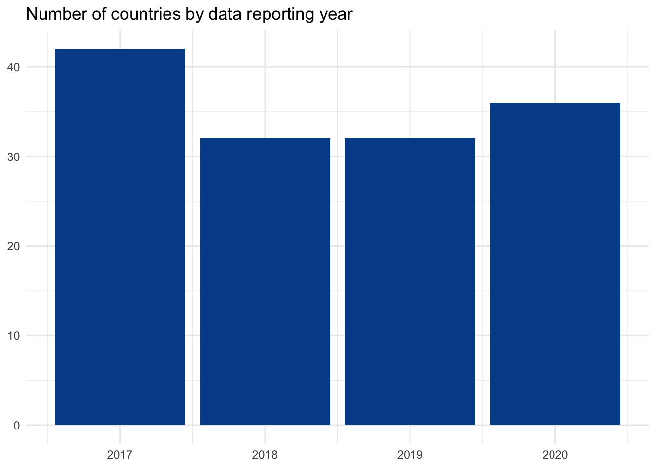
We can still do the frequency counting with numeric variables that we did with categorical variables. When we have relatively few unique values this makes sense, like with data_year.
When we have many possible values, as with temp_c, this doesn’t add much immediate benefit.
Later, we will use the many unique values to generate new variables, such as cumulative counting and percentages, that could make this view more useful. For now, the table isn’t that informative.
What can we do?
Interval analysis opened up minimum, maximum, median, and percentile summaries. These remain for interval variables. We also now have average, variance, and standard deviation — all of which we’ll dive into with more detail later in the program.
Calculations from this material can be found here.
5.3.2 Ratio
Ratio variables are our final data type and are not much different than interval variables. In fact, everything that we’ve mentioned so far can be applied to them.
- Frequency counts and percentages
- Minimum and maximums
- Medians and percentiles
- Averages
- Variance and standard deviation
However, ratio variables do have a true zero and answer yes to all our key data type questions:
- Is the order of the unique values meaningful? Yes
- Is there equal distance between unique possible values? Yes
- Is there a “true zero?” Yes
True zero means that a value of zero indicates the absence of what that variable attempts to measure.
There are several examples of these in our dataset. Each one is included in the following table with the summary statistics that we’ve referenced earlier. Don’t worry, we will revisit their importance and calculations separately in later lessons.
Note: GDP is in billions and population is in millions in the table.
This is a compact summary. Even if you are not yet comfortable with the statistics shown, you can still see how much we are now able to say. But all of these summary statistics were also possible with interval variables.
What’s the analytical importance of true zero?
By having a true zero, ratio variables — as the name indicates — enable us to take meaningful ratio calculations from their values.
Let’s start with an example of why ratio calculations do not work for interval variables. Recall that a temperature of 0°C doesn’t represent the absence of heat. Similarly when we go from 2°C to 4°C, we are not getting twice as hot.
In contrast, when we take a ratio variable like population, going from two million people to four million people is a meaningful doubling.
A country with two million people is 50% the size of another country with four million people. A country with 2°C average temperatures does not have 50% the heat of a country with average temperatures of 4°C.
Can a ratio variable have negative values?
I’ve had conversations with statisticians on this and have heard conflicting responses. Let me know if anyone finds a definitive source or a compelling argument. As we have two variables that are growth rates, gdp_growth and inflation, which have positive, negative, and zero values, I’m content labeling them as ratios. An economic growth rate of zero is reporting the absence of growth and an inflation rate of zero indicates stability in average price levels. Seems to fit the true zero definition to me.
What does it all mean?
Although the last four entries on data types may have felt a bit pedantic, I assure you it is a useful foundation for the concepts, techniques, and assumptions on the horizon. We now know some common approaches to better understand the four data types.
| What can I do? | Categorical | Categorical | Numeric | Numeric |
|---|---|---|---|---|
| Nominal | Ordinal | Interval | Ratio | |
| Frequency counts and percentages | Yes | Yes | Yes | Yes |
| Medians and percentiles | No | Yes | Yes | Yes |
| Mean | No | No | Yes | Yes |
| Variance and standard deviation | No | No | Yes | Yes |
| Ratios | No | No | No | Yes |
Keep these possibilities in mind as we begin more practical exploratory analysis.
Some relevant readings:
- Data Types in Statistics from Towards Data Science.
- What is the difference between ordinal, interval and ratio variables? Why should I care? from GraphPad
5.3.3 Discrete vs. continuous
There is a final distinction to make before leaving data types behind. This again will matter to you more in some situations than others.
We know that with the exception of taking ratios, the descriptive summary statistics for interval and ratio variables are the same. There is a way to further distinguish between numeric variables that will come in handy later.
1. Discrete data
- Only specific values within an interval (i.e., I have three kids)
- Spaces exist between values
- Usually don’t have decimal points but there are exceptions (see below)
- Typically counted
2. Continuous data
- Any value within an interval (i.e., My three kids weigh 16.54, 20.45, and 36 kilograms)
- Includes all the major points and the values in between
- Common to see fractions and decimals
- Typically measured
You can find explainer videos here and here if you want a more detailed overview.
Look around your room. What could you quantify by counting or measuring? Or think about your company. If you don’t work, think about the data that a company might record based on your actions.
| Metric | Discrete | Continuous |
|---|---|---|
| Product sales | Total purchase orders | Weight of delivered products in kilograms |
| Customer information | Number of countries represented | Proportion of customers who made a purchase in the last three months |
| Objectives | Number of objectives per business unit | Percent of objectives achieved for the quarter |
| Website | Number of page visits | Average time spent on each page |
Are currency amounts (e.g., salary or sales) discrete or continuous? A Google search will reveal conflicting results. Technically, because U.S. dollar amounts are all rounded to two decimals, they should be considered discrete as the values in between those points don’t exist. However, in practice it is “continuous enough” for many analytical purposes. Much depends on what you are trying to accomplish and what techniques you are attempting to use.
Let’s return to our countries dataset.
## Rows: 142
## Columns: 14
## $ country       <chr> "Angola", "Albania", "Argentina", "Armenia", "Australia", "Austria", "Azerbaijan", "Buru…
## $ country_code  <chr> "AGO", "ALB", "ARG", "ARM", "AUS", "AUT", "AZE", "BDI", "BEL", "BEN", "BFA", "BGD", "BGR…
## $ region        <chr> "Middle East & Africa", "Europe", "Americas", "Europe", "Asia Pacific", "Europe", "Asia …
## $ income_level  <chr> "Lower middle income", "Upper middle income", "Upper middle income", "Upper middle incom…
## $ college_share <dbl> 9.3, 59.8, 90.0, 51.5, 107.8, 86.7, 31.5, 4.1, 78.9, 12.5, 7.1, 24.0, 71.5, 40.2, 87.4, …
## $ inflation     <dbl> 27.2, 0.4, 50.6, 1.5, 3.4, 1.7, -0.2, 0.8, 1.7, -0.3, -0.6, 4.5, 5.3, 2.6, 6.6, 0.2, 4.2…
## $ gdp           <dbl> 99013511554, 14872299622, 437813398154, 13996188672, 1450499018770, 448761534683, 589370…
## $ gdp_growth    <dbl> -0.6, 2.2, -2.1, 7.6, 2.2, 1.4, 2.2, 1.8, 1.7, 6.9, 5.7, 8.2, 3.7, 2.7, 1.2, 0.3, 1.1, 3…
## $ life_expect   <dbl> 60.8, 78.5, 76.5, 74.9, 82.7, 81.7, 72.9, 61.2, 81.6, 61.5, 61.2, 72.3, 75.0, 77.3, 74.2…
## $ population    <dbl> 31825295, 2854191, 44938712, 2957731, 25364307, 8877067, 10023318, 11530580, 11484055, 1…
## $ unemployment  <dbl> 6.8, 12.8, 10.4, 16.6, 5.3, 4.8, 6.0, 1.4, 5.7, 2.0, 6.4, 4.2, 3.8, 18.4, 4.6, 6.4, 12.0…
## $ gini          <dbl> 51.3, 33.2, 41.4, 34.4, 34.4, 29.7, 26.6, 38.6, 27.4, 47.8, 35.3, 32.4, 40.4, 33.0, 25.2…
## $ temp_c        <dbl> 21.6, 11.4, 14.8, 7.2, 21.7, 6.4, 12.0, 20.8, 9.6, 27.6, 28.3, 25.0, 10.6, 9.9, 6.2, 25.…
## $ data_year     <dbl> 2019, 2018, 2020, 2017, 2020, 2019, 2020, 2018, 2020, 2017, 2019, 2020, 2020, 2020, 2018…
We find more continuous variables in our dataset than discrete variables. See the data dictionary if you need a reminder on what’s included.
Visualizing discrete data
The discrete variables in our dataset include gdp, population, and data_year. A bar chart is a good visualization choice for discrete data as there is no chance for a value to appear in between any of the included labels.
Visualizing continuous data
The continuous data points in our sample are college_share, inflation, gdp_growth, life_expect, unemployment, gini, and temp_c. Because continuous data can take any values along the scale, charts that connect visuals make sense. These could include line charts, area charts, or histograms.
We already had the tools to classify data into categorical — nominal and ordinal — or numeric — interval and ratio. We can now further group numeric variables into discrete and continuous.
We’ll refer to these foundations as we add new techniques and approaches to our data science toolkits.