14 Visualizing data
Visualization is one of our most powerful tools to summarize complex data relationships and help diverse audiences absorb key findings. This can be approached in the traditional static sense, where we use Excel or PowerPoint to create a simple bar chart, or as an infographic where we intertwine a variety of visual elements to tell a story, or in increasingly interactive environments where users are in control through dynamically filtering and real-time exploration.
The format, style, or level of interaction you choose to share will likely involve a little science, but a lot of art. It is a mix because we have so many tools at our visualization disposal.
How can I communicate data findings?
Everyone has different information digestion preferences and these preferences change depending on a variety of factors and situations.
As the data artist, you must choose to surface results across a continuum ranging from handing over the raw data to crafting a pithy social media post.
Which format you decide to deploy likely comes down to three key questions:
- What messages are you trying to convey?
- Who will be consuming the data output?
- Where and how will they be consuming it?
The only certainty is that the typical person won’t have the tools, skillsets, or time to synthesize the raw data on their own. This means it is your job to select visual summary options that grab the attention of your target audience.
How do I choose the best visualization?
There is a well-established library of traditional charts and graphs from which you can experiment.
Some data types go better with certain visuals. For instance, if we want to show the relationship between two numeric variables, we lean toward scatter plots. If we are comparing across groups, bar or column charts are often the best bet. And if we are tracking trends over time, a line chart generally does the job most effectively.
That said, there are no concrete rules, and, in most cases you’ll try multiple approaches and ultimately be forced to use your best judgement. During this process, from Data to Viz can be an invaluable resource to help you narrow down appropriate chart types.
In terms of general design principles, I also recommend the online book DATA + DESIGN. It shares tactical advice for creating attractive and digestible visualizations and also discusses the ongoing balance that data practitioners must work towards.
“In most cases, you want a chart or graph to be able to stand alone, outside of any narrative text. It’s important to find a balance between giving enough information to your audience and keeping your text simple.” ― DATA + DESIGN
We want a visualization to contain enough information that a reader will find meaning in it without additional context. At the same time, we want to keep it simple and clean enough so that they won’t be overwhelmed.
14.1 A visualization blueprint
Thankfully, even without explicit rules to create attractive and effective visualizations, we can still make things easier by considering five guiding questions that apply in most situations.
To do so, let’s take a look at average college_share values by world region from the countries dataset. Recall that it is possible for a country to have a college_share above 100 percent due to inbound higher education mobility.
If we were to calculate the average by world region and use the default column chart in Microsoft Excel, the output would look something like this:
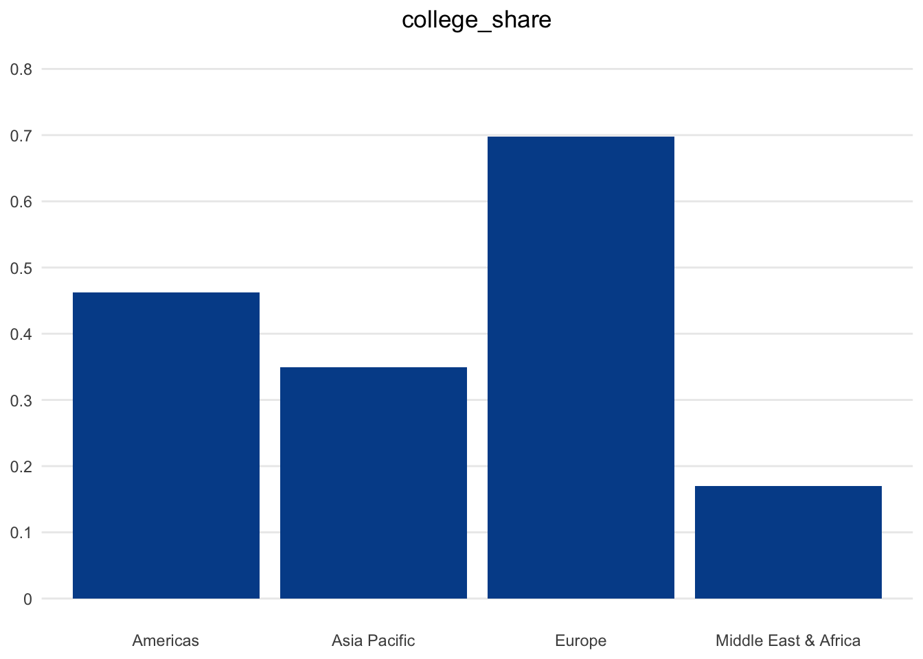
To be honest, basic spreadsheet software has improved substantially in recent years in terms of default visualizations and formatting options. Still, there is a lot that we can consider in order to improve this baseline chart with the goal of maximizing understanding and engagement.
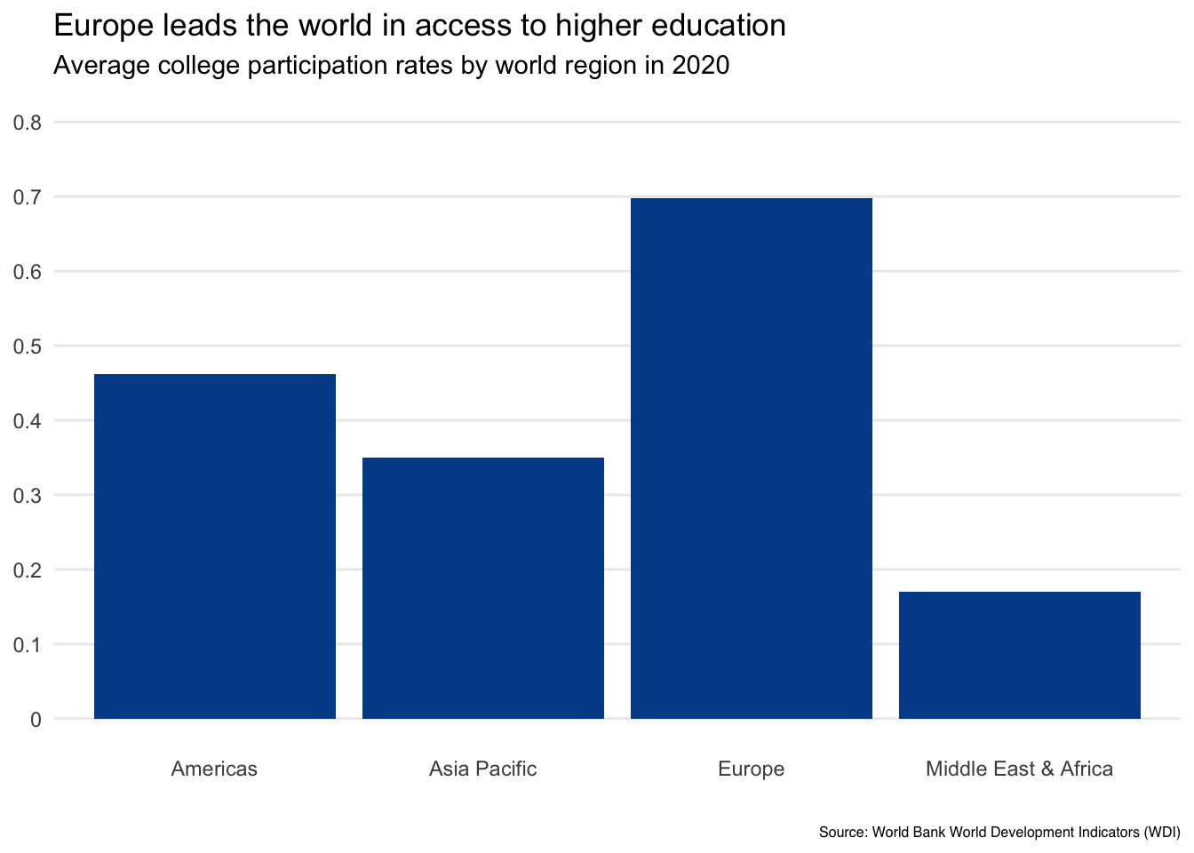
Question 1. How can you craft a title to capture attention in a non-sensationalist way?
The first element to consider is the title, which surprisingly tends to be the most overlooked. Your title is a chance to summarize key messages and clearly define what the readers are looking at.
In our example, it is accurate but limiting to simply say Average college participation rates. We could add a bit more depth by changing it to College participation by world region in 2020.
If you really want to take advantage of the opportunity and give your readers a clear takeaway, consider a main title like Europe leads the world in access to higher education and a subtitle adding the data definition Average college participation rates by world region in 2020.
If people love your visual, they will want to share it. They may snap a picture at a conference or take a screenshot from a report before forwarding it. Although it is great for others to benefit from your creation, it would also be good for you or your organization to get some credit. This is why it is also a good idea to add a logo or source text when there is a chance a visual may be shared more widely.
We’ve added Source: World Bank World Development Indicators (WDI) in smaller text on the bottom of our chart so that readers at least know where the underlying data comes from.
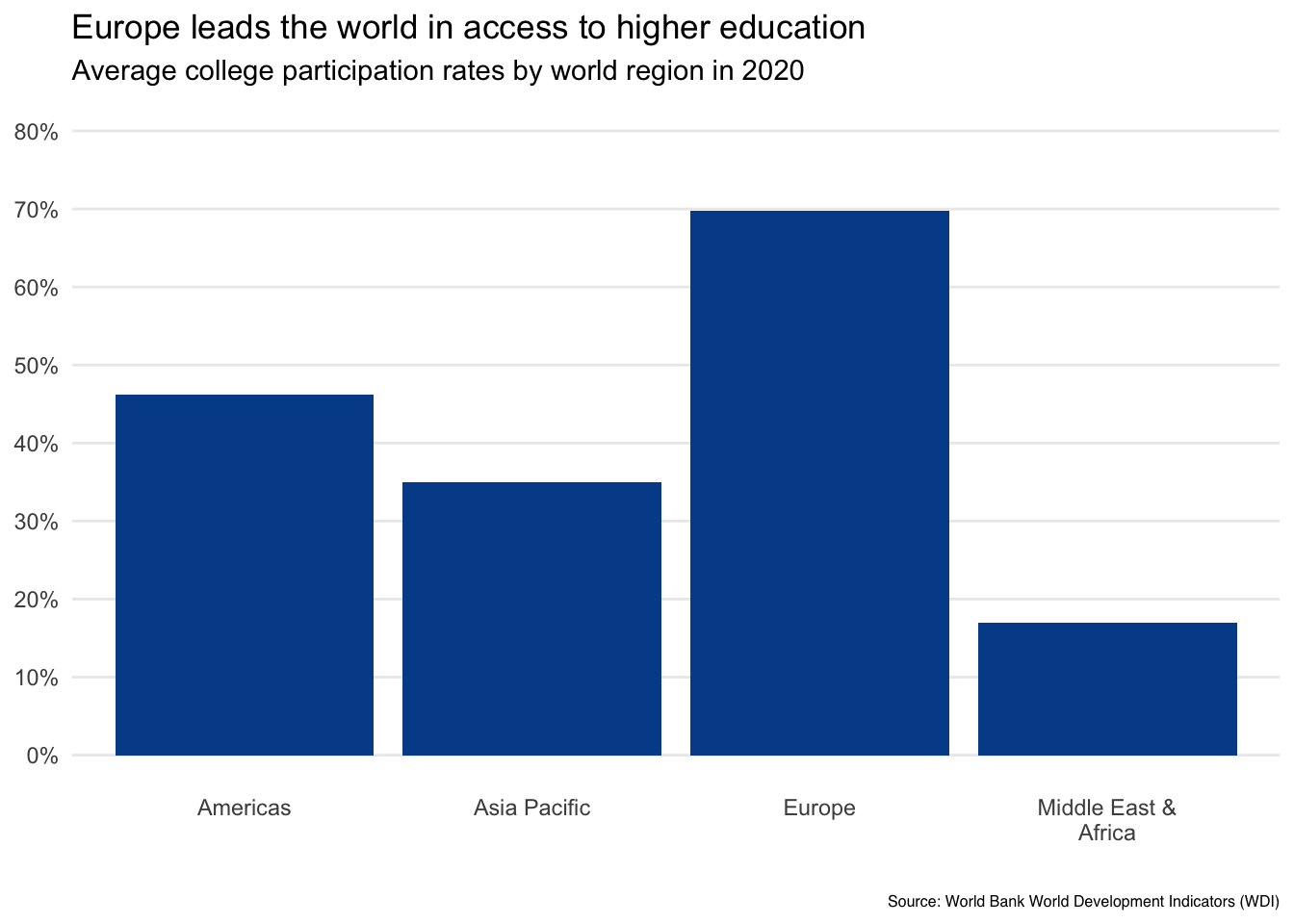
2. What can you do with axis values and labels to reduce visual clutter?
Next, let’s look at our axes, both the vertical y-axis that is showing the mean college participation rate, and the horizontal x-axis that is displaying the distinct world regions from our dataset.
We can make two quick fixes:
First, we change the default Excel labels on the vertical axis from decimals such as 0.2 and 0.4 to their percentage form of 20 percent and 40 percent.
Second, we adjust the font spacing and wrapping of the response option labels shown on the horizontal axis to give the Middle East & Africa bar more room to breathe.
3. Is it possible to highlight specific data points on which you want readers to focus?
Depending on the data, we could go even further. If you have relatively few data points to show, it is usually a good idea to completely remove the axis with the numeric summary and simply show the actual values as text labels for each column.
If you do this, you can also remove the horizontal gridlines to further reduce clutter. Just make sure to keep your minimum vertical axis value at zero since the distance between that point and the top of the column is what creates an accurate proportional representation.
Taking these steps works well with our example as we only have four data points to show.
Finally, think about how you choose to sort the results in the chart. Our example began in alphabetical order. If our focus really is Europe, we could also sort based on college_share values from high to low.
In this case, you could consider adding a reference line to help readers internalize the difference between Europe and the other world regions.
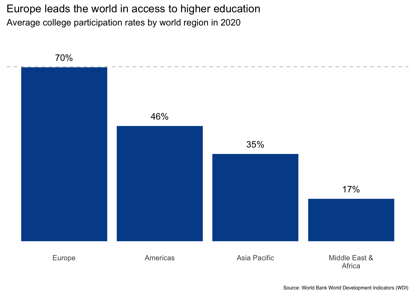
Here, we see the impact of our changes. The vertical axis is gone, data labels are added, and results are sorted from high to low. In my opinion, these steps will help focus the reader on the main message without introducing any undue complexity.
Regardless of your final decision, the right question to ask is, does the selected ordering or data highlighting make sense and how might it help or hurt a reader’s interpretation of the results?
4. Is the legend really needed? Is so, where does it go?
Another element at our disposal is the legend, something that doesn’t need to be included if the information is already embedded into the chart.
In our simple example, a legend doesn’t make sense as the horizontal axis labels make it clear which region is associated with each column. But let’s add another variable, income_level, to see a case where a legend is required.
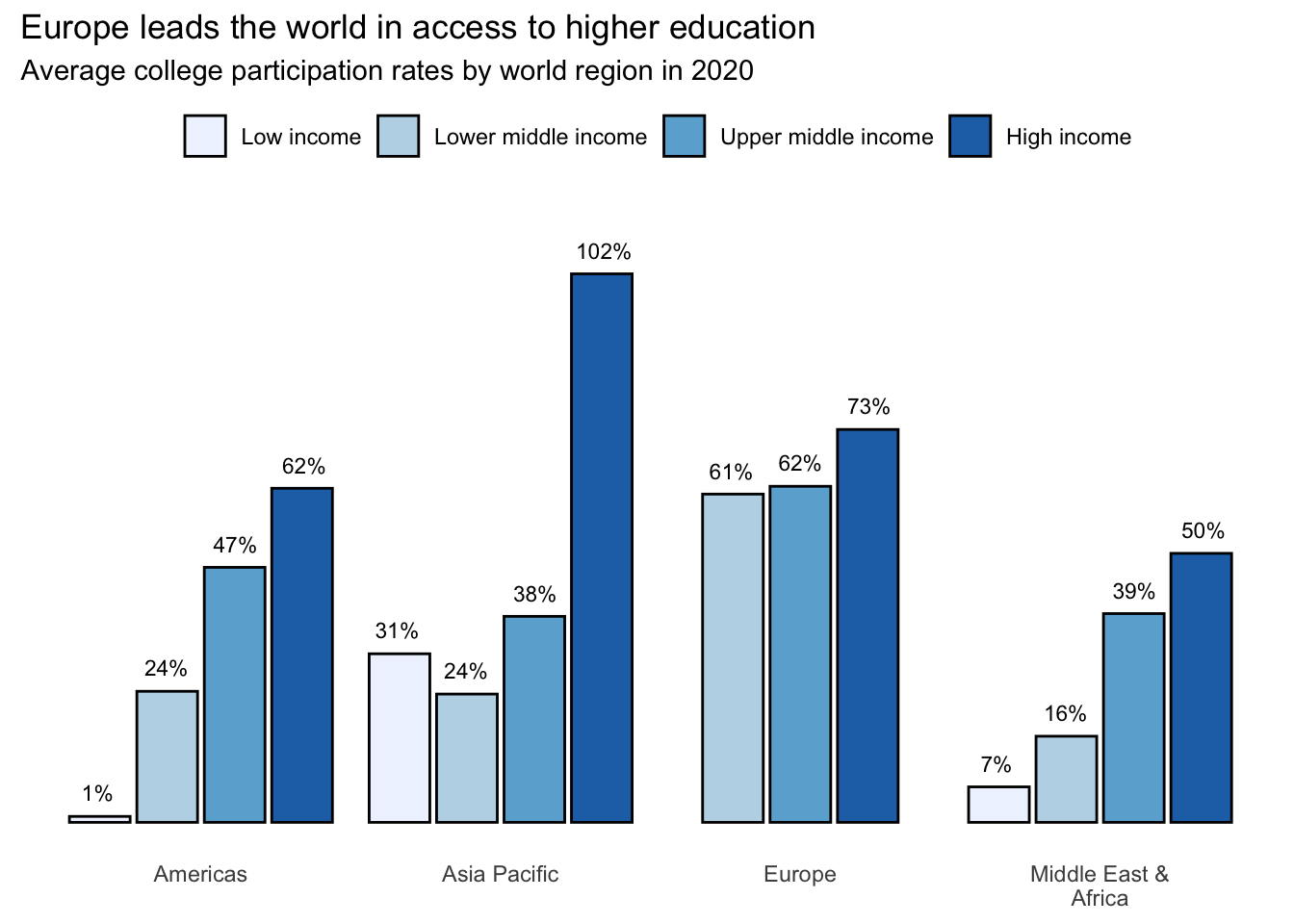
This action introduces another judgment call. Where do we place the legend? I generally recommend putting it underneath the title if it shows the different color categories that appear in the chart.
It is also helpful to keep the ordering consistent between the legend and the visual. For instance, the one we added goes from left to right, matching how the data is displayed for each region. A vertical legend would have been inconsistent with the rest of the visual, forcing readers to take unnecessary mental steps to match the legend to the columns.
5. How can color be used to enhance interpretation and not distract from it?
The final element we consider is color, which can either enhance or detract from our final result.
Thankfully, there are great resources that provide guidance in terms of both color scale selection and color code identification, which can then be plugged into spreadsheet software.
We recommend a website called Color Brewer, which asks you to provide the number of distinct colors you need and the type of data scale you are using. If you don’t know the answer to these choices, the website also helps you make the right decision.
Matching data scales to color scales
- Sequential: Use light to dark gradients of the same color when there is a natural low-to-high ordering as with ordinal data. We used this approach in the income levels chart above.
- Diverging: Use when values can go above or below some baseline level. For instance, GDP growth ranges, which can include both negative and positive values.
- Qualitative: Use colors that look nice together but don’t convey a natural ordering for nominal variables such as world region.
Another choice would be to just use one color, for instance, keeping the columns blue for all regions and relying on the labels to do the talking.
Or we could use color to highlight a value for which we want readers to pay attention. Since our narrative is about Europe boasting higher college participation rates than other regions, we might decide to make it blue while changing the other regions to a neutral color.
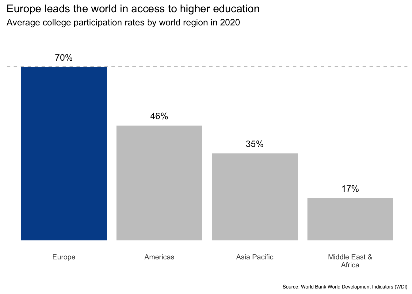
Now Europe stands out in terms of both ordering and color. It would now be hard for a reader to miss the main data message.
Finally, it is worth considering the ability of our audience to discern color differences.
- First, many people still print out presentations and reports. It is therefore useful to test how your graphics would look with both color and black and white print settings.
- Second, it is estimated that nearly one in ten men are colorblind. Certain color combinations will therefore be indistinguishable for them (source: http://www.colourblindawareness.org). Thankfully, the Color Brewer resource linked above provides color options to reduce this risk.
Final version
So, here we are. We’ve gone from the default Excel chart on the left to this formatted visual on the right.
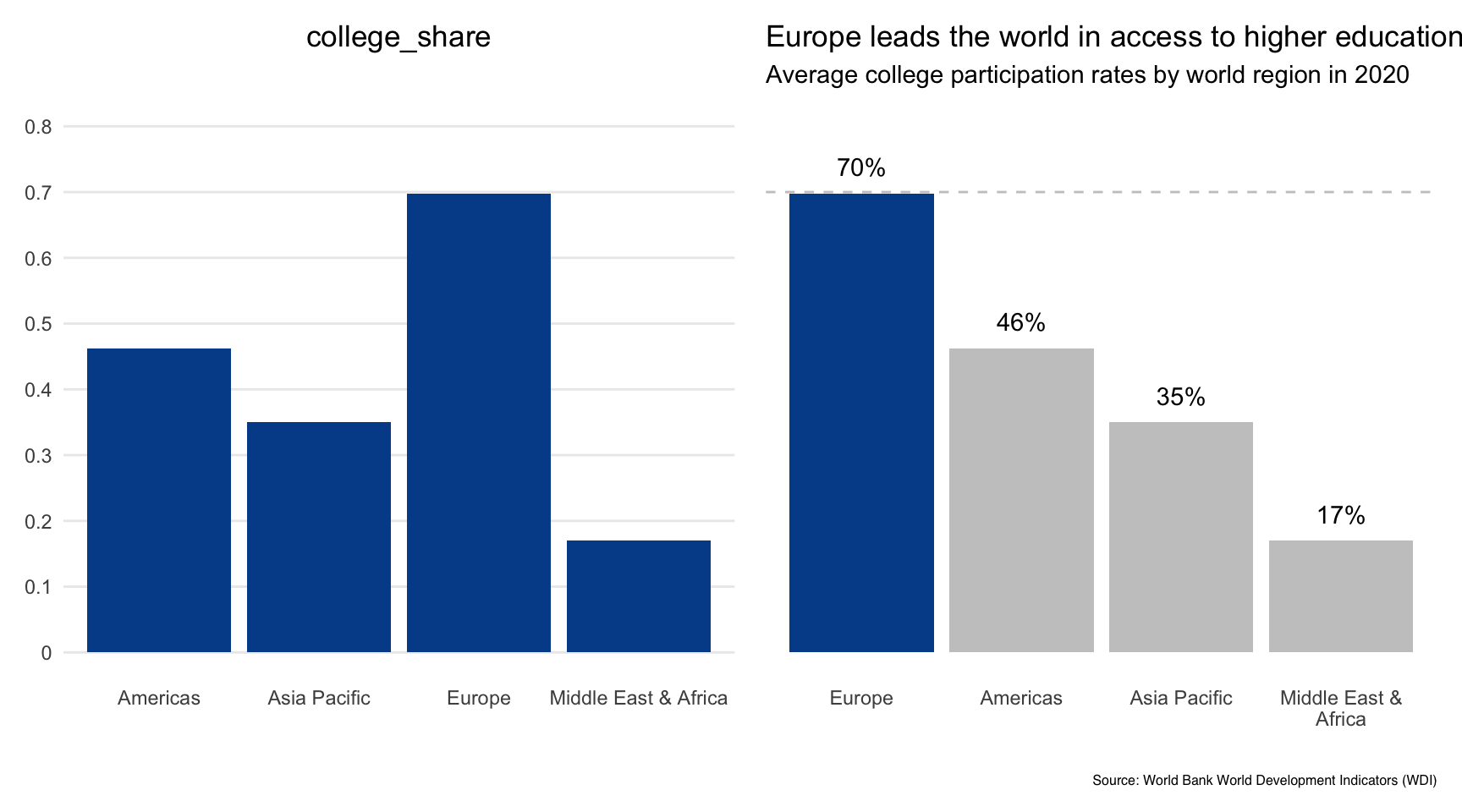
Let’s be honest. We made several subjective decisions as we went through each guiding question. Although you may or may not agree with our choices, this type of internal dialogue or collaborative conversation is extremely helpful when fine-tuning important visualizations.
Five guiding questions for effective visualizations:
- How can you craft a title to capture attention in a non-sensationalist way?
- What can you do with axis values and labels to reduce visual clutter?
- Is it possible to highlight specific data points on which you want readers to focus?
- Is the legend really needed? Is so, where does it go?
- How can color be used to enhance interpretation and not distract from it?
Sticking with spreadsheet terminology, a bar chart is similar to a column chart except it displays horizontal bars instead of vertical columns.
Bar chart key characteristics
Axes:
- Y-axis: One or more categorical variables on the vertical axis
- X-axis: Counts, percentages, raw values or summary statistics on the horizontal axis
Tips:
- Set the x-axis minimum at zero to maintain the correct visual proportions between results
- Sort order for the categorical variables depending on if you want the visual to be an A-Z reference or a callout for value differences
- Bar charts are especially useful when there are many unique labels within a categorical variable
Click here for a Google Sheets example.
Bar charts with one categorical variable
Although not the most interesting, let’s start with our countries dataset and plot the number of countries represented in each world region.
As there are only four regions to display, this would likely be more effective in column chart form because people are better at comparing vertical bar distances. But what if we were interested in showing unemployment rate differences for all the countries in Asia Pacific?
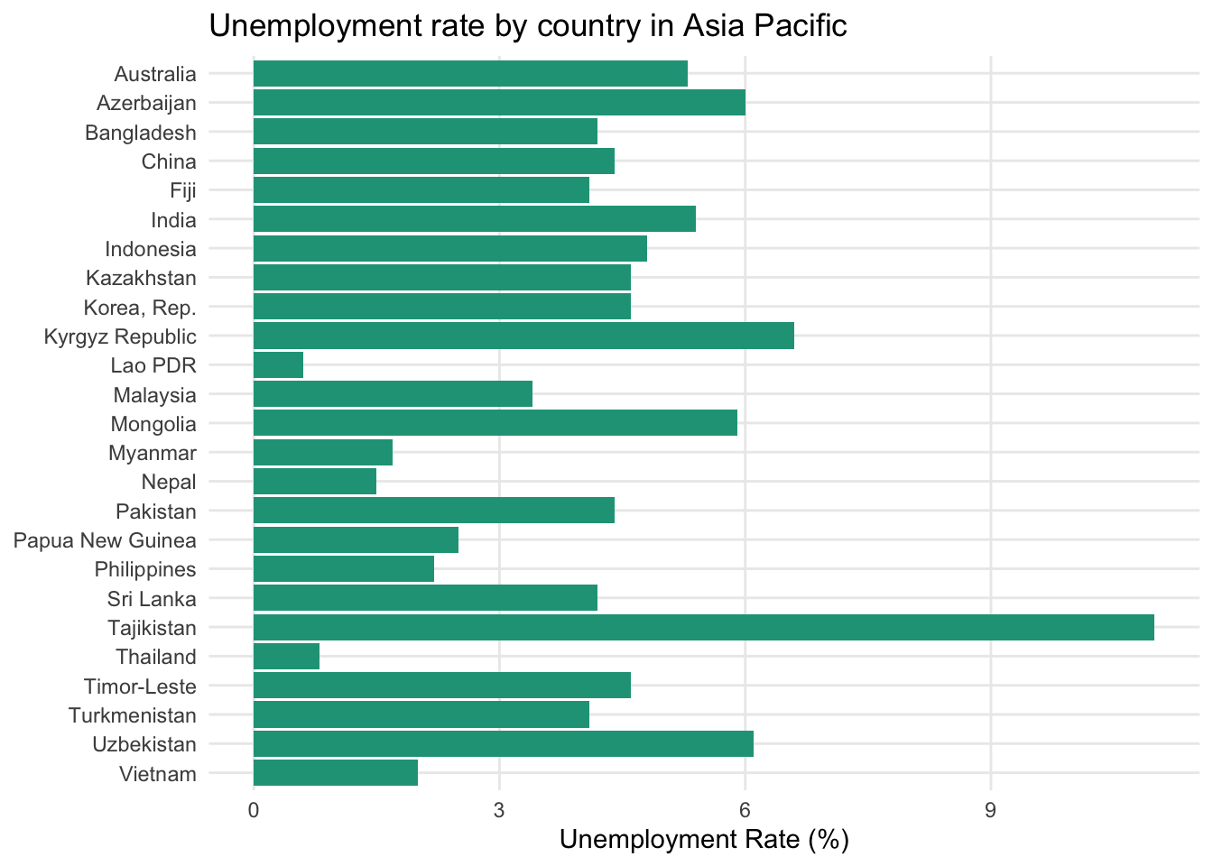
This is now a great use case for a bar chart. If all the countries were instead placed along the horizontal axis of a column chart, the country labels would likely have to be turned vertically or at an angle, which is more difficult for people to interpret.
What is the best sort order?
The chart above used alphabetic ordering of the categorical values. Although this is useful if your reader wants to quickly navigate to a specific country, it is not as helpful for identifying which countries cluster around one another.
To serve that purpose, let’s sort the countries based on the unemployment rate value in descending order.
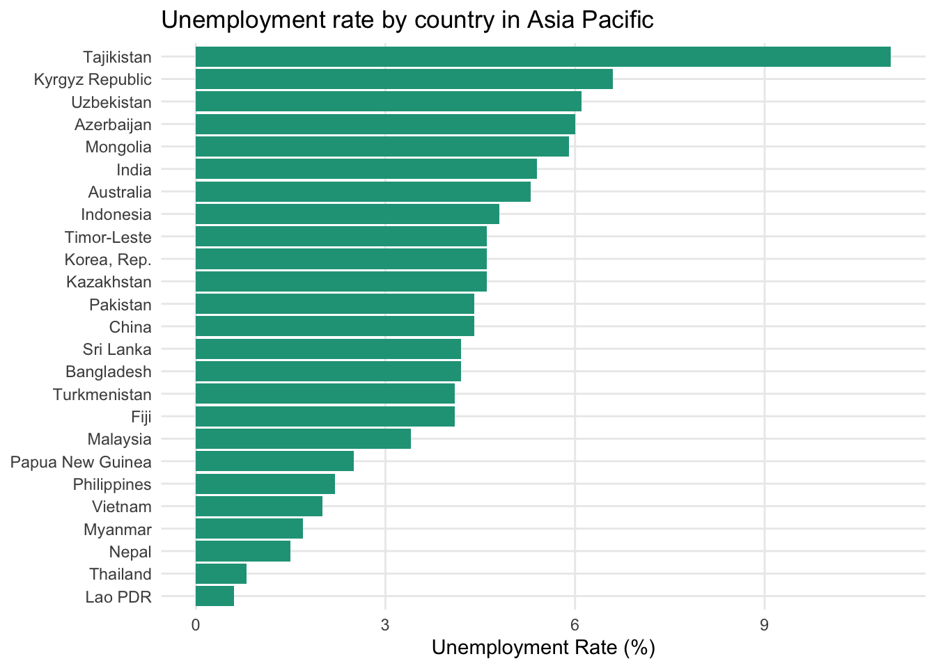
Now it is immediately clear that Tajikistan stands alone as the country with the highest regional unemployment rate. The next grouping includes the Kyrgyz Republic, Uzbekistan, and Azerbaijan. At the other end of the spectrum, Thailand and Lao PDR boast the lowest unemployment levels.
A bar chart is a standard spreadsheet visualization feature and you will find an example here.
Bar charts with two categorical variables
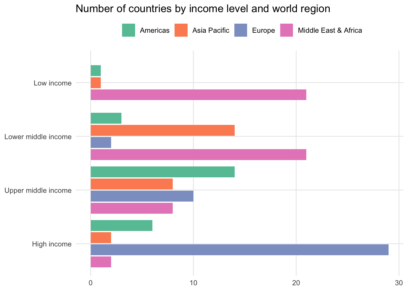
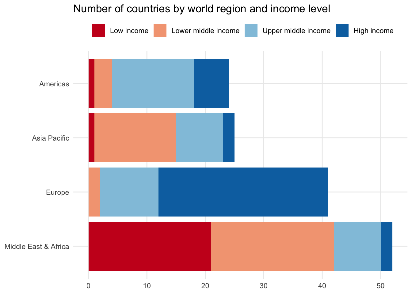
Including a second categorical variable increases the number of data points shown. For instance, adding income_level on top of region splits it into four distinct data points, one for each income level. There are several options for how to incorporate this into a bar chart.
Side-by-side bar
One option is to put income_level next to each other but within the region grouping. This makes it easier to see how countries are different in terms of income within specific regions.
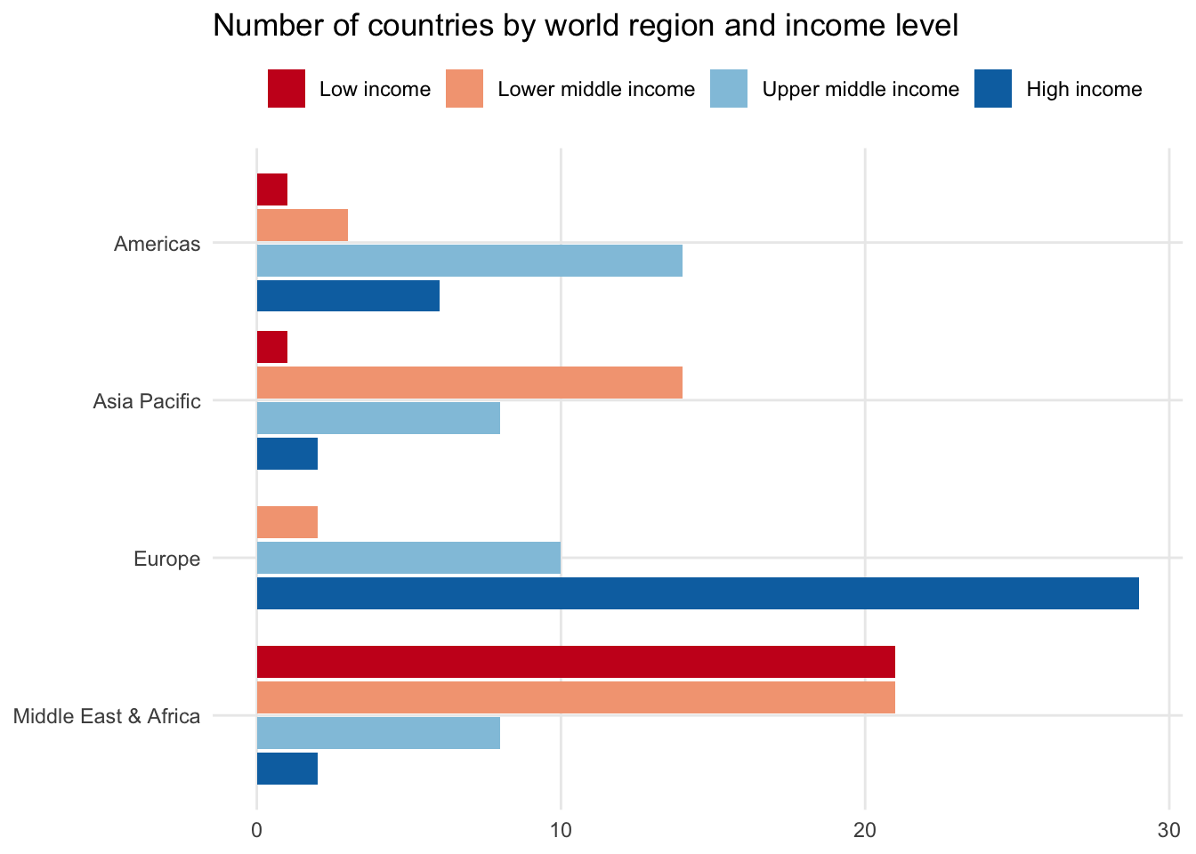
Another approach would be to make income_level the high-level variable, splitting each of its labels by region. This makes it easier to see which regions dominate specific income brackets.
Stacked bar chart
Instead of placing the second categorical variable side by side, you could also stack the bar chart by placing each group on top of each other. This maintains the overall shape of the simple bar chart where the length of each full bar reflects the total number of observations in each region.
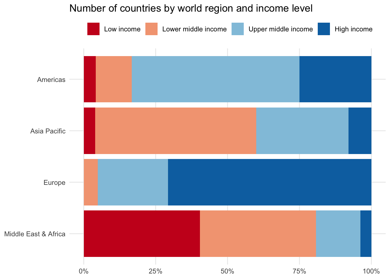
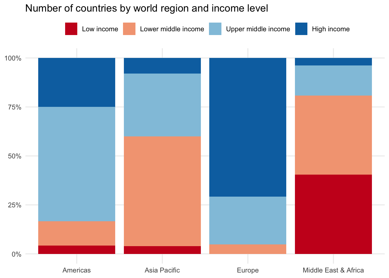
100% stacked bar chart
A final alternative is to standardize each of the second categorical variables — in our case income_level — to return the overall share of observations for each region. In other words, each region will now have their income bracket observations equal 100 percent.
This can be especially helpful if your main categorical variable has a handful of large segments, making it difficult to see the data differences among the smaller segments.
14.2 Box and whisker plot
A box and whisker plot is cryptic to interpret at first. It packs more information into its visual than most other charts, covering the entire Five Number Summary as well as highlighting outliers.
Starting with one numeric variable
We’ll use life_expect from the countries dataset as an example, which shows average life expectancy in years for each country.
The box and whisker plot consists of two main visual elements.
A box: This box covers the bulk of the distribution and is a visual representation of the interquartile range (IQR), the middle 50 percent of the data series. The top of the box is the 75th percentile and the bottom is the 25th percentile. Somewhere between these points is the median or 50th percentile.
A straight line: If there are no outliers, the straight line takes us from the minimum at the bottom to the maximum at the top. If outliers do exist — as calculated by the IQR outlier approach — they may appear as dots above or below an adjusted min/max line.
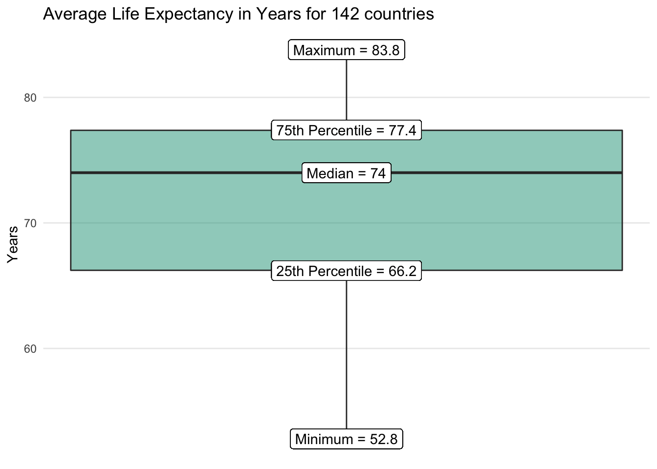
We quickly get a sense for the range of observed life expectancy values as well as where most countries tend to fall. No outliers emerge on the visualization for the life_expect data series overall.
Comparing across categories
The box and whisker plot becomes more effective when used to compare a numeric variable against the unique labels in a categorical variable.
Let’s say we wanted to know how life expectancy compares across world regions. We’re concerned that average values are misleading due to regional variation and select a box and whisker visual as an option to more broadly summarize each group.
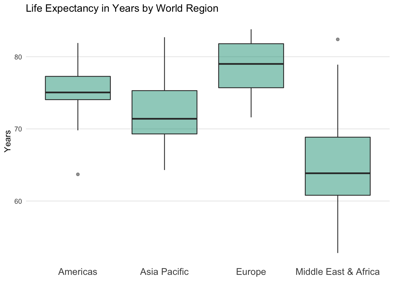
It is clear that Europeans tend to live longer lives than people in the Middle East & Africa. However, we also notice that there are a handful of countries in the Middle East & Africa that stretch into the heart of the European distribution.
Outliers also enter the visualization for the first time. In the Americas, there is one country that sits well below the typical life expectancy range for the region. In the Middle East & Africa there is one country that stretches well above its regional range. These extreme observations are shown as dots.
If you look at the underlying data, you will discover that the outliers are Haiti in the Americas with a life expectancy of just 63.7 years and Malta in the Middle East & Africa at 82.4 years.
This leads to a question for another time — in which regions should countries be assigned? Although Malta is in the European Union, the World Bank WDI regional classifications place it in the Middle East & North Africa…
Making a box and whisker plot in a spreadsheet
For many years, it was challenging to make box and whisker plots in spreadsheets, requiring analysts to use workarounds to create them. Thankfully, Microsoft Excel now provides native functionality. In Google Sheets, you still need to fake it a little with help from the candlestick chart.
14.3 Bubble chart
A bubble chart is an extension of a scatter plot that enables you to add a third numeric variable as seen through the size of each observation point.
Bubble chart key characteristics
- Y-axis: One numeric variable on the vertical axis
- X-axis: One numeric variable on the horizontal axis
- Bubble size: The size of the bubble represents the size of the third numeric variable
Here we add population as the new numeric variable that is represented by the size of each bubble.
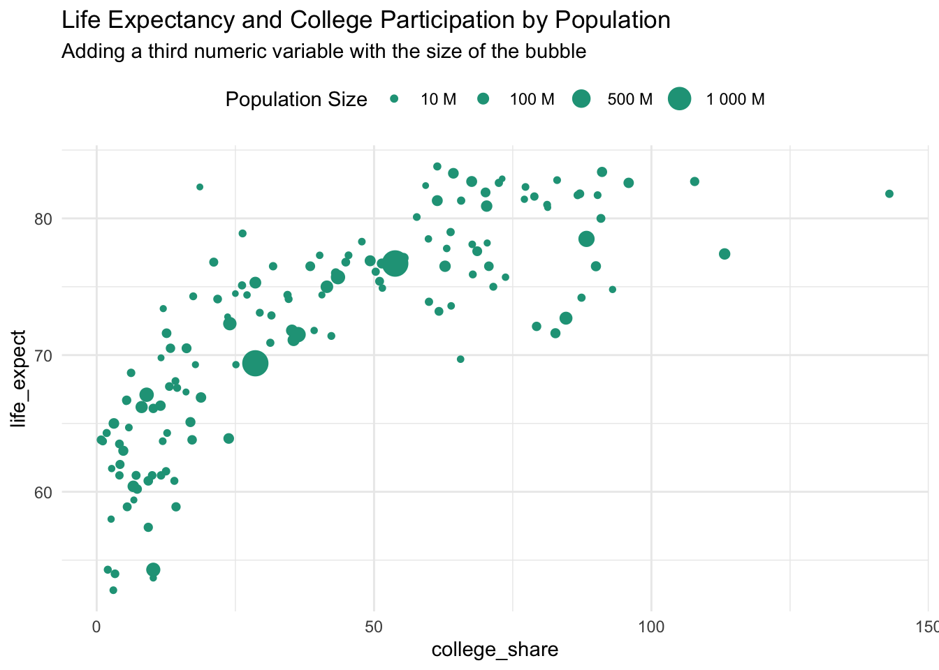
Notice that there are big and small countries along both scales. The two largest circles, India and China, sit in the middle of both distributions. A bubble chart can also be created in spreadsheet software. Here is an example in Google Sheets.
Putting it all together
You can also choose to include both a categorical variable and a third numeric variable by combining the previous examples.
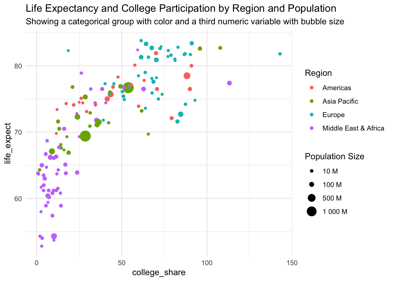
There is now a lot of information contained in the chart. So much that it might be hard for people to digest at first glance. That doesn’t necessarily mean that you shouldn’t use it, just expect to spend more time explaining it to others.
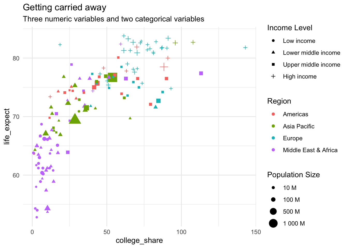
Getting carried away
At some point, you likely want to back off. As an example, here we include three numeric variables and two categorical variables.
14.4 Column chart
A column chart is the simplest yet effective way to visualize data differences among categorical and discrete variables. It is composed of vertical columns and is closely related to the bar chart.
Column chart key characteristics
Axes
- Y-axis: Counts, percentages, raw values, or summary statistics on the vertical axis
- X-axis: One or more categorical variables on the horizontal axis
Tips:
- Set the y-axis minimum to zero to maintain the correct visual proportions between results
- Sort order for the categorical variables depends on if you want the visual to be an A-Z reference or a callout for value differences
- Consider a bar chart when there are many groups within a given category
Click here for a Google Sheets example.
Column charts with one categorical variable
We can use a basic column chart to plot counts for the number of countries in each world region. The vertical distance of each column represents the counts. It is important to keep the y-axis minimum at zero to maintain comparable distances or risk misleading visuals.
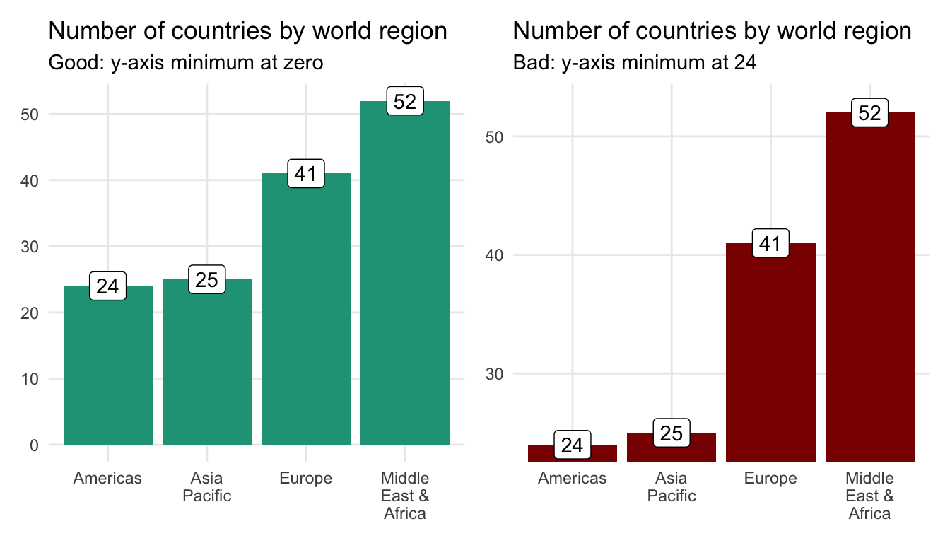
You can’t accurately compare column lengths in the above chart on the right because the y-axis minimum is set to 23. This gives the appearance that the country count difference between the Americas and the Middle East & Africa, for example, is much larger than it truly is.
What should I do when there are many categorical labels?
A column chart can get overloaded when there are a large number of data labels within the categorical variable or the labels themselves are long. For instance, when we show the unemployment rate for all countries in Asia Pacific we’re forced to rotate the labels 90 degrees so that they don’t overlap.
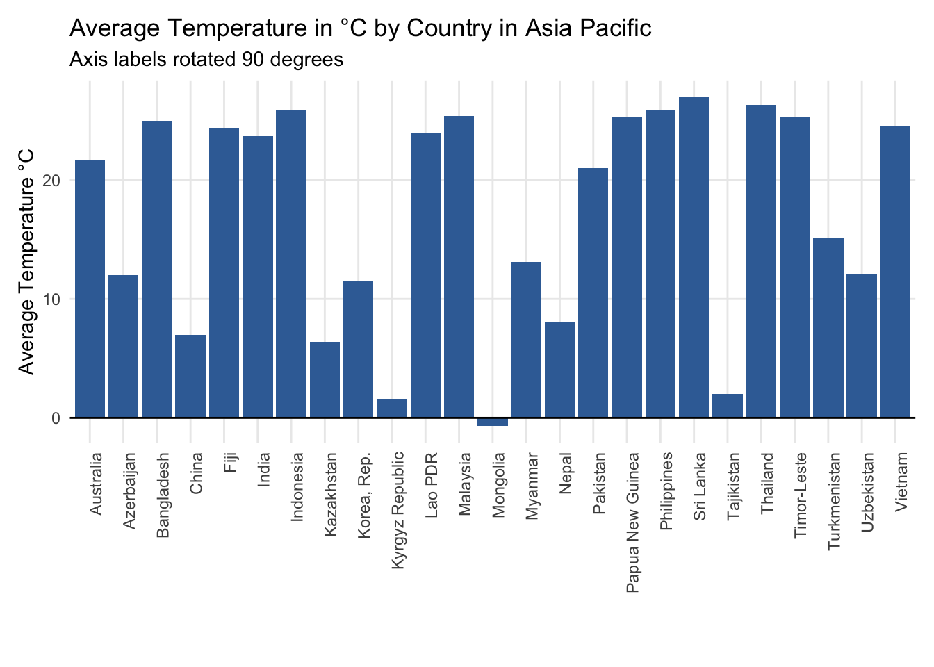
You could also choose to adjust the labels 45 degrees.
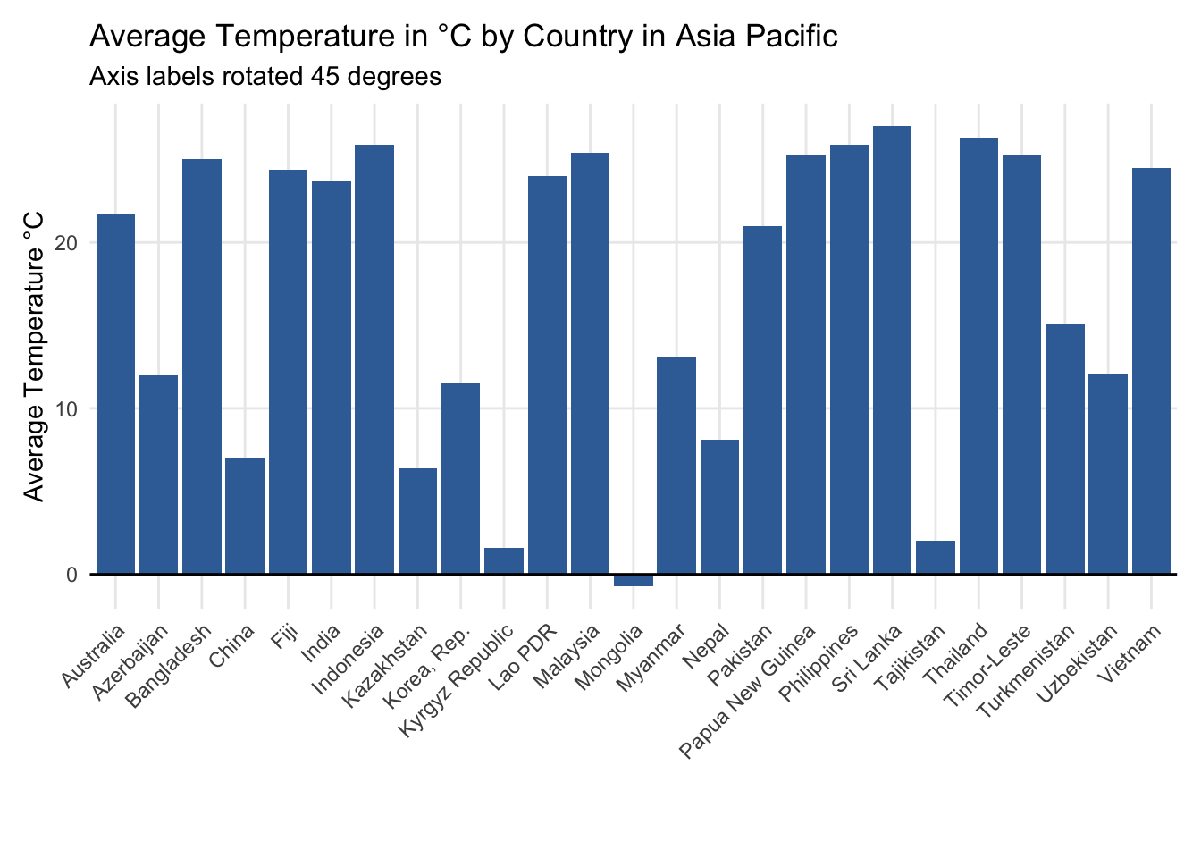
Although the 45-degree rotation helps somewhat in terms of legibility, it almost certainly hurts in terms of helping readers connect the labels to the respective column values.
Turn to a bar chart in these situations.
Column charts with two categorical variables
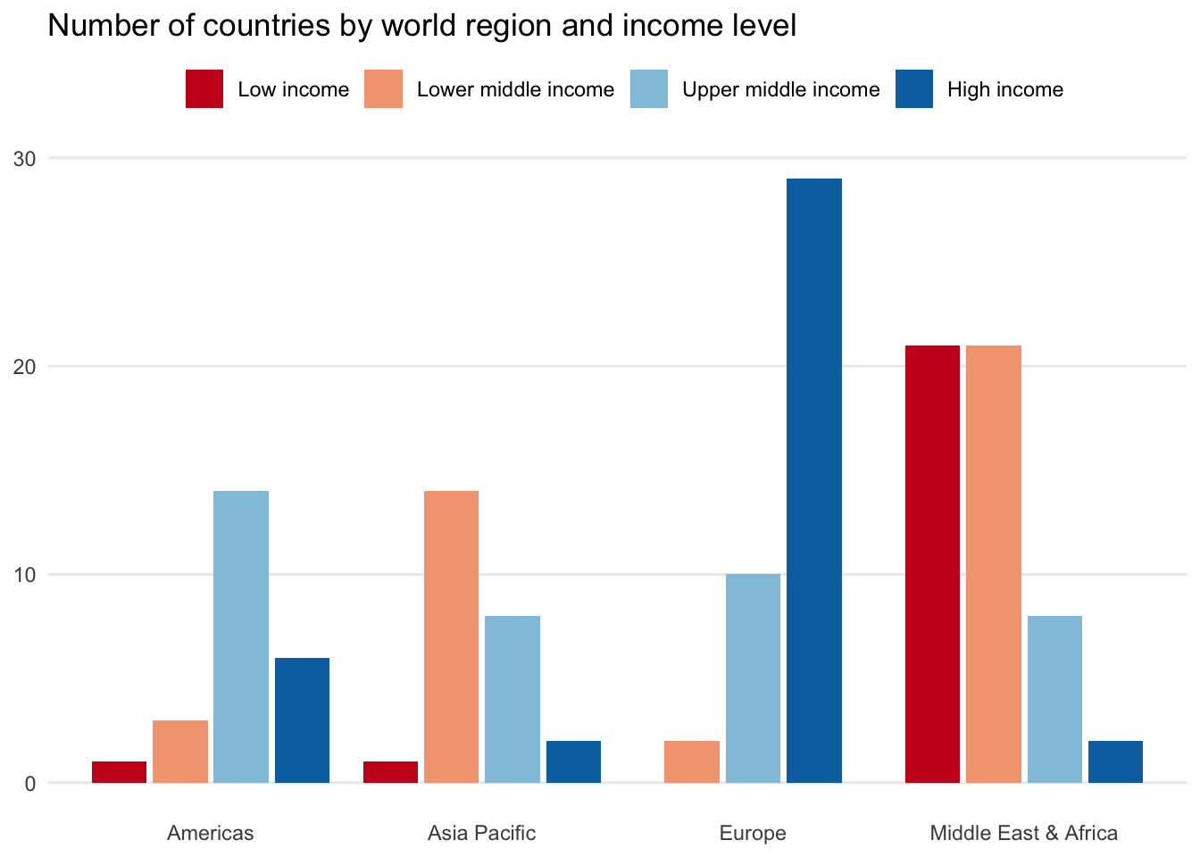
You can further customize column charts by adding a second categorical variable. Here, we look at several ways to visualize income_level in addition to region.
Side-by-side column
Placing income_level as side-by-side columns on top of each region is the typical approach. It enables readers to quickly digest the regional distribution. For instance, Europe is composed mostly of high-income countries and Asia Pacific is more evenly distributed.
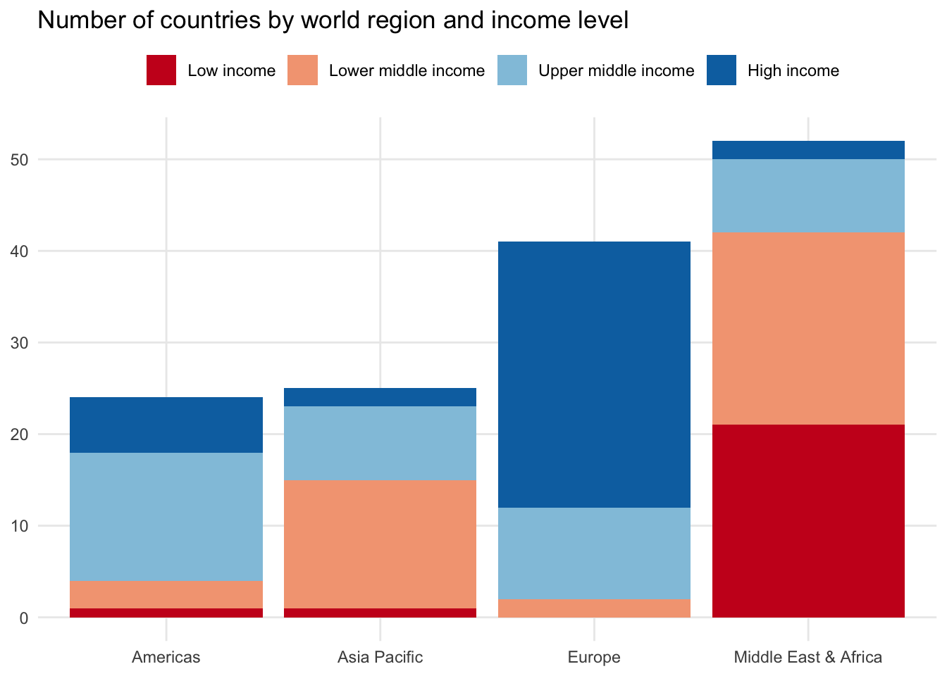
Stacked column chart
You could also stack the column chart by placing each group on top of each other. The height of the columns will once again reflect the total number of observations in each region.
100% stacked column chart
If you like the stacked column chart appearance but are having trouble seeing categorical differences due to one or more groups with fewer observations, you can try the 100% stacked column chart.
This approach standardizes the income_level values and calculates the proportion relative to the total number of countries in each region. Each column will add up to 100 percent, making it easier to compare among groups.
14.5 Histogram
A histogram shows the distribution of one numeric variable by grouping values into either a specified group of ranges or number of bins.
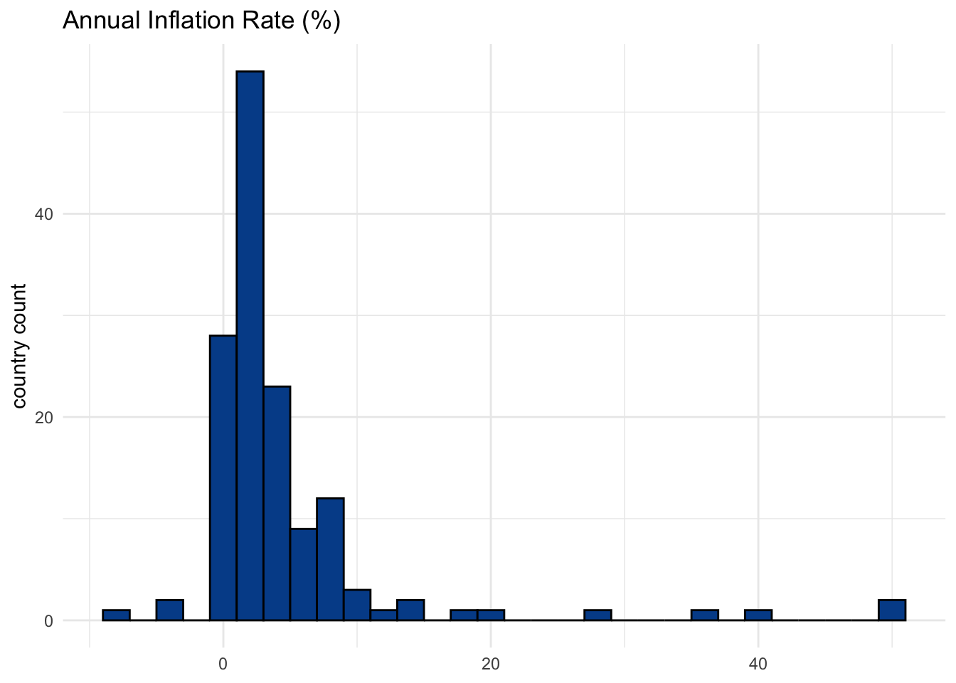
The chart above defines bin widths to be two. In this case, that relates to a two percent range of inflation rate values. If you turn these ranges into a frequency table, you will find the specific cuts and counts.
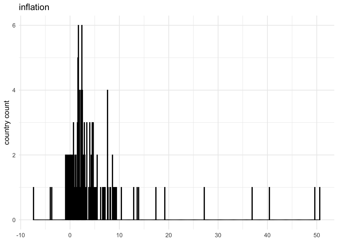
Every possible value
The number of bins you select or the range of bin values you define has a big impact on the visualization’s impact and explanatory power. This version shows all possible inflation values.
Choose wisely
You want to use bin values that balance showing too much granularity — a large number of bins — with showing not enough information — a small number of bins.
Here is how our visual changes with different bin width values.
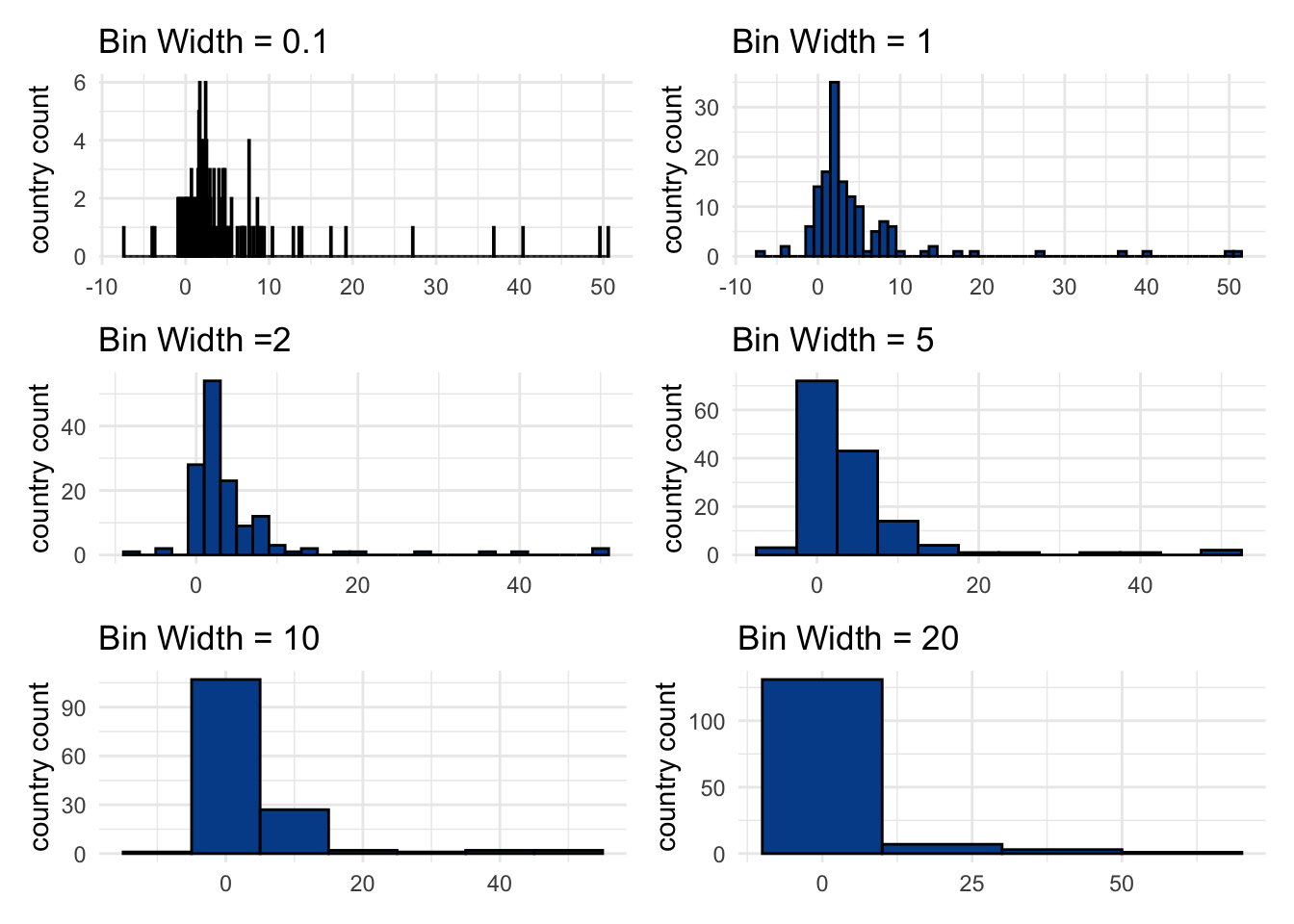
Somewhere between a bin width of 1 and 5 seems to make most sense.
See a Google Sheets example.
14.6 Line chart
Tracking change over time is a core component of analytics and the line chart is one of the primary visuals associated with the task. It consists of an uninterrupted line connecting sequential points, usually related to periods of time.
Line chart key characteristics
Axes:
- Y-axis: The values for the numeric variable(s) you want to track over time on the vertical axis
- X-axis: A set of dates or time periods such as days, months, or years on the horizontal axis
Tips:
- Although the y-axis minimum doesn’t need to be set to zero for the same proportional reasons as with bar or column charts, it still makes sense to do so unless the values are very large.
Click here for a Google Sheets example.
For the following examples, we’ll use a time series version of the countries dataset. Although a country is still our unit of analysis, we now have a new year variable that enables us to focus on how a given variable has changed over time.
One numeric variable
We’ll start by looking at a single variable, unemployment, for a single country, Argentina. A line chart shows how unemployment rates in the country changed between the years 1990 and 2018.
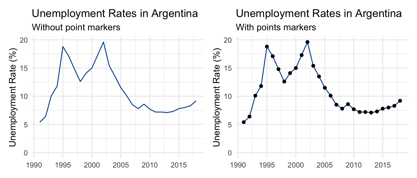
There are two major unemployment spikes in the mid 1990s and mid 2000s that correspond with serious domestic economic challenges.
Visually, the line chart on the left does not use markers to highlight individual data points. It is smooth. In contrast, the chart on the right uses circle markers to explicitly indicate annual observations.
There is no right or wrong here. Typically, the more observations you have, the less practical showing all markers becomes. This is clear when we try to do the same with monthly unemployment data from another country going back to the 1960s.
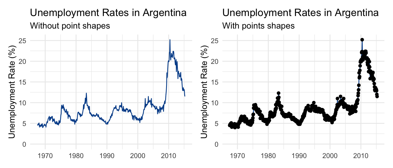
Using point markers in this case adds unnecessary noise to our visual.
Another item to be aware of is the value labels on the horizontal axis. It is unlikely that you’ll be able to fit in all periods of time in your data series. The best practice is to drop some value labels in a logical way. We chose to highlight the first year of each new decade.
Multiple categorical values
You can also use a line chart to show more than one group within a categorical variable. Let’s say we wanted to compare unemployment in Argentina and Brazil over the same period.
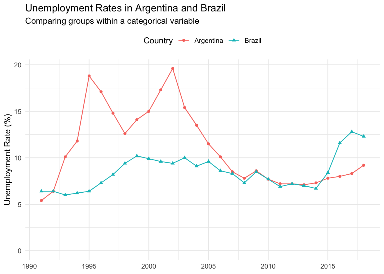
Color is used to differentiate between the two countries. We’ve also employed a different shape marker for each line to help people who have trouble differentiating between certain colors. This works here because there are relatively few data points.
To further reduce the mental steps a reader must take, you could also drop the legend and move labels directly over a given line. This works well in cases with divergent areas.
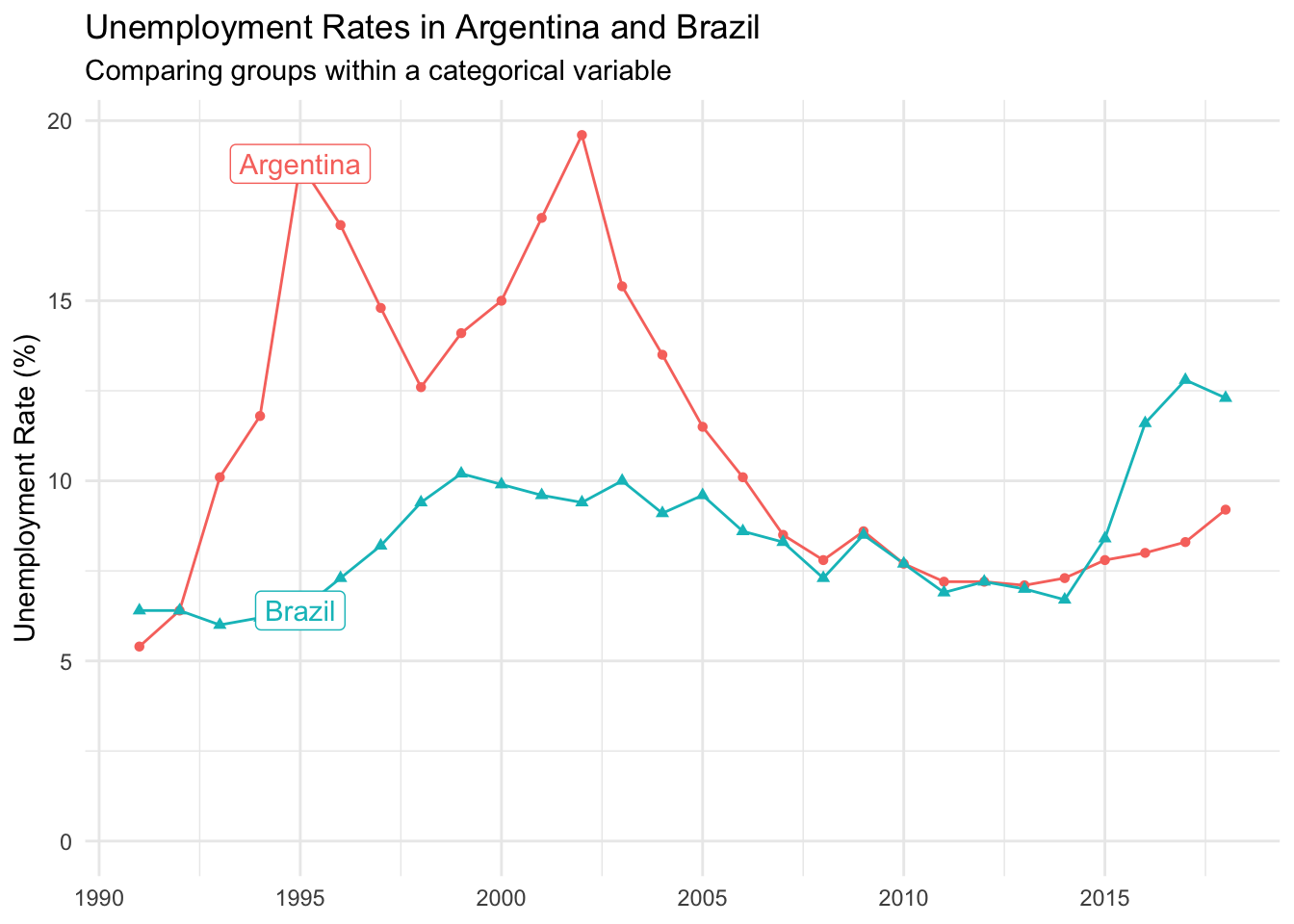
Matching the color of the new label to the color of its respective line also helps with interpretation.
Multiple numeric variables
Finally, we can use a line chart to look at multiple variables. This works better when the range of the variables are relatively similar, and you focus on a single group.
Here, we look at both unemployment and gdp_growth for Argentina over time.
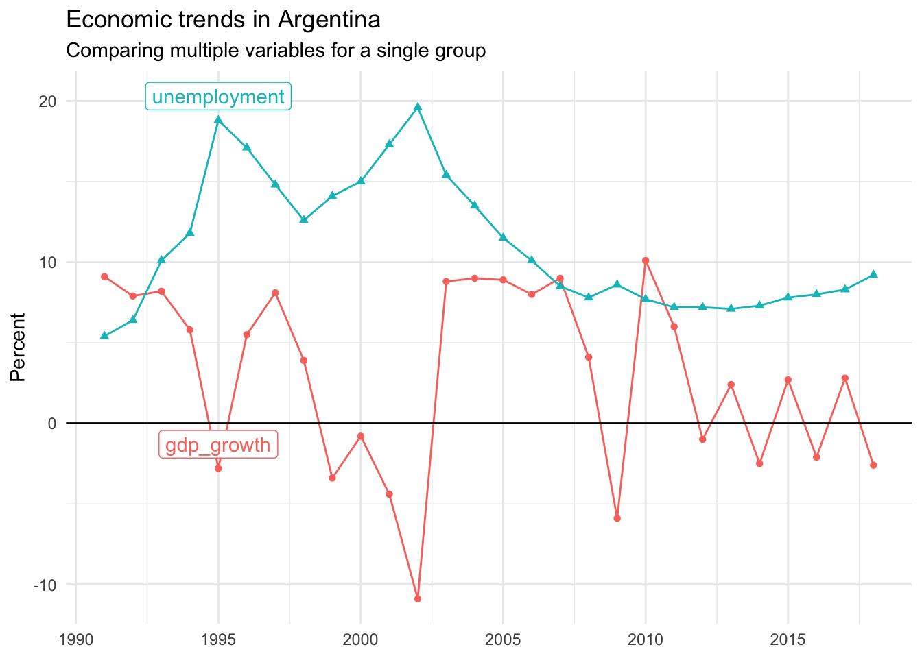
This visual shows us that the two unemployment peaks aligned with periods of shrinking economic growth, represented by negative gdp_growth values.
14.7 Pie chart
If you present a pie chart to a data person, they will likely clench their teeth or roll their eyes. Let’s take a look at why.
Pie chart key characteristics
Slices:
- Each pie slice represents the proportional share of a specific group within a categorical variable.
Tips:
- Don’t use it! Choose a column chart or make a simple table instead.
If you must:
- Limit the number of groups shown to four or less.
- Remove the legend and add the group name and summary data point to a label on each slice.
Click here for a Google Sheets example.
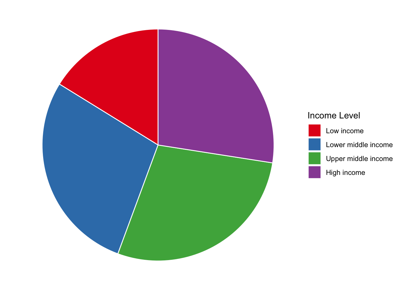
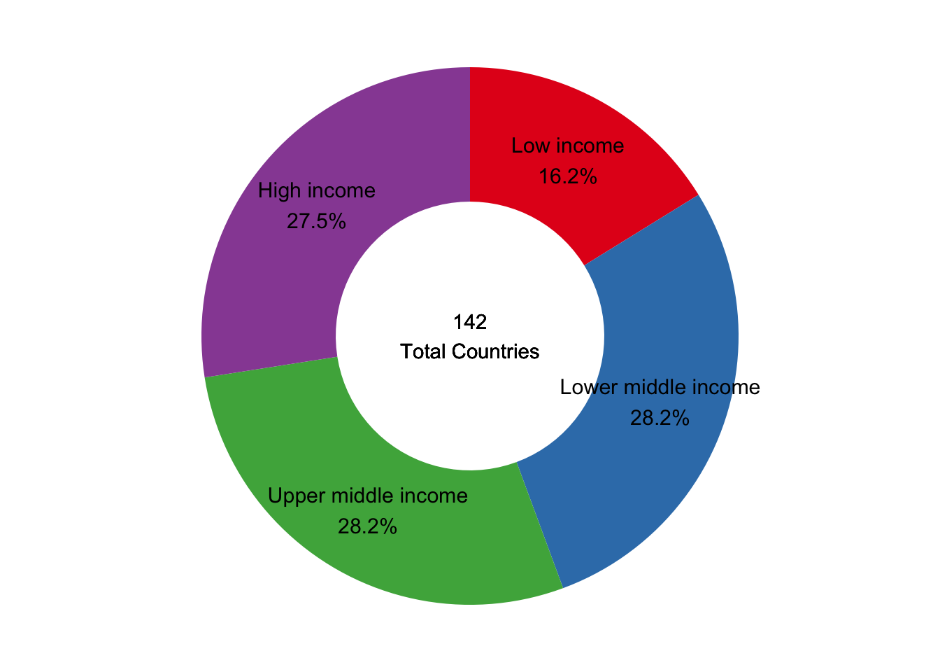
Let’s take the ordinal variable income_level in the countries dataset as an illustrative example. Here are the summary statistics we will be plotting.
We use the proportions to generate a pie chart that visualizes the splits for each income level.
Why do data people find this so offense? It is colorful and can add chart diversity when communicating results. But if the entire point of a visual is to help readers more quickly internalize key findings, there are several reasons why a pie chart isn’t the best choice.
Too many mental steps: When trying to understand what is shown in the pie chart above, what do your eyes have to do? First, they need to find a category of interest, learn its associated color, and then scan left to see its relative size in the visual. Then, unless you memorized all the color combinations, you have to choose the color of another slice before scanning back to identify which group it represents.
Difficulty comparing sizes: Our brains are also bad at comparing size differences among the various slices. Does the chart reveal relatively even splits between all groups? Is purple, blue, or green the biggest slice? Or are all three the exact same?
We can attempt to solve these primary issues by reformatting the visual. Removing the legend and adding both group name and proportion directly above its respective slice helps make it more digestible.
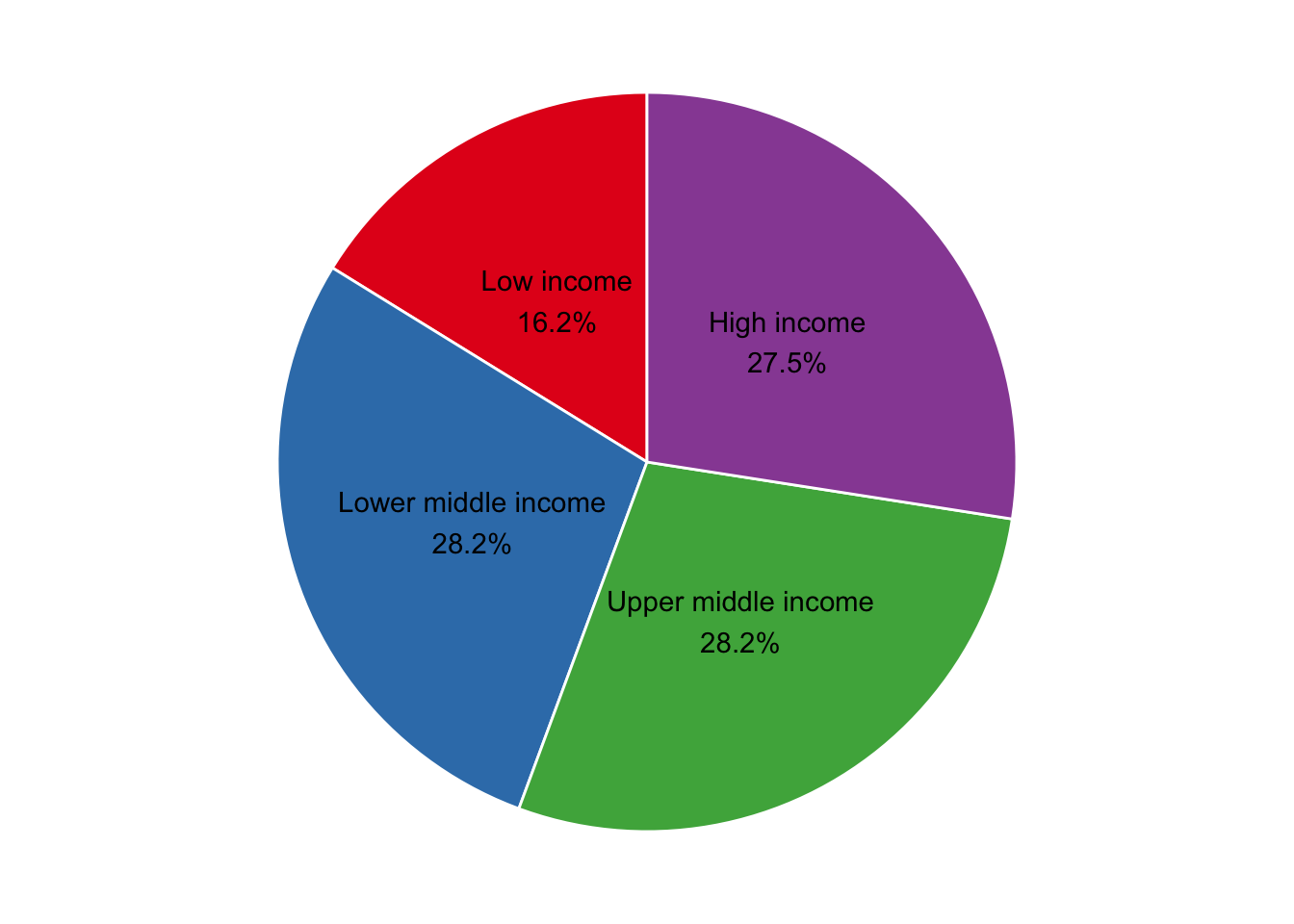
At least now a reader can scan the visual and take away meaning without expending too much mental energy. However, a simple table here would be more effective. The pie chart still isn’t helping readers visually quantify proportional differences to the fullest.
To see this, let’s place the pie chart next to a column chart.
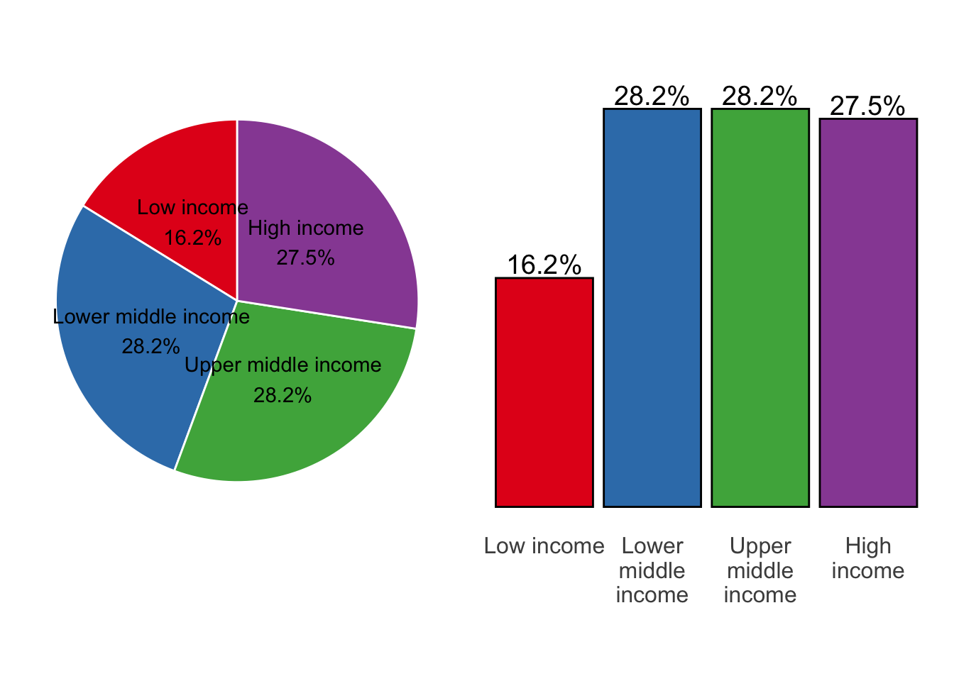
The column chart on the right is much clearer. The natural, left-to-right ordering of the income levels is intuitive, and the proportional difference between the three larger groups and the smaller one is more distinct.
If you must…
If you still feel the need to use a pie chart, at least consider only doing so when there are no more than three or four groups. This will let you avoid the legend and place all relevant information directly on the pie.
The other thing to consider is experimenting with a donut chart, which maintains pie chart form but removes its center.
From a visual perspective, people seem to find this more engaging. It also opens up space to include additional context such as sample size, observation date, or data source.
14.8 Scatter plot
A scatter plot is a great tool to visualize the relationship — or lack thereof — between two numeric variables. It is especially effective when both variables are continuous.
Scatter plot key characteristics:
- Y-axis: One numeric variable on the vertical axis
- X-axis: One numeric variable on the horizontal axis
- Each point or dot represents the values for two variables from a single observation such as an individual’s weight and height
- Each axis shows the original range of its respective variable from low to high
- Any relationship or pattern observed does not tell us which variable, if any, is causing the other to change
Using the clean countries dataset let’s visualize the relationship between life_expect and college_share with a scatter plot.
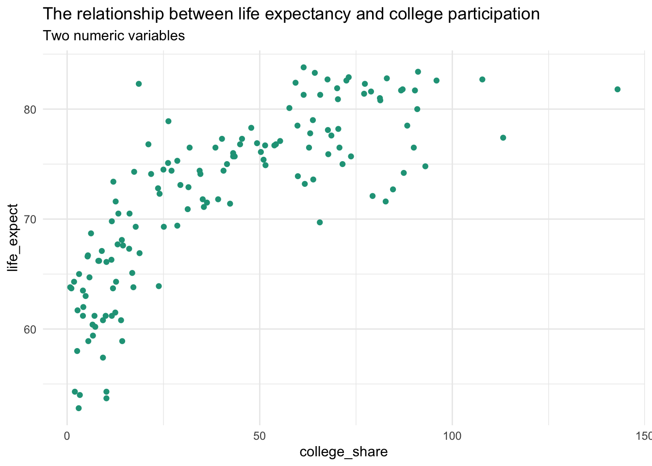
A rise in life expectancy is associated with a rise in a country’s college participation rate and vice versa. This is an example of a positive association or relationship between two numeric values.
A simple scatter plot is easy to create in spreadsheet software.
Adding categories
You can add more information to a scatter plot by incorporating categorical variables and altering the visual appearance of the observations. Here, we show regional breakdowns with unique colors and shapes.
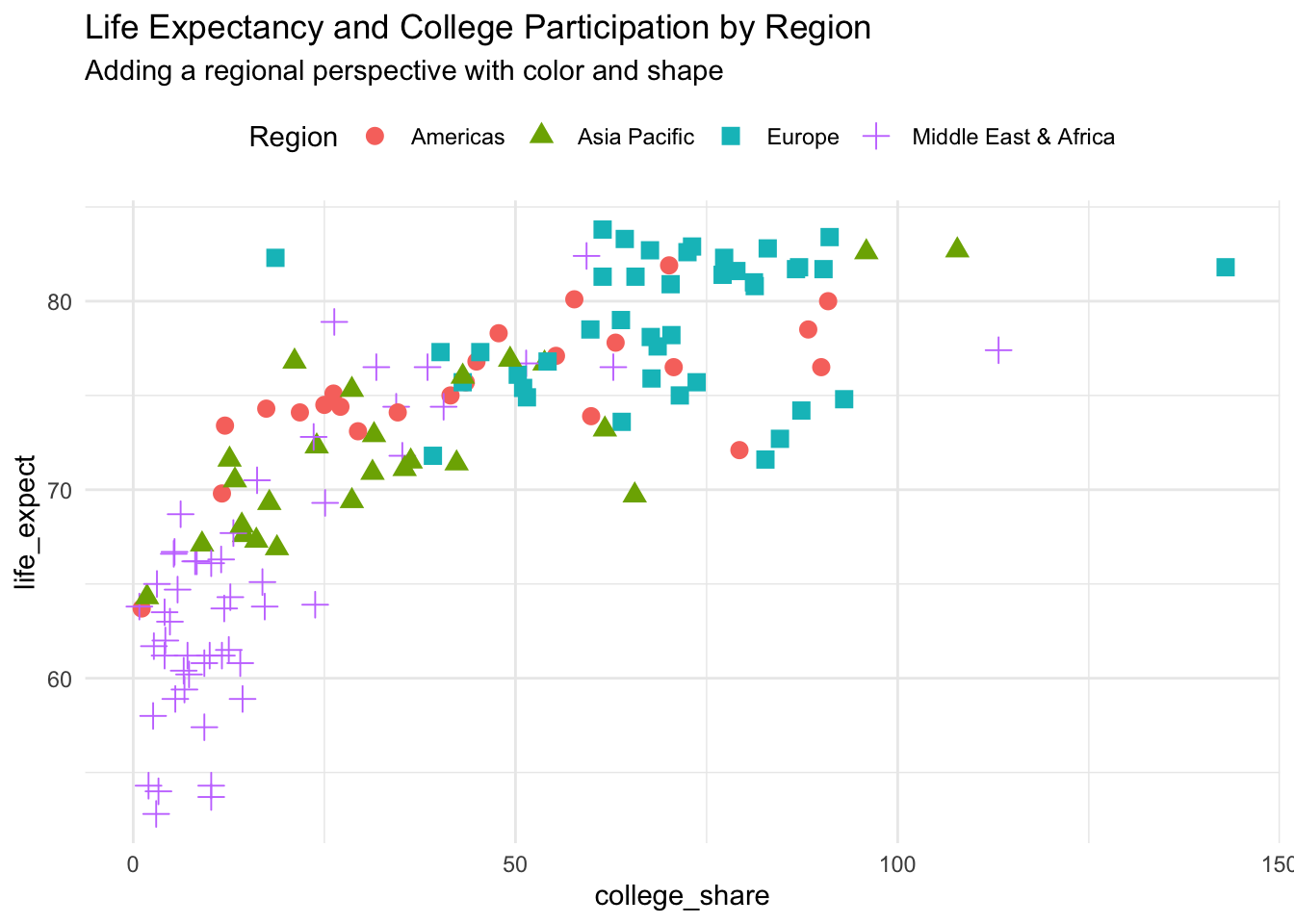
You quickly see from this alteration that regional differences exist with the Middle East & Africa on the low end of both measured variables and Europe on the high end.
Try a bubble chart if you want to incorporate a third numeric variable.