7 Manipulating data
Sometimes we need to manipulate our raw data. This section contains some basic approaches and their considerations.
7.1 Data transformation
Many statistical techniques work well with normal data. Some methods even require it. Data people sometimes go to great lengths to transform non-normal data into normal data because of this. There are other potential benefits that we’ll see as well, including relationship detection and outlier mitigation.
Data transformation involves taking all the original values from a data series and doing something consistent to them in an attempt to change the shape of the distribution.
Examples of data transformation
Let’s look at total economic output — gdp — and population from the countries dataset.
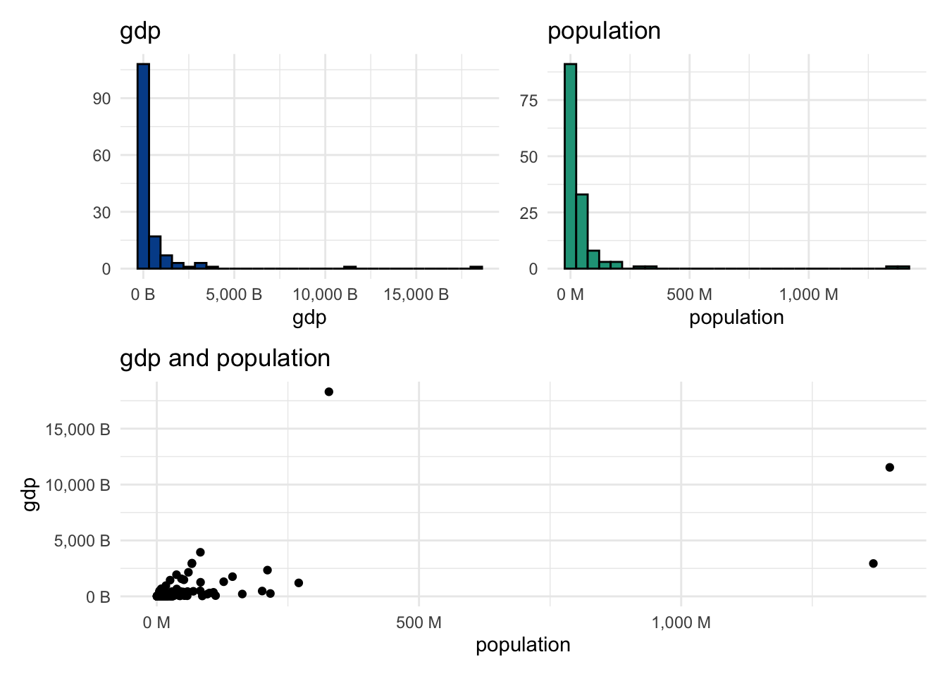
Both variables are clearly non-normal. Many observations are on the far left of the distribution, and there are a small number of really large values moving right of the horizontal axis.
QQ plots for the original data
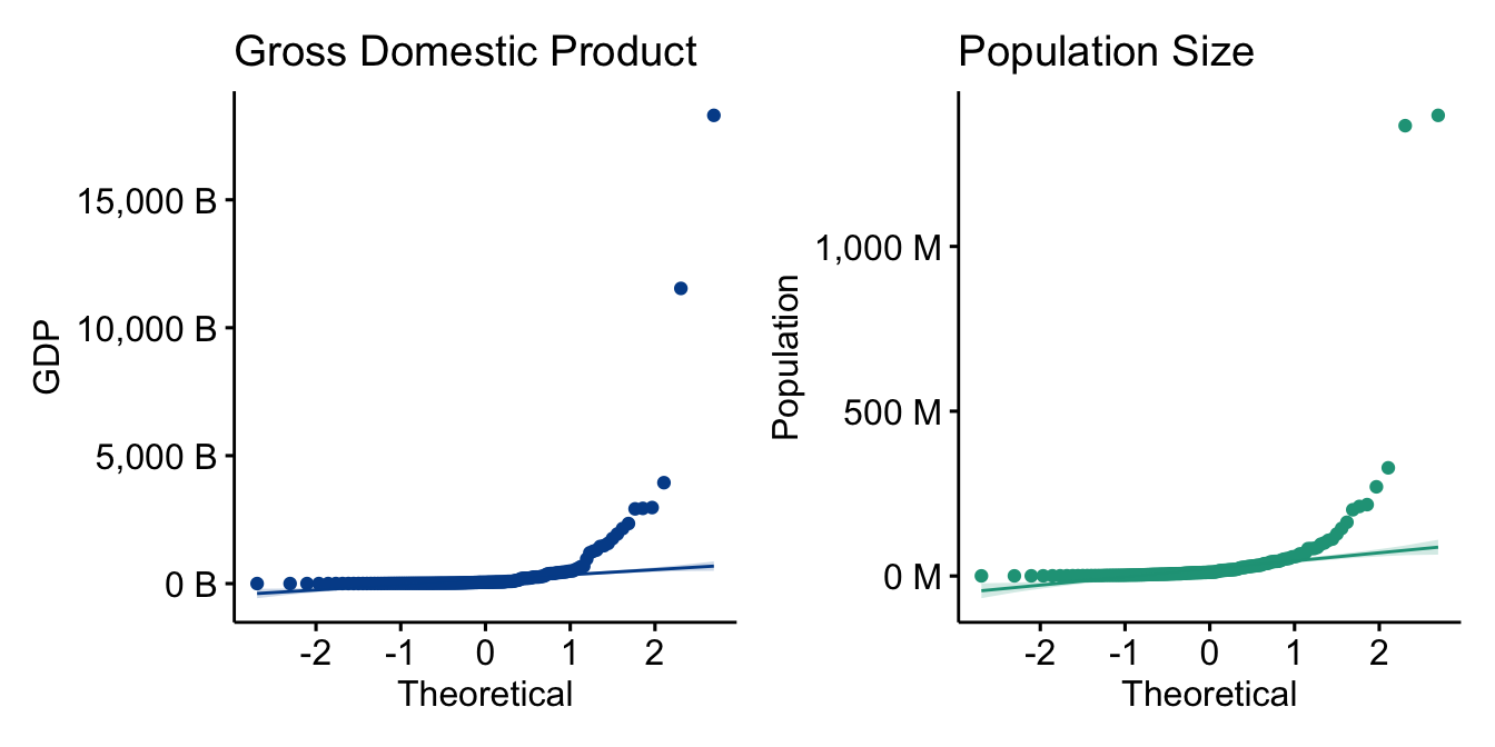
The QQ plots show observations very far removed from the reference line, another indication that both series are non-normal.
Logarithmic transformation to the rescue
Something incredible happens when we take the log of each data point and re-plot the variables.
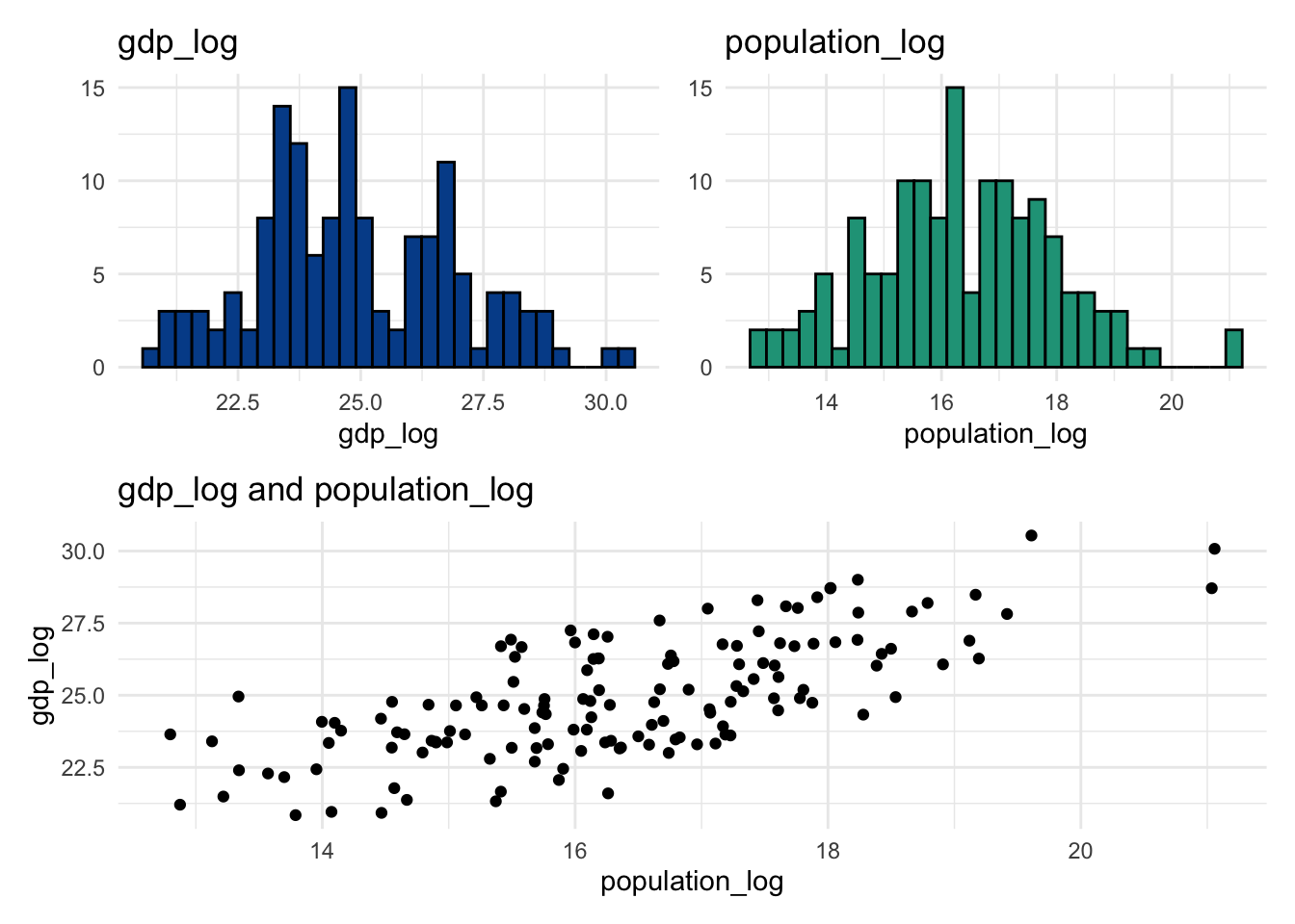
All three visuals look completely different. It is much easier to see variation across the individual distributions, and the linear relationship now appears quite clear in the scatter plot.
QQ plots for the transformed data
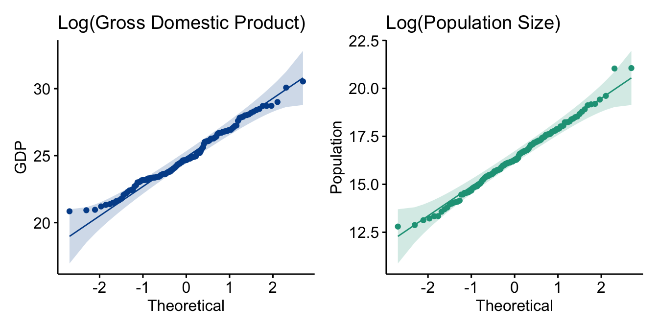
The QQ plots now indicate near-normality for the transformed data. Not surprising given the new histograms.
Common data transformation approaches
A logarithmic transformation is just one potential approach.
Common data transformations
The first four approaches can be seen here. Box Cox and the Johnson Transformation are more advanced techniques that use power functions and can’t be easily shown in spreadsheets.
Let’s apply all the transformations above to gdp and observe the impact.
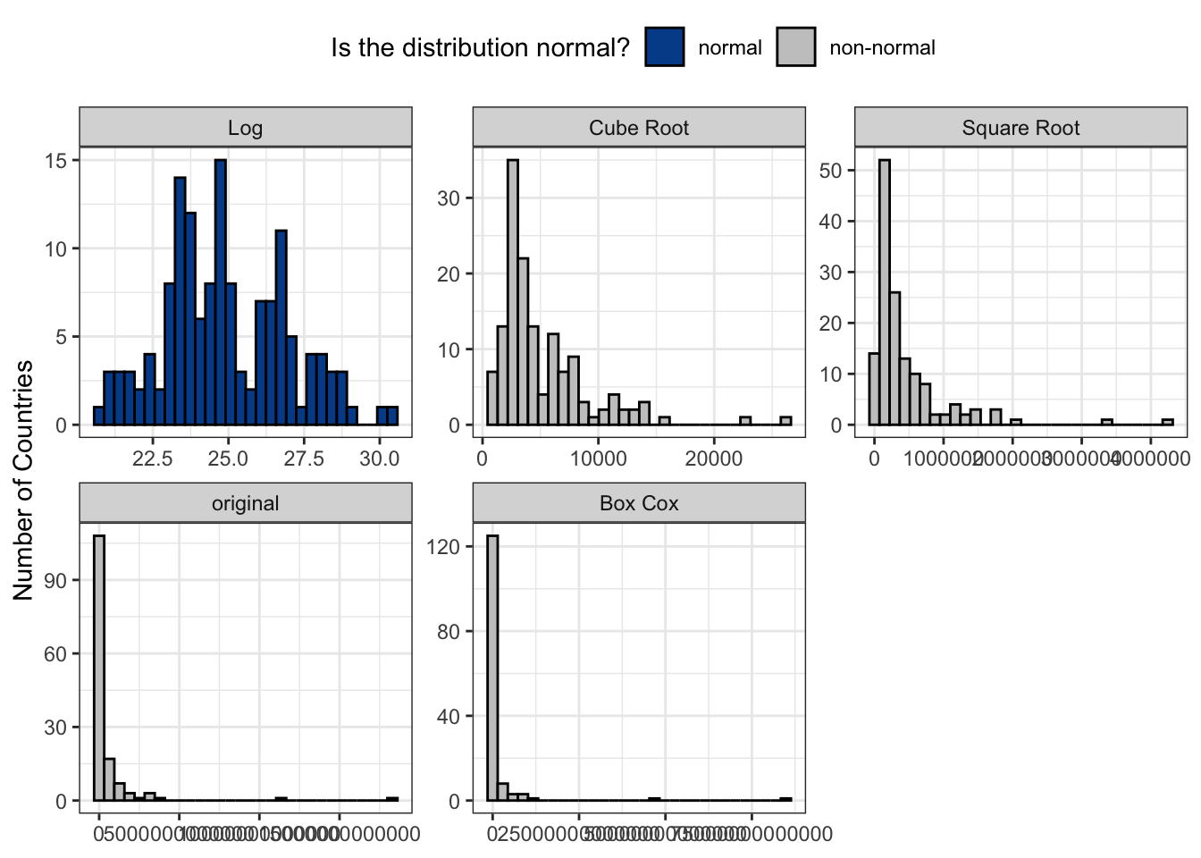
For gdp, the Johnson Transformation and logarithmic approaches succeeded in changing the underlying distribution to normal. Depending on the characteristics of the original distribution, different transformations will be more effective than others.
For instance, see how many work for the gini coefficient, a measure of income inequality.
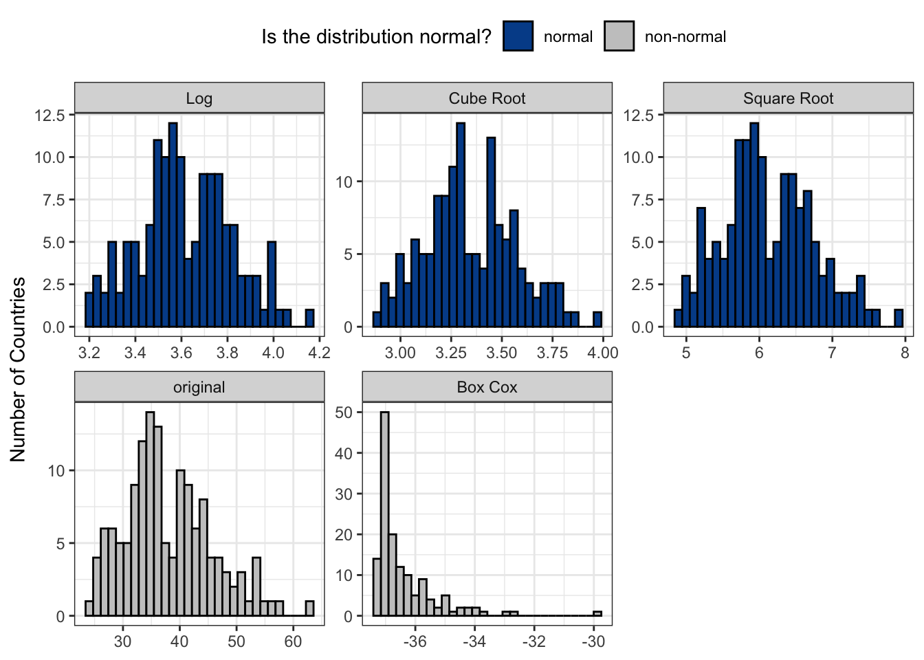
Five of the six data transformations tested on gini led to normal distribution designations. So, which one should you pick? It is generally best to select one that you and your audience will understand.
Downsides
Although there are benefits to transforming data to better approach normality, there are also costs. Most importantly, the interpretability of your results will likely challenge many audiences. It is easy to wrap our brains around data such as population totals. Deciphering the cube root transformation of total population, or its relevance, is more difficult.
7.2 Rescaling
We transformed data when trying to reshape a data series to more closely approximate a normal distribution. There are also moments where we don’t want to change the underlying shape, just the range it happens to take.
The motivation can be to score something on a pre-defined scale, make comparisons more easily from data with different natural ranges, or remove negative values to work better in some subsequent analysis.
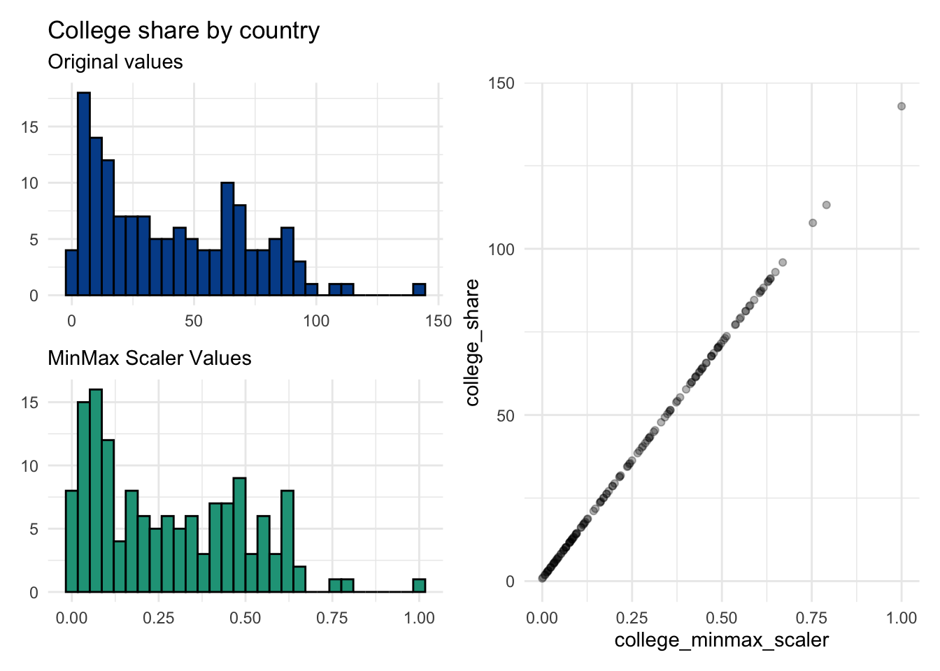
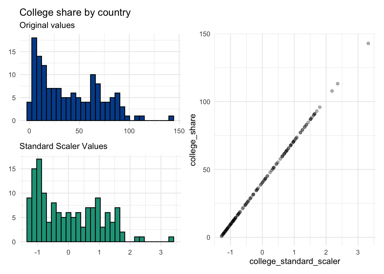
Let’s take a look at college_share from the clean countries dataset.
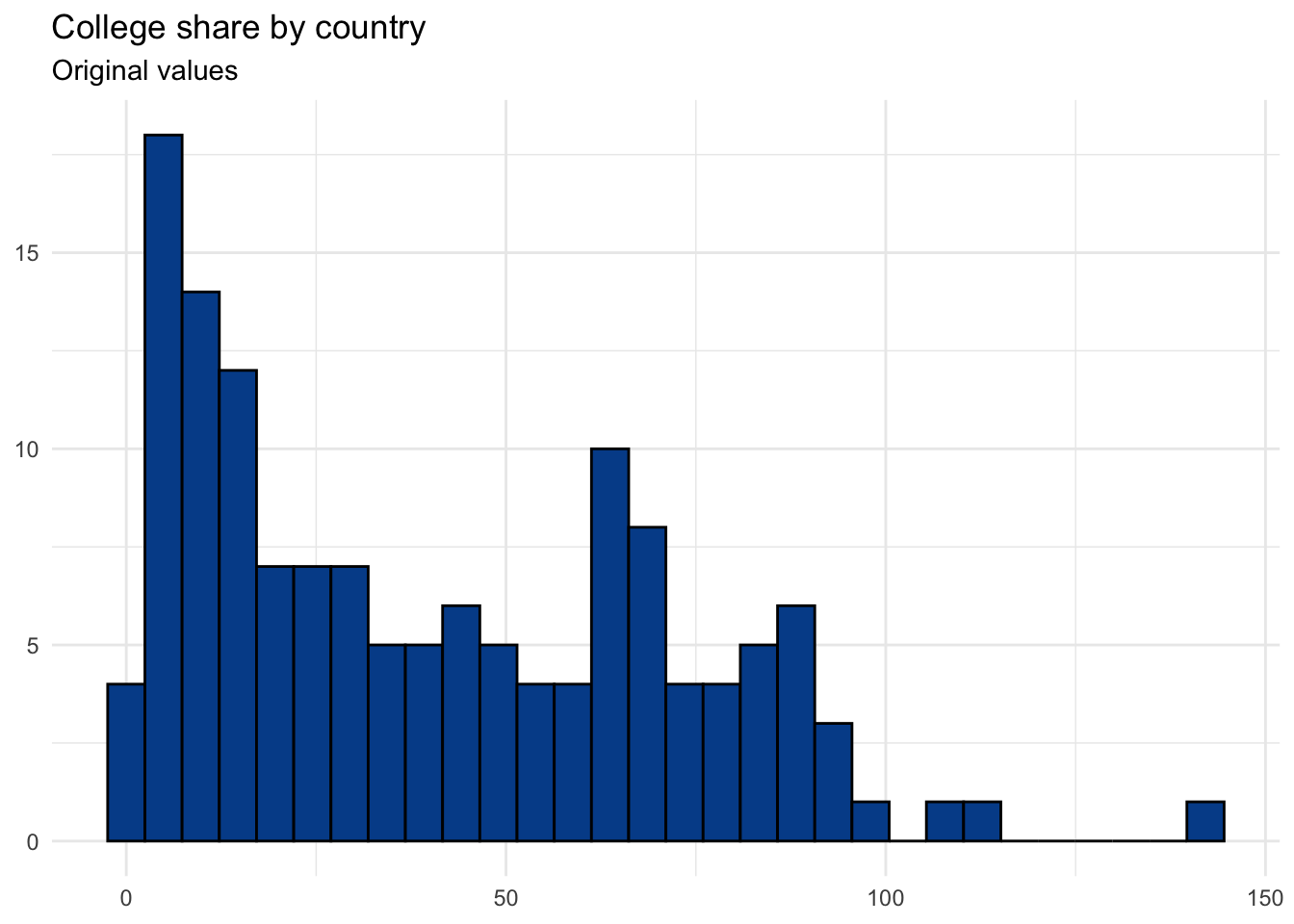
The college_share variable is somewhat difficult to interpret. It represents the proportion of a country’s student age population that is enrolled in some form of higher education. The confusing part is that it can be greater than 100 due to international student mobility. So, for countries who attract a lot of international students, the proportion may stretch well over 100 percent. This difficulty in interpretation could be another reason to rescale the original range.
We’ll look at four different rescaling methods, each of which does something consistent to each observation while maintaining the underlying distribution from the original data series.
1. MinMax scaler
A MinMax scaler is a normalization technique that will force a range of data values to fall between zero and one. Whichever value was the lowest on the original scale becomes zero and whichever value was the highest becomes one. If desired, it is easy to turn the results into a zero to 100 scale by multiplying each value by 100.
\[\frac{\text{Observation - Minimum value}}{\text{Maximum value - Minimum value}}\]
2. Standard scaler
The standard scaler standardizes the values relative to the standard deviation from the series. The rescaled values will have a mean of zero and a standard deviation of one. Each value represents the distance from the mean in terms of original standard deviation value.
\[\frac{\text{Observation - Mean value}}{\text{Standard deviation}}\]
3. robust scaler
Because the Standard Scaler approach uses the mean and standard deviation values, it is subject to more influence from outliers. In contrast, the Robust Scaler uses the median and interquartile range (IQR) for the calculation. The rescaled values can be both negative and positive.
\[\frac{\text{Observation - Median value}}{\text{Interquartile range (IQR)}}\]

4. New range
Finally, we can arbitrarily rescale a data series to have a desired minimum and maximum value.
Here, we do the analysis to force a scale with a minimum of one and a maximum of ten.
\[\frac{\text{Observation - Min original value}}{\text{Max original value - Min original value}}\times(\text{Desired max - Desired min})+\text{Desired min}\]
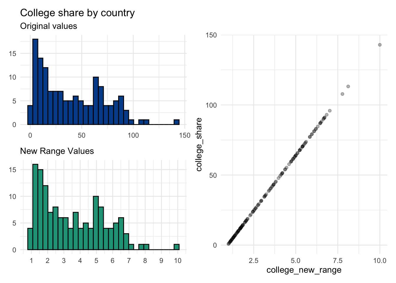
All four rescale examples are linear transformations as seen by the scatter plots comparing the original and rescaled values.
Calculations behind each approach can be found here.
7.3 Rounding
One of the variables in our CountriesClean dataset is gdp_growth, which is the annual rate of economic growth as measured by changes in a country’s gross domestic product (GDP).
Here are some of the country-level values. The first thing to notice is that at some stage in the data cleaning process they were all rounded to only one decimal point.
##   [1] -0.6  2.2 -2.1  7.6  2.2  1.4  2.2  1.8  1.7  6.9  5.7  8.2  3.7  2.7  1.2
##  [16]  0.3  1.1  3.0  3.0  1.7  0.9  1.1  6.1  6.2  3.7  4.4 -3.5  3.3  5.7  2.1
##  [31]  3.1  2.3  0.6  7.8  2.8  5.1  0.8  0.1  5.6  2.0  5.0  8.4  1.1 -0.4  1.5
##  [46]  3.9  1.5  5.0  6.5  5.6  6.1  4.6  1.9  3.8  5.4  2.7  2.9 -1.7  4.6  5.0
##  [61]  4.2  5.5 -6.8  4.4  1.9  0.3  0.7  2.0  4.5  5.4  4.5  2.0  4.7 -6.7 -2.3
##  [76]  2.3 -0.8  4.3  2.3  2.1  2.5  3.6  4.9 -0.1  3.2  4.8  4.9  2.9  4.1  5.2
##  [91]  2.3  5.9  3.0  4.4  4.3  5.9  2.2 -3.9  1.7  1.2  7.0  1.0  3.0  2.2  6.0
## [106]  5.9  4.5  2.2  0.0  4.2  1.3  9.4 -2.5  5.3  5.5  2.4  4.2  2.3  3.2  1.3
## [121]  2.2  3.2  5.3  2.4  7.0  6.2 18.7  0.0  1.0  0.9  5.8  6.8  3.2  0.2  2.2
## [136]  5.6 -3.9  7.0  2.1  0.2  1.4 -8.1
The mean gdp_growth of all the countries turns out to be 2.9774648. Many more decimal points have suddenly appeared. But are they helpful?
As with many topics in data science, it depends. Some questions to consider:
Question 1. Is it a terminal summary point?
If your purpose is to communicate the most concise yet accurate number, then it makes sense to remove some of the decimal noise. Although you can specify the number of decimals to which you hope to round, most spreadsheet rounding functions default to zero decimals.
All of these options are fair representations, so what do you decide?
I typically choose one decimal to show we care about precision but not to the detriment of understanding. In this case, that would be 3.0. I can think of very few cases in which I’d choose to show more than two decimal points.
The decision also depends on the absolute size of the number in question. If you are talking about population size and the mean is 51121768.3732394, then you don’t need to show any decimals at all.
Rounding to zero decimals here eliminates the noise but still leaves us with a very large number. In some cases, perhaps when comparing population averages by region, this might be what you want. In other cases, it remains overkill.
You can use negative values to reduce the precision even further. Everything up through -7 seems okay. At that level, the returning value is 50 million, which is much easier to digest.
Another technique that’s useful here would be to transform the large number into millions by dividing it by 1,000,000.
51121768.3732394 becomes 51.1217684 which could then be rounded down to 51.1.
Saying 51.1 million people is obviously much clearer than reporting 51121768. But again, it depends on your purpose.
Question 2. Is it a value that will be used in a subsequent calculation?
If you’re going to use the value as an input for some other calculation, then it generally makes sense to keep it in its full form until the very end. This is because rounding decisions get magnified as they are used again and again.
Let’s say you were scoring an Olympic diving competition. Assume that traditional judges have been replaced with AI bots and the scores have moved from discrete to continuous where decimal points are now involved at each stage.
These are the raw scores for each dive. The final score, however, will only have one decimal so we consider two approaches:
Approach 1. Round both the individual dive scores and the final combined score
Approach 2. Round only the final combined score
Karen wins under the first scoring approach. It is a tie between her and Clara under the second.
The point here is to be aware what rounding decisions you make and when. Also, if you find yourself disagreeing with someone on slightly different output numbers, start by evaluating when and where rounding took place.
You can experiment with the rounding functions in Google Sheets, here.
7.4 Scientific notation
Scientific notation converts numbers that are very small or very large into a shorter and more comparable form.
However, depending on the nature of the dataset that you are working with, sometimes this process leads to more confusion than it is worth in my opinion.
Below is a table of scientific notation labels used in the R programming language alongside corresponding raw values.
| Scientific Notation | Full digit equivalent |
|---|---|
| 2.8e+01 | 28 |
| 2.8e+02 | 280 |
| 2.8e+03 | 2,800 |
| 2.8e+04 | 28,000 |
| 2.8e+05 | 280,000 |
| 2.8e+06 | 2,800,000 |
| 2.8e+07 | 28,000,000 |
| 2.8e+08 | 280,000,000 |
| 2.8e+09 | 2,800,000,000 |
| 2.8e+10 | 28,000,000,000 |