6 Exploring data
In this section we’ll cover some basic exploratory data analysis (EDA) techniques.
“Your goal during EDA is to develop an understanding of your data… EDA is not a formal process with a strict set of rules.” Wickham, Grolemund | R for Data Science
Our aim is simply to better understand what we have to work with, test any initial questions, and potentially uncover unexpected insights along the way.
6.1 Dataset shape
In the data types material, we classified single variables into their appropriate types. We now want to take a more holistic view for the entire dataset to start identifying how the variables fit together and what stories may be hiding beneath the raw data surface.
Shape
The shape of a dataset reflects how long and wide it is. This is also referred to as its dimension. A dataset’s length is the number of rows, and its width is the number of columns.
If the data is in tidy form, then the rows represent individual observations, and the columns contain the related variables. Take another look at our primary dataset.
Its shape is 142 x 15 since it has 142 rows and 15 columns.
Rows or observations
Each row represents a set of observations for each of the 142 countries in the dataset.
Columns or variables
The 15 columns are variables that describe the country-level object.
##  [1] "country"             "country_code"        "region"
##  [4] "income_level"        "college_share"       "inflation"
##  [7] "gdp"                 "gdp_growth"          "life_expect"
## [10] "population"          "unemployment"        "gini"
## [13] "temp_c"              "data_year"           "ordinal_rank_income"
We already know the data types associated with these variables and will use that knowledge as we continue our exploratory analysis with the dataset.
6.2 Central tendency
We summarize a set of data points because it is hard to get a sense of the underlying meaning from the raw values alone. This is especially true as the number of data points, often called n, gets larger.
Measures of central tendency are a good place to start. Imagine you are analyzing sales revenue by client. Visualize ordering the revenue values from lowest dollar amount to highest dollar amount. In many cases, the center of that list does a decent job describing the typical customer in digestible terms.
Your new boss might ask, “How much does the average client spend with us?” Responding that the average client spent $26,000 last year is generally more helpful than handing over a spreadsheet of all 3,500 client interactions. Even if your new boss loves data, summary statistics provide a great starting point to get everyone — regardless of their data literacy levels — on the same page as quickly as possible.
We demonstrated some of these in passing during the data types discussion. Now we will define the mean, median, and mode in more detail.
6.2.1 Mean
The arithmetic mean is widely referred to as the average, although there are technically several average measures that can be calculated. We will use mean and average interchangeably using the following calculation.
\[\text{The Mean = }\frac{\text{The sum of all the values}}{\text{The total number of values}}\]
So, if you only have three customers and they spent $10,000, $15,000, and $12,000 on your services in the last year, the average spend would be $12,333.
\[\text{The mean = }\frac{10,000 + 15,000 + 12,000}{3}=12,333\]
This calculation works with all the interval and ratio numeric variables in our primary dataset.
As you may notice from the formula above, the mean can be significantly influenced by outliers — values that are substantially lower or higher than what we typically see. For now, just imagine if we had a fourth client who spent $200,000 with our company last year.
\[\text{The mean = }\frac{10,000 + 15,000 + 12,000 + 200,000}{4}=59,250\]
In this case, the mean no longer reflects any observed data point in the sequence. An amount of $59,000 is much higher than the lower spending clients and much lower than the one client who spends a lot.
The influence of outliers on the mean is why statisticians refer to the mean as a non-robust estimate. More on both these concepts once we introduce a few other measures of central tendency.
6.2.2 Weighted mean
It is easy to calculate the mean when you have access to all the underlying data. What about situations in which you only have summary data?
Let’s say you want to find the average number of pages viewed by visitors to your competitors’ websites. Although you are unable to find the precise figure online, you manage to uncover this summary table.
Website visitors by number of pages viewed
How would you go about finding the mean number of page visits for Company A? We know that to find the mean we add up all the values and divide by the total number of values. So one inefficient way that would work is to write out all the values based upon the counts for each page level.
##  [1] 1 1 1 1 1 1 1 1 1 1 1 1 1 1 1 1 1 1 1 1 1 1
##  [1] 2 2 2 2 2 2 2 2 2 2 2 2 2 2 2 2 2 2 2 2 2 2 2 2 2 2 2 2 2 2
## [1] 3 3 3 3 3 3
##  [1] 4 4 4 4 4 4 4 4 4 4 4
## [1] 5 5 5
## [1] 6 6
## [1] 7 7 7 7 7 7 7 7 7
## [1] 8 8 8 8 8
## [1] 9 9 9 9 9 9 9 9
## [1] 10 10
At the extremes, we see the 22 observations of people viewing only one page and the two observations of people viewing 10 pages. We could add up these figures and divide by the 98 total observations to get the mean. But this requires a lot of intermediate steps that are a pain to replicate (at least in a spreadsheet).
Weighted mean
Alternatively, you could calculate the weighted mean by multiplying each unique value label by the number of observations, taking the sum of that output and then dividing by the total number.
\[\text{Weighted mean = }\frac{\text{Sum (unique label * number of observations)}}{\text{The total number of observations}}\]
This looks a bit cryptic so let’s translate it into the data presented for Company A.
\[\frac{\text{(1*22)+(2*30)+(3*6)+(4*11)+(5*3)+(6*2)+(7*9)+(8*5)+(9*8)+(10*2)}}{\text{98}}=3.7\]
The mean number of pages viewed by visitors for Company A’s website is 3.7.
Spreadsheet shortcut
Getting there appears equally as tedious compared with the other approach. Thankfully there is a great function in both Excel and Google Sheets called sumproduct(). It allows you to pass a range of values to multiply and add up.
You can see here how we can calculate the weighted mean succinctly underneath our table with =sumproduct($A\(2:\)A$11,B2:B11)/B12 for Company A. Here is the human-language translation for the formula =sumproduct(range of total pages viewed, range of counts for each page level)/total visits.
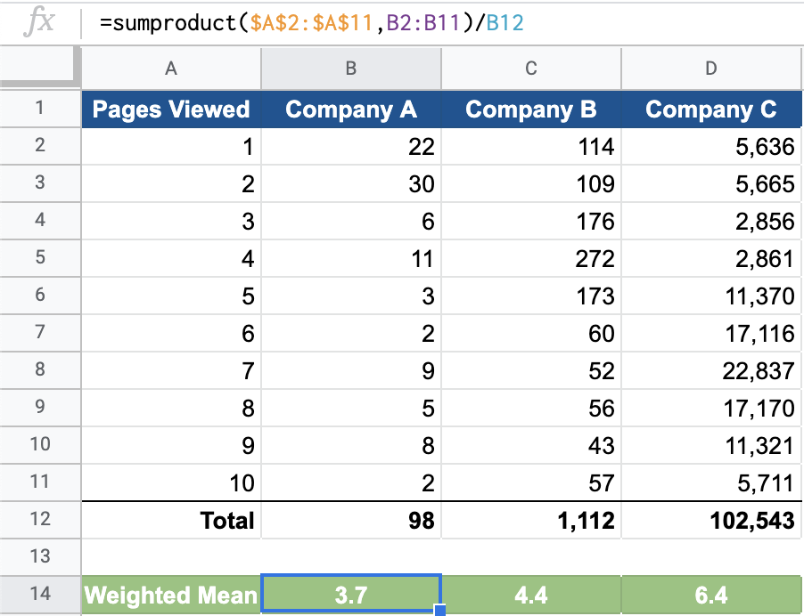
Try it on your own for Company B and Company C or visit the spreadsheet to examine the formulas.
6.2.3 Median
The median is the middle number in a set of ordered data values. Calculate it by simply sorting all values from lowest to highest and finding the middle point. This works if you have an odd number of data points.
Imagine a product team of people with the following annual salaries:
- $40,000, $65,000, $70,000, $85,000, $120,000
There are five data points. Because they are already sorted in order by salary amount, you just go to the middle number to find the median salary value, which is $70,000 in this case.
The product team grows and adds a new junior member with an annual salary of $45,000. What does this do to the median value? Our new data series looks like this:
- $40,000, $45,000, $65,000, $70,000, $85,000, $120,000
There is no longer a standalone middle value because we have an even number of data points. In these situations, you take the average of the two middle points. In our example, the two middle values are $65,000 and $70,000 so the median salary is $67,500, the average of those two values.
Spreadsheet approach
As the size of our dataset grows, it becomes troublesome to visually sort and find the middle value(s). Thankfully, the median is a standard formula in spreadsheet software.
=MEDIAN(range of values)
You can see the median formula applied to our primary dataset here.
Mean vs. median
The median is a more stable summary statistic than the mean, which can fluctuate widely in the presence of extreme data values. Although we’ll discuss outliers later, let’s build on our simple example.
Imagine the company decides to hire a chief product officer (CPO) to oversee all product operations. The annual salary for this position is $275,000, substantially higher than even the highest paid person on the current team.
The salary points for the team now grow to seven:
- $40,000, $45,000, $65,000, $70,000, $85,000, $120,000, $275,000
Look at how the median and mean values have changed along with team hiring.
| Team make-up | Mean | Median |
|---|---|---|
| Original five | $76,000 | $70,000 |
| Six with junior PM | $70,833 | $67,500 |
| Seven with CPO | $100,000 | $70,000 |
The median remained relatively stable while the mean jumped around considerably.
A larger dataset
If we add median values to our CountriesClean dataset, we see some large differences between mean and median values.
The variable gdp_growth has nearly identical values when comparing the mean with the median, and gdp is off by a factor of ten.
A mean value that is substantially larger than a median value might indicate the presence of a few very large values or outliers. When the mean is substantially smaller than the corresponding median, there might be a few very small extreme values. We’ll return to this concept and the implications later.
6.2.4 Mode
The mode is the final central tendency summary measure we’ll look at. It reflects the most commonly occurring value within a set of data points. There are two perspectives to consider.
1. The formal definition
What exact number appears most often?
Let’s return to the number of page views for Company B covered in the weighted mean material. It contained data on 1,112 website visitors. Here are the number of pages viewed by the first 100 visitors:
##   [1]  3  7  5 10  9  4  5 10  1  5  8  5  2  1  4 10  4  4  3  8 10  2  1  8  2
##  [26]  2  5  1  3  4  8  9  2  7  4  5  7  4  3  4  4  5  5  3  4  4  4  5  3 10
##  [51]  4  5  7  4  1  4  4  7 10  3  2  4  3  3  6  5  6  6  7  5  7  1  2  4  5
##  [76]  4  3  1  3  4  4  2  5  7  4  5  8 10 10  4  4  2  3  2  3  4  7  4  5  5
We can find the mode by using the standard function in spreadsheet software.
=MODE(range of data)
There are a few potential cases:
- All the numbers are different: There is no mode, and the function will calculate the no value is available message or #N/A.
- One number appears the most: There is a single mode, and the function calculates it.
- There are two or more numbers that appear the most. There are multiple modes but the function still only calculates one.
In our example, there is a single mode for Company B, and it is 4.
Case 3 poses a problem as the MODE() function is only capable of calculating one mode value even if multiple modes exist. Modern spreadsheet software now adjusts for this with the following function.
=MODE.MULT(range of data)
You can see this in action with the number of children by employee data example. There are only 20 observations to make it easier to eyeball. Two distinct values are calculated when you use the MODE.MULT() function, indicating it is most common for employees to have either 2 or 4 children.
2. The practical value
Distributions are the shape of the underlying dataset from which we have derived central tendency measures including the mean, median, and mode.
You’ll often have so many data points that even if a single mode exists (or no mode exists) there remain other parts of the distribution that are more common than others. This is important information to know.
One way to visualize the distribution of numeric variables is with a histogram. We look more closely at how the chart is made in Visualizing data. For now, just understand that the numeric variable goes from low to high as your eyes move from left to right on the chart. The higher the bars go, the more observations are concentrated around that numeric value.
Single modal
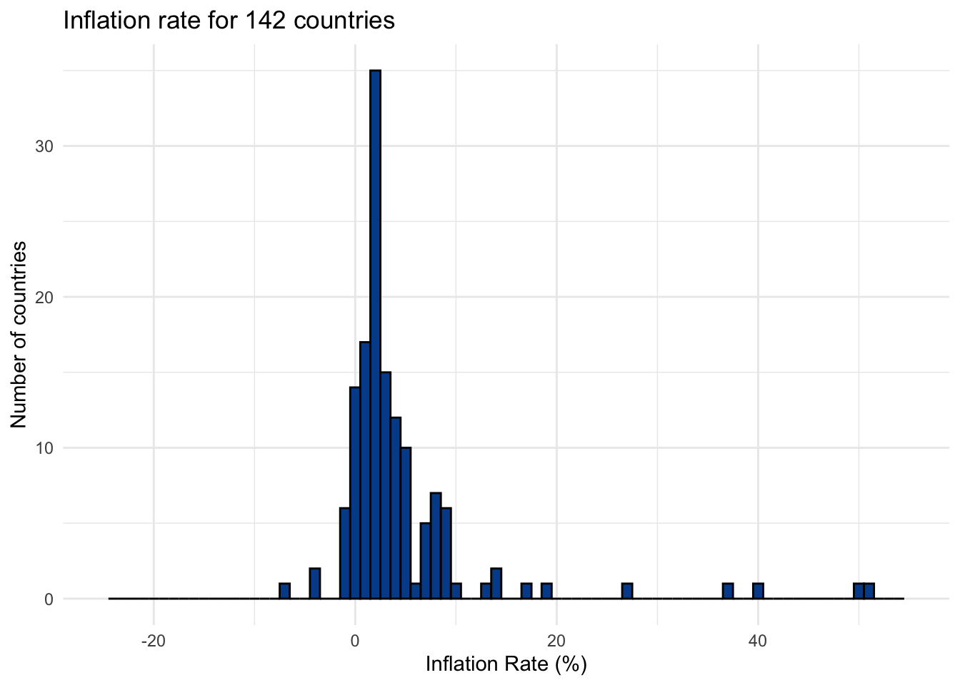
Returning to our primary dataset, here is the inflation rate for the countries in our sample. The areas with the highest bars have the greatest number of countries within those data ranges.
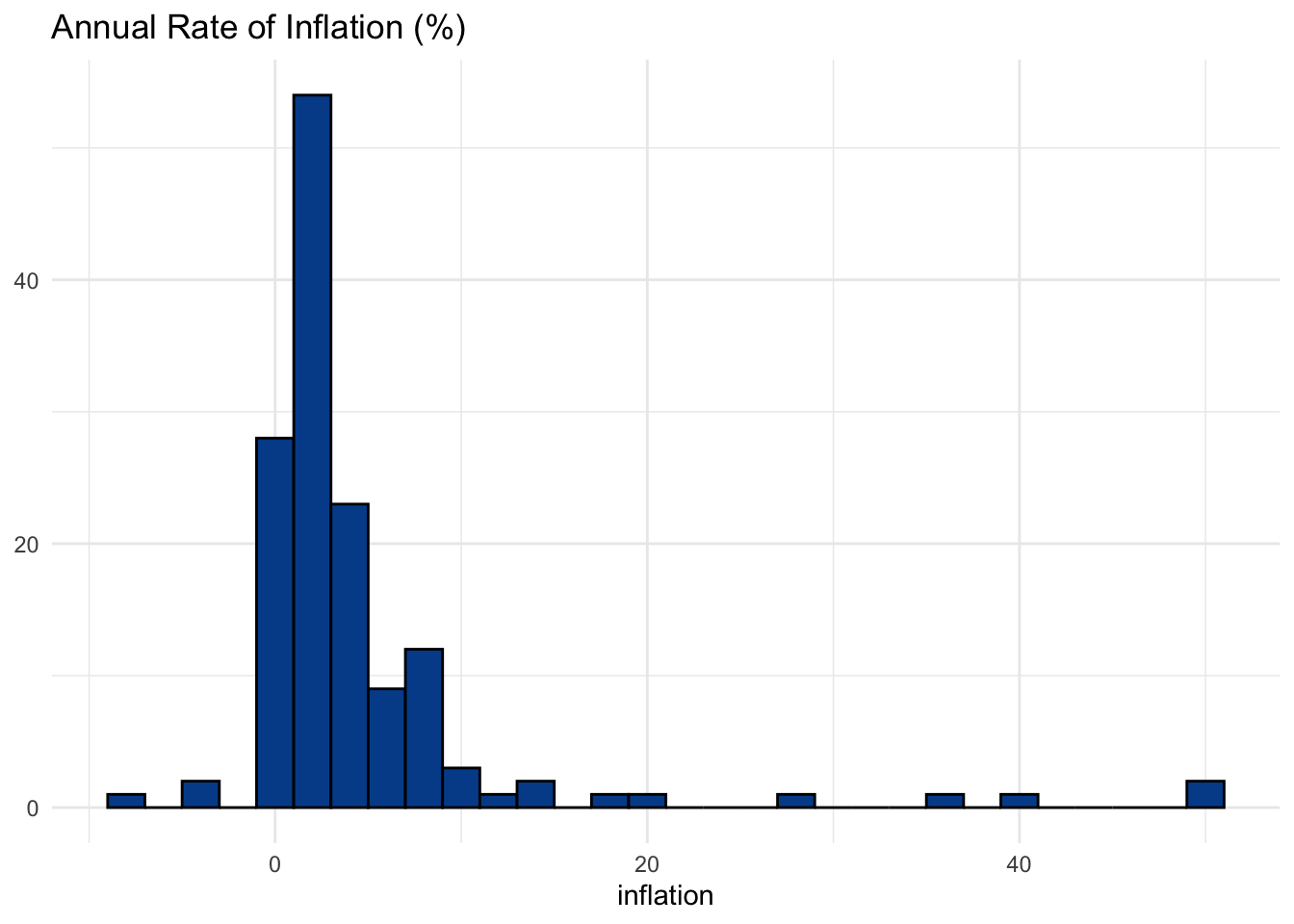
It looks like a decent example of a data series with a single mode. Most countries pop up around the 2-3 percent inflation level. Even if a single number, like 2.3 percent, doesn’t emerge as the most common value, we can still think of this part of the chart as where most countries are in terms of inflation.
Bimodal
Everything isn’t always clear with real-world datasets. But if we look at gdp_growth we see what looks like a bimodal distribution where two areas of the most common values exist.
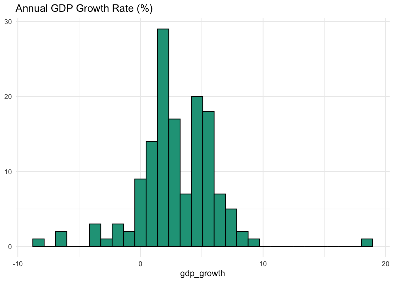
If you have a background in economics, this might make intuitive sense.
The economies of some countries are shrinking (<0% per year) and at least one is growing very fast (> 10%). The first spike in countries occurs around 2-3%. This is the “natural” rate of growth for developed markets. However, in the chart we notice another spike around 6-7%, which is a level at which emerging markets tend to grow.
Multi-modal
As a final example, let’s look at temp_c.
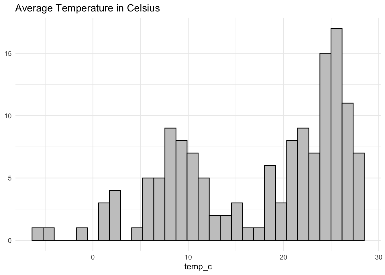
You could argue that this visual shows a multi-modal distribution with clusters around 2 to 3 degrees, 6 to 12 degrees, and 21 to 32 degrees. Even if the technical mode would likely be on the higher end of the spectrum, it seems distinct areas of cold, moderate, and warm climates clearly exist.
Pivoting from central tendency to spread
The mode is a natural point for us to begin considering distribution more closely, which we’ll do as we turn from measuring central tendency to measuring spread.
6.3 Measuring spread
Mean and median measures help us summarize large amounts of data into digestible talking points. They also help enable quick comparisons between different sets.
However, if we only rely on these summary measures, then we risk being misled as similarities in central tendency don’t necessarily mean that the underlying data is remotely similar.
Monthly rainfall example
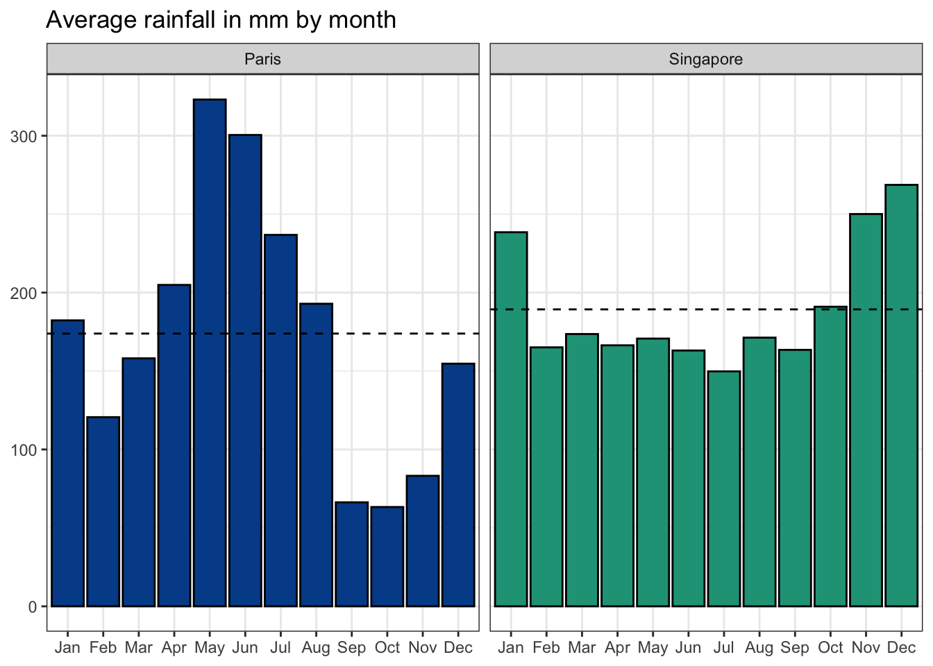
Let’s look at a new dataset that includes monthly weather information from various cities around the world.
We’ll look specifically at rain_mm, the average monthly rainfall in millimeters for Paris and Singapore.
If this was all the information at your disposal, you would likely conclude that rainfall in the two cities is approximately the same. However, the mean and median fail to show how different the distribution of rainfall values is across the year.
Bar chart of rainfall by month
Although the monthly data shows clear seasonality in both cities, it also highlights greater volatility in the French capital.
Histogram of the monthly rainfall values
Another way to look at the distribution is with a histogram. A histogram buckets numeric values into a certain number of ranges or bins. In then shows how many observations fit within each defined range — ignoring the original monthly ordering.
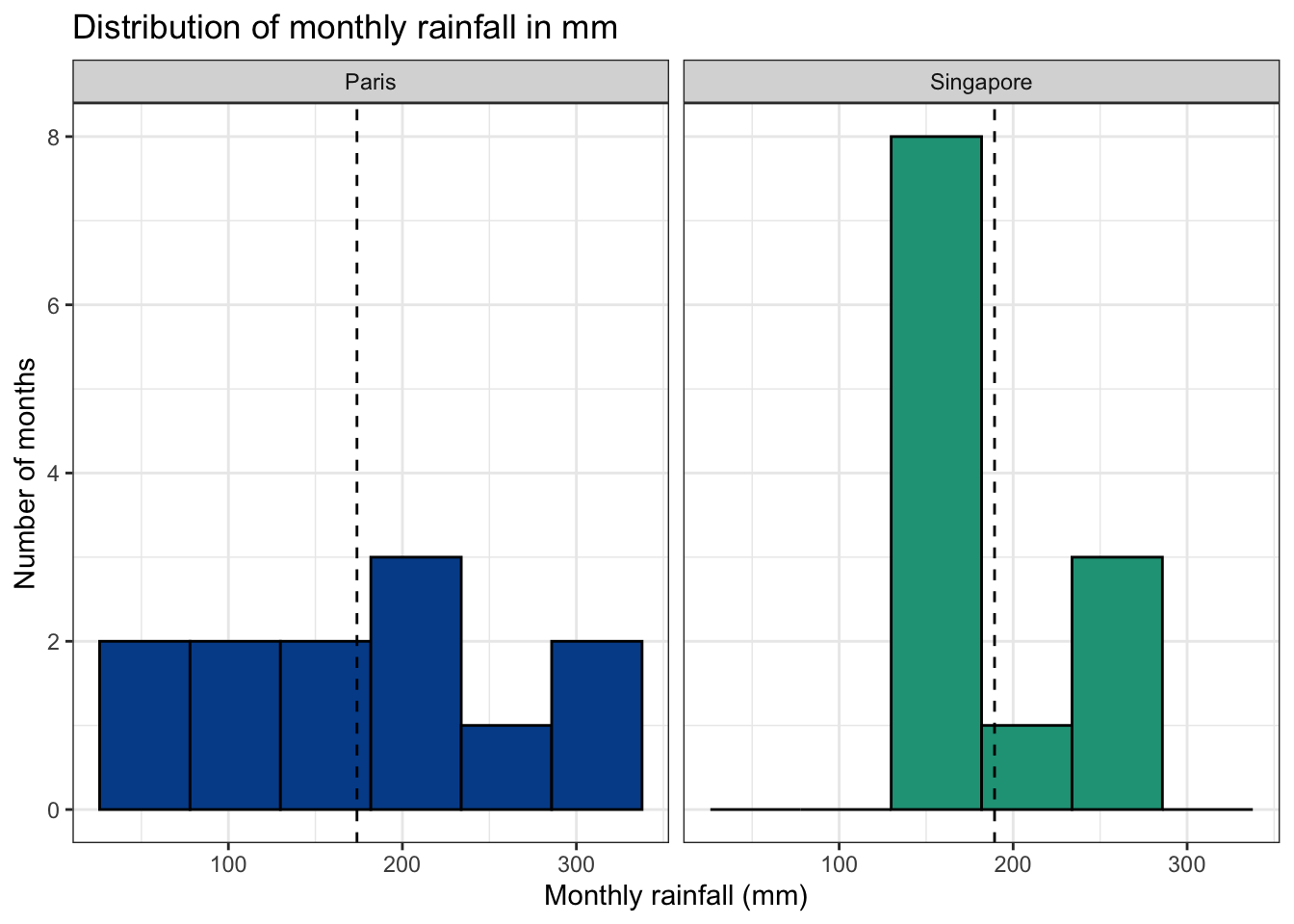
The histogram shows that rainfall values in Singapore tend to fall in a more restricted range when compared with Paris, which has more extreme monthly variation.
Quantifying spread
We’ll now explore several measures of spread to quantify a set of data points beyond basic measures of central tendency.
6.3.1 Range
The range of a data series is simply the maximum value minus the minimum value.
\[\text{Range = maximum value - minimum value}\]
Let’s return to our seven person product team with the following staff salaries: $40,000, $45,000, $65,000, $70,000, $85,000, $120,000, $275,000
Minimum
The minimum is the smallest number in a given dataset. The minimum of the salaries data is $40,000, the lowest salary from within the team.
Maximum
The maximum is the largest number in a given dataset. The maximum of the salaries data is $275,000, the salary for the company’s new chief product officer (CPO).
Range
The range is therefore $235,000 or the distance between the maximum value and the minimum value.
\[\text{Range = 275,000 - 40,000 = 235,000}\]
This statistic reveals nothing about how concentrated observations are across the range, only that at least one value exists at both extremes.
Comparing ranges
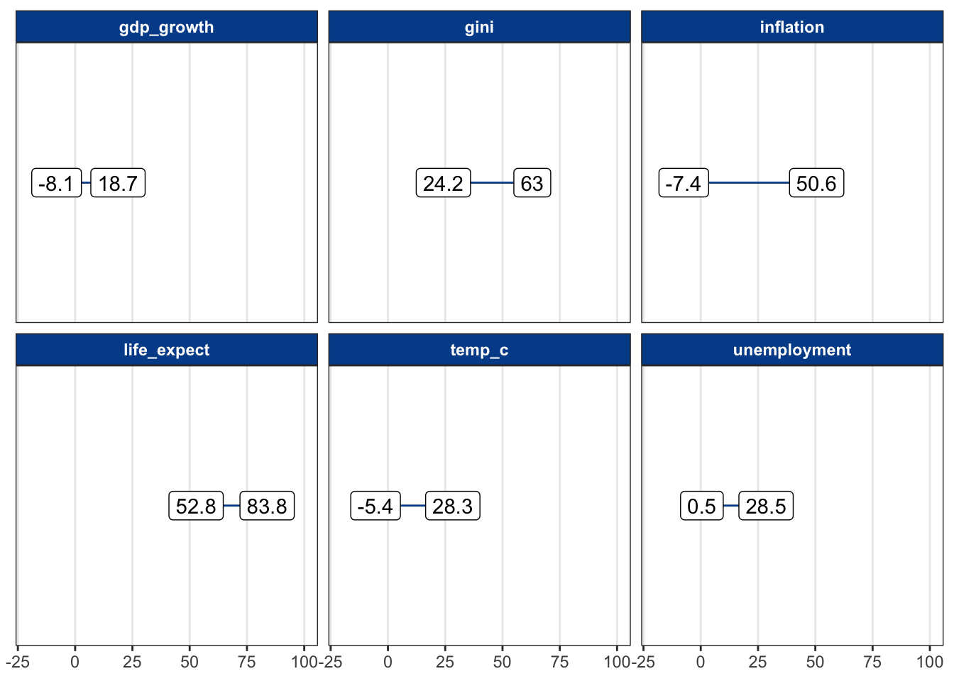
Now we return to the CountriesClean dataset and add these new measures.
Visualizing ranges across variables with different scales isn’t easy. Here, we group a few of the variables with minimum and maximum values that aren’t too different.
We can see, for instance, that GDP growth ranged from negative 8.1 percent to positive 18.7 percent. No country was higher, and no country was lower.
6.3.2 Interquartile range
Although the range reveals the distance between the smallest and biggest values in a data series, it does not shed light on how those values are concentrated along the spectrum.
The interquartile range or IQR returns a range associated with the middle 50 percent of observations.
Quartiles
Quartiles split a data series into four parts of equal sized observations.
Let’s say we have salary data on 10,000 data science professionals. The data is normally distributed — something we’ll define later but means in this case that there are a lot of people earning salaries around mean and median values (which are similar) and fewer people earning at the extremes.
Each of the four regions shown below contains 25 percent of the total observations and have their boundaries set by the 1st, 2nd, and 3rd quartile dividers.
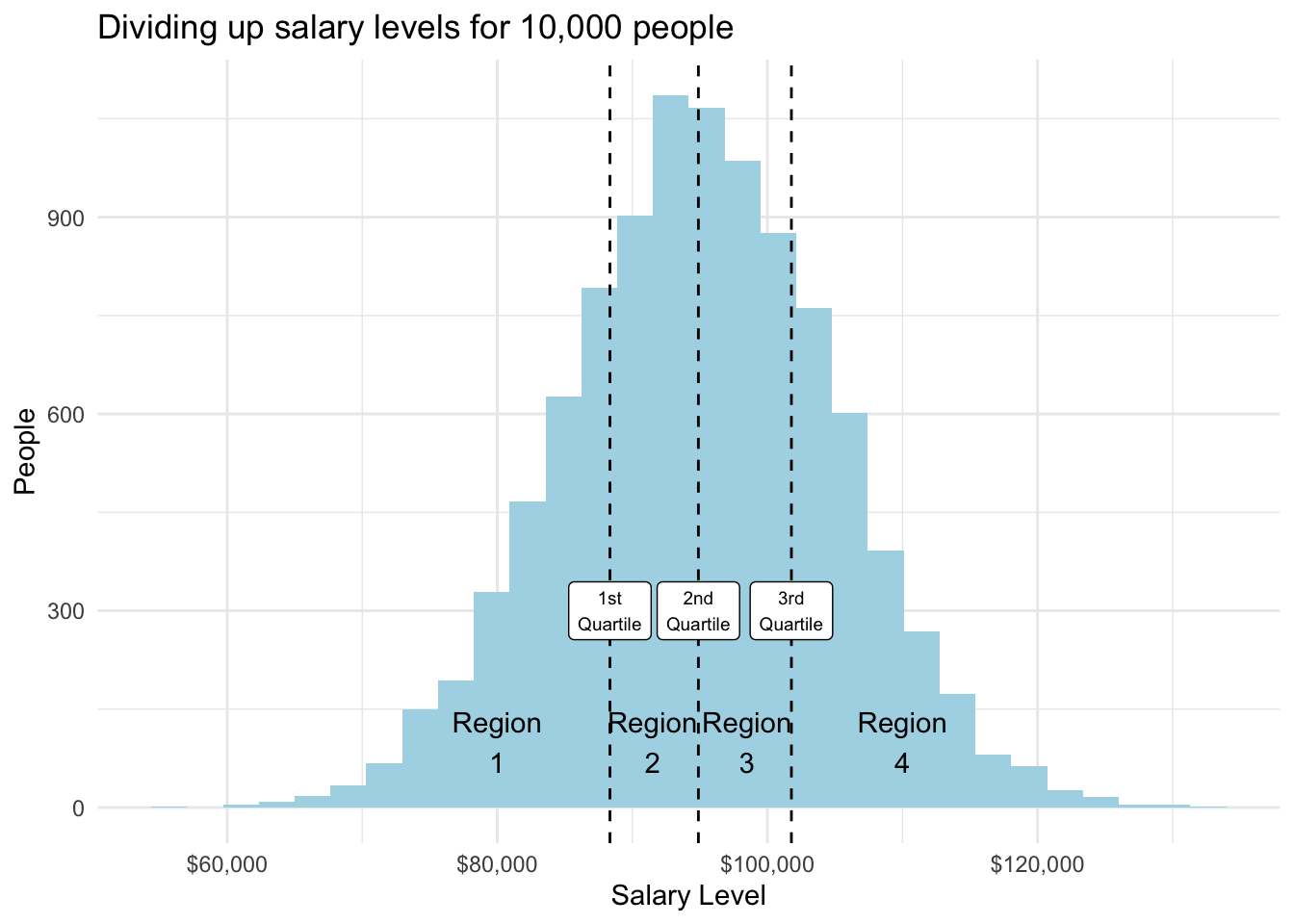
Quartiles are related to the percentile concept that we referenced when studying data types.
| Quartile | Meaning | Percentile equivalent |
|---|---|---|
| 1st quartile | 25% of the data occur at or below this value | 25th percentile |
| 2nd quartile | 50% of the data occur at or below this value (same as the median) | 50th percentile |
| 3rd quartile | 75% of the data occur at or below this value | 75th percentile |
Using real data
The distribution doesn’t have to be normally distributed to use quartiles.
Here is a similar visual from the gini variable in our dataset. The gini coefficient is a measure of income inequality for a given country. Its theoretical values range from 0 to 100 with 0 representing full income equality and 100 representing full income inequality.
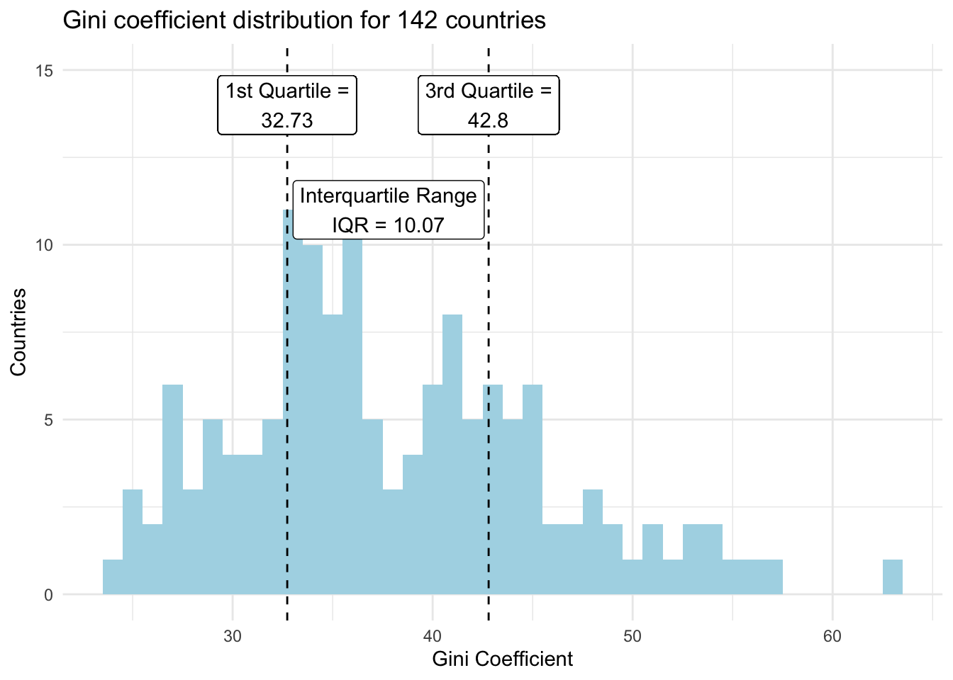
Calculating the IQR
The IQR is simply the distance between the 1st and 3rd quartiles.
\[\text{IQR = 3rd quartile - 1st quartile}\]
From the gini variable.
\[\text{IQR = 42.8 - 32.73 = 10.07 }\]
This means that the middle half of observations from the distribution covered the area from 32.73 to 42.8, an IQR of 10.07. A larger IQR value indicates greater data spread than a lower IQR value, assuming similar data scales.
We could also define and add any percentile values to the chart.
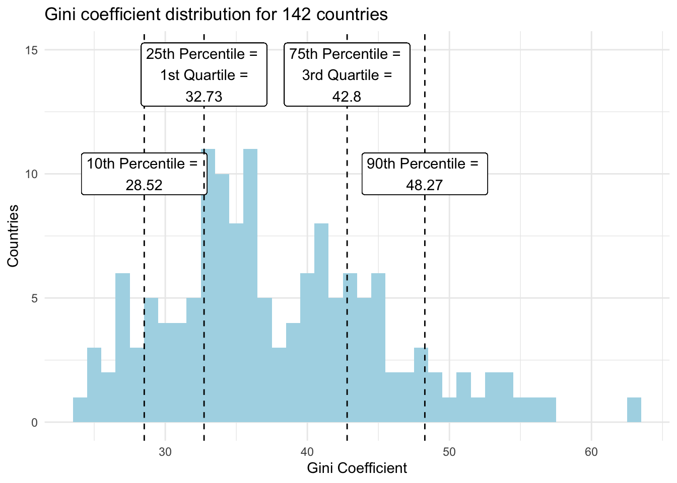
Spreadsheet calculations
Calculating quartiles and percentiles in spreadsheets is easy. You can see it done with our dataset variables here.
=QUARTILE(range of data, quartile number in integer form (e.g., 1 for 1st quartile))
=PERCENTILE(range of data, percentile number in decimal form (e.g., 0.1 for 10th percentile))
6.3.3 Standard deviation
Standard deviation is the most common metric to summarize data spread for numeric variables. It is a standardized measure of how far away, on average, a set of data points approximately fall relative to their mean.
This is usually where new students begin to question learning statistics. So, we’ll start without formulas, instead relying on intuition.
Let’s say you run a department store with the creative name Company A. Each month, 20,000 customers make one or more purchases. The mean revenue per customer is $300 and the full distribution is below.
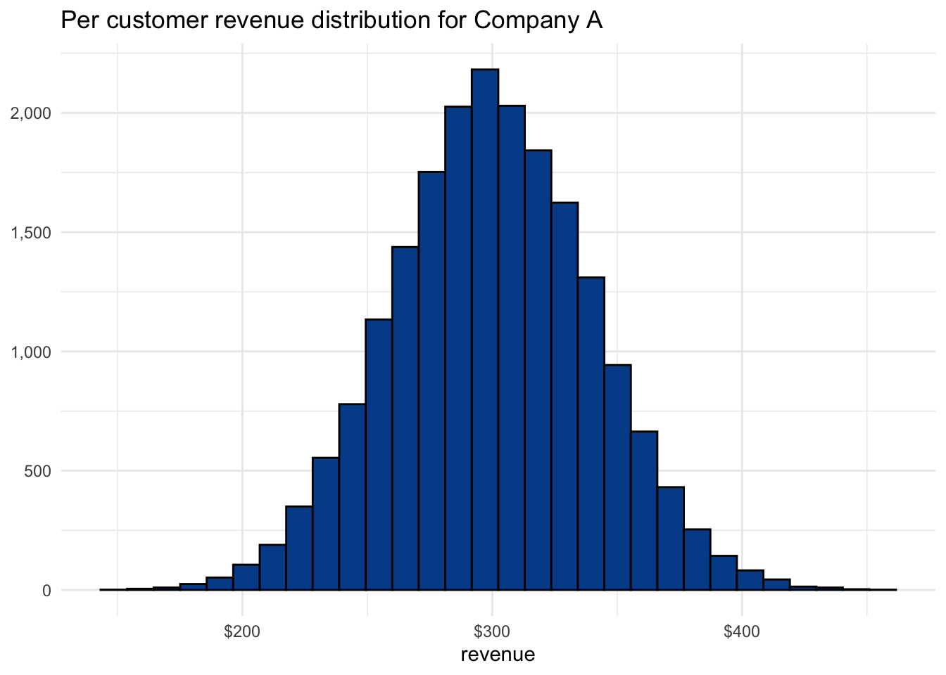
The IQR for Company A is $53.83 with a range of $273.05 to $326.88, representing the middle 50% of the distribution. There is a good chance that the next customer makes a purchase within these boundaries. Based on the current distribution, there is an even greater chance that the next customer brings in between $200 and $400.
What would more spread or less spread look like?
Consider two competing companies, Company B and Company C. Although all three companies have the same market share in terms of customers and total revenue, the way they get there is quite different. The following chart shows the per customer revenue distribution by company.
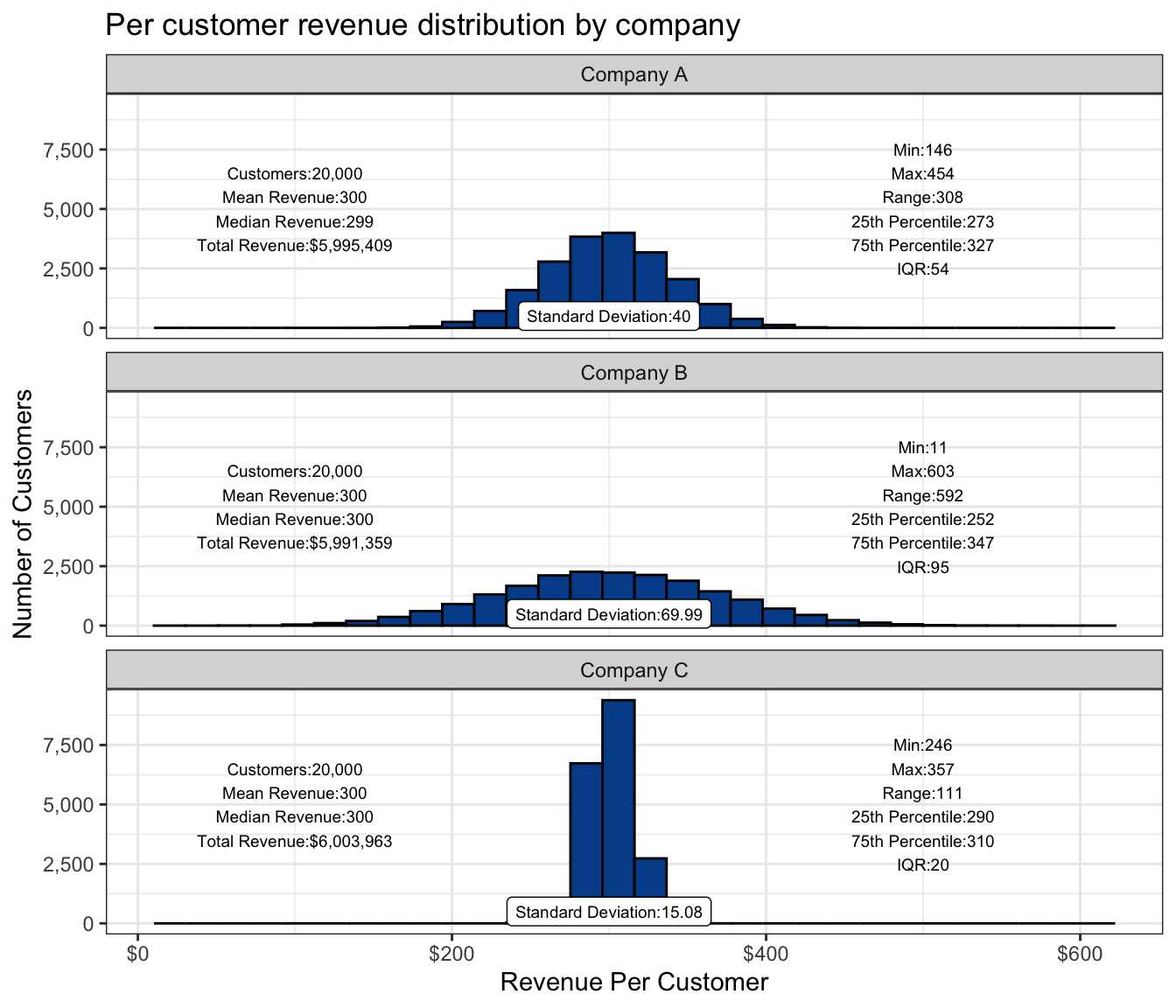
The central tendency summary statistics on the left side of the chart show how similar these companies are. The measure of spread summary statistics on the right side highlights their differences.
Compared with Company A, Company B has more customers who end up spending lower and higher amounts. Spending habits for Company C’s customers tend to occur much closer to the overall mean.
We’ve also added a label that shows the standard deviation.
- Low standard deviation values: Less spread between the data points and their mean.
- High standard deviation values: More spread between the data points and their mean.
Company B has the largest standard deviation value and, as you can see, the most data spread. Company C has the smallest standard deviation and the tightest distribution.
Large standard deviation is an indicator of greater volatility and in many cases greater potential risk.
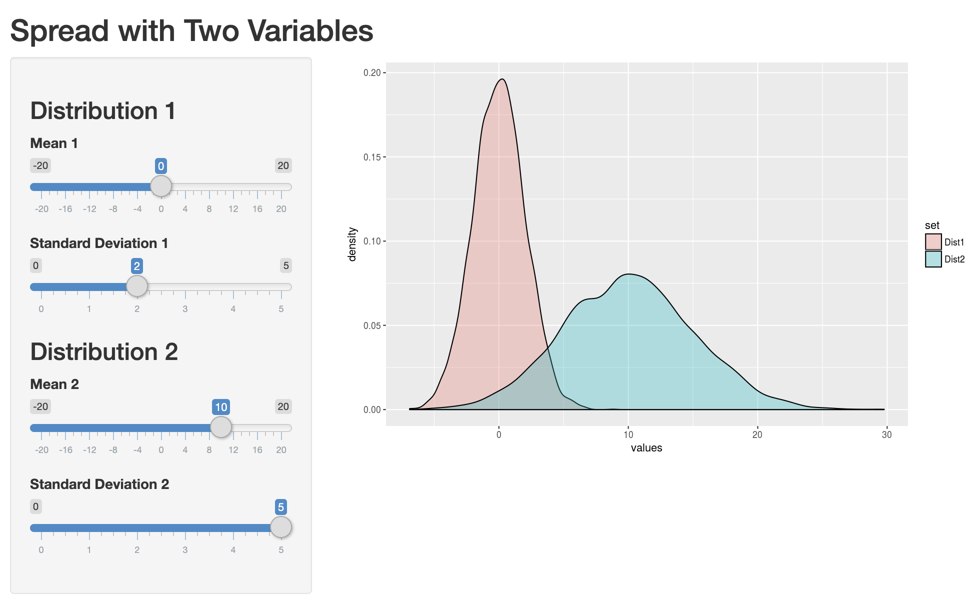
Interactive example
It helps to play around with fake data to see the impact on distributions of varying standard deviation values. You can do so by clicking the image below and adjusting mean and standard deviation values.
Calculating the standard deviation
To calculate the standard deviation:
- Find the mean of the dataset.
- Subtract the mean from each individual data point and then square it to find the squared differences.
- Find the average of the squared differences to find the variance.
- Take the square root of the variance to find the standard deviation.
Or… just use the following functions.
VAR(range of values)
STDEV(range of values)
You can see both the full calculation and the defined function approach in our spreadsheet.
Sample vs. population standard deviation
In the full calculation tab, you’ll notice slightly different values for the sample standard deviation when compared with the population standard deviation.
Samples by definition have more uncertainty because they are a subset of the overall population. So, we adjust the variance calculation to incorporate the sample size, penalizing estimates from smaller samples and ultimately increasing the standard deviation somewhat.
The default functions in Google Sheets and Excel use the sample variance approach, but either can be specified explicitly through =STDEV.P() or =STDEV.S().
Implications
We now have several approaches to quantify data spread. Before we move on, we’ll take a look at some implications and uses of standard deviation, specifically.
6.3.4 68-95-99.7 rule
An extension of standard deviation is the 68-95-99.7 rule. The power of the rule is that when armed with only the mean and standard deviation of a dataset, you can still have a decent sense of the underlying distribution. The rule states that if a dataset is normally distributed:
- 68 percent of observations will be within one standard deviation from the mean
- 95 percent of observations will be within two standard deviations from the mean
- 99.7 percent of observations will be within three standard deviations from the mean
Recall that standard deviation is just a measure of spread that can be calculated in spreadsheets with the =STDEV() function. Although the assumption of a normal distribution is something we haven’t yet covered, we can still look at some examples.
Heights with a normal distribution
We have a dataset that contains height in inches for 1,000 men from the United States. The mean is 70.03 inches, and the standard deviation is 1.98 inches.
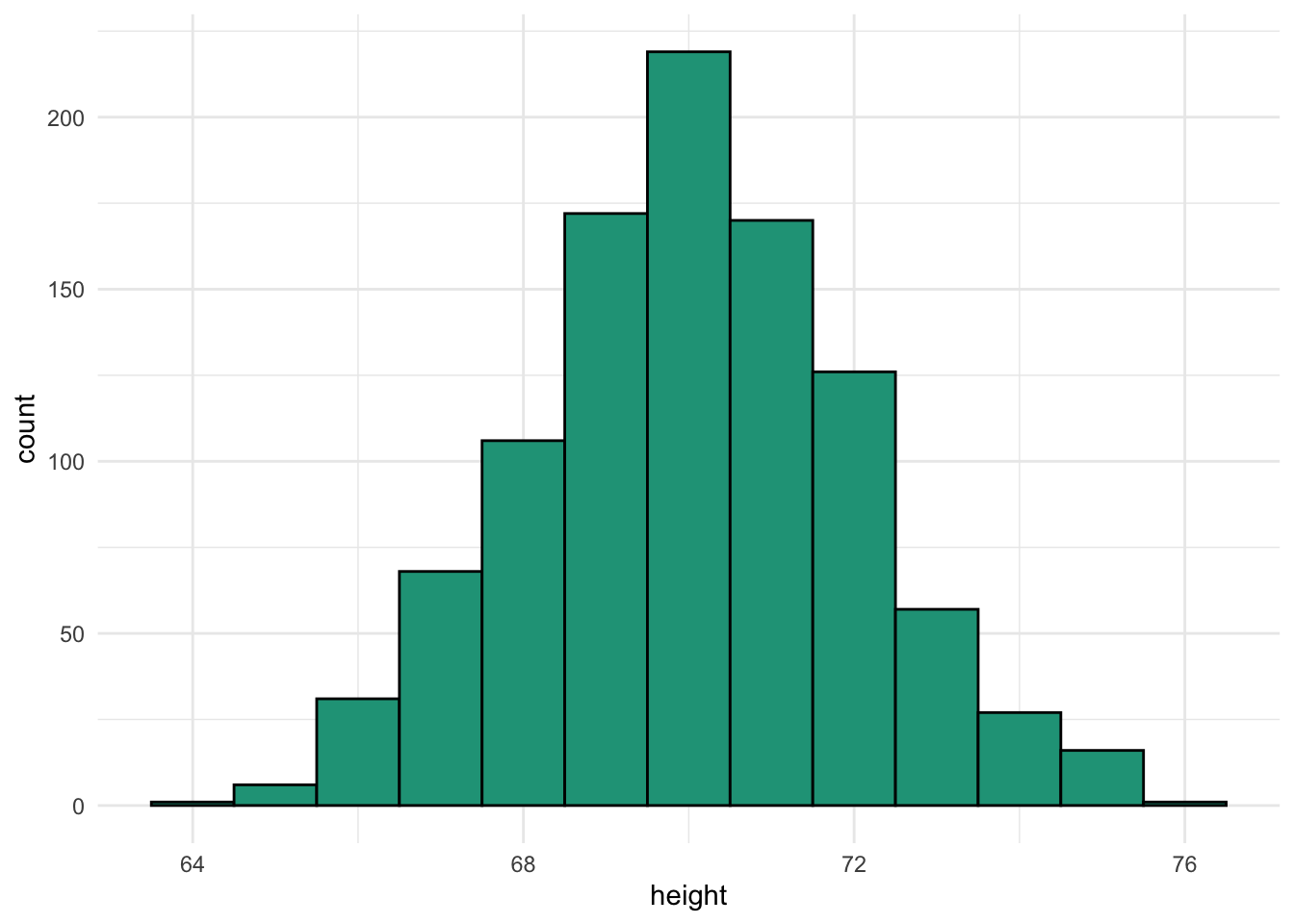
Later, we’ll look at approaches to verify that this distribution is normal. For now, just look at the visual characteristics.
- Most observations occur in the middle of the range.
- The shape doesn’t appear to lean too much to the left or the right.
- There are only a few observations at the extreme ends or tails of the distribution.
The height data meets these criteria so we can check it against the rule.
- 68 percent of observations will be within one standard deviation from the mean
- From 68.05 (70.03 inches - 1.98 inches) to 72.02 (70.03 inches + 1.98 inches)
- 95 percent of observations will be within two standard deviations from the mean
- From 66.07 (70.03 inches - 1.98 inches x 2) to 74.00 (70.03 inches + 1.98 inches x 2)
- 99.7 percent of observations will be within three standard deviations from the mean
- From 64.08 (70.03 inches - 1.98 inches x 3) to 75.98 (70.03 inches + 1.98 inches x 3)
Comparing these expected ranges with the full distribution, we see that it works very well.
Approximately normal data
In our countries dataset, we have several numeric variables. Some of them are more normal than others in terms of distribution. The variable gini is relatively normal.
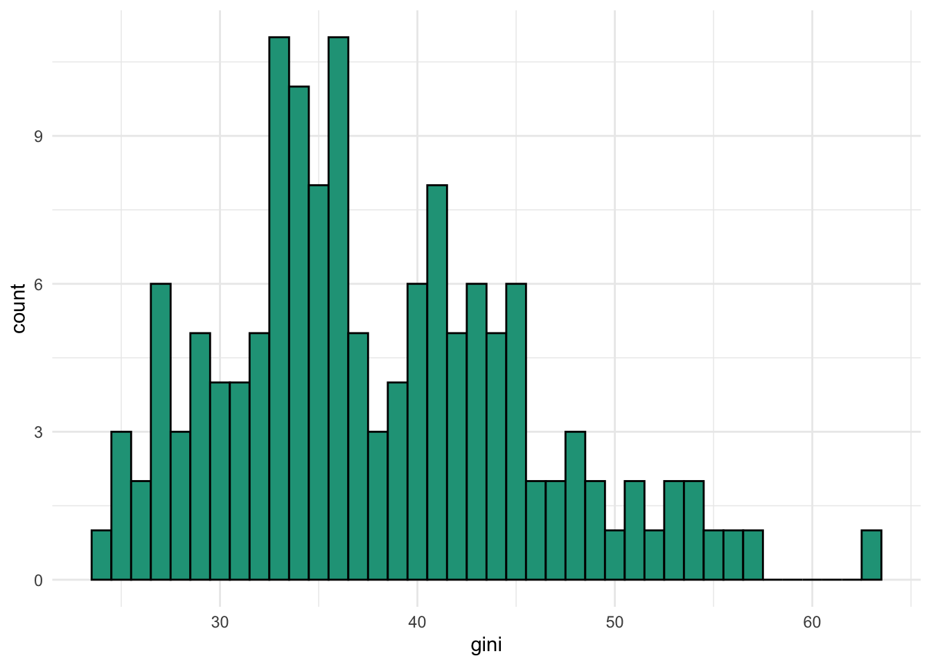
It is somewhat right skewed and there is some evidence of bimodality so don’t expect the 68-95-99.7 rule to hold up perfectly.
Even though gini is not a perfectly normally distribution, the rule still worked fairly well in this case as the difference between expected and observed are within a few percentage points.
The rule does not work with non-normal data
Now let’s take a look at the gdp variable from our dataset.
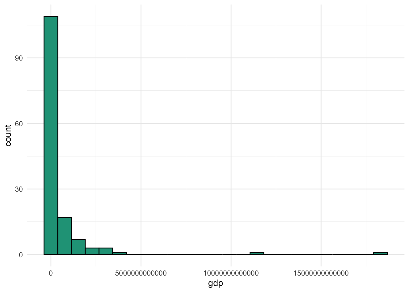
We have a lot of countries with smaller economies, a few with huge economies, and another handful in the middle. Let’s apply the 68-95-99.7 rule even though it clearly is not normally distributed.
Look how far off the 68 percent and 95 percent expected ranges are compared with the observed values. Another oddity due to the distribution and the large standard deviation is that our lower values are technically impossible. You can’t produce a negative amount of goods and services in a given year.
The takeaway is that the 68-95-99.7 rule does not hold up well with a non-normal data series.
Do the math
Finding the expected ranges and observed comparisons requires a bit of work. You can find the calculation for both gini and gdp here.
6.4 Outliers
6.4.1 Detection
Some numeric summary measures are more sensitive than others to the presence of extreme values or outliers in a data series. Such values can easily distort the mean, minimum, maximum, range, and standard deviation due to the nature of their calculations.
We’ll use the inflation variable in the countries dataset as an illustration. The annual inflation rate for a country is a measure of how much average prices have risen or fallen from the previous year. Below is what the distribution looks like.
You can see that most inflation values are concentrated in the single digit range with a few dropping below zero and a handful creeping up the scale.
But which ones are outliers? We generally worry about outliers because of their ability to distort some underlying summary statistics that may confuse reporting or impact applied prediction models.
Either way, we need a methodology to formally declare specific values as outliers. We’ll cover two common approaches.
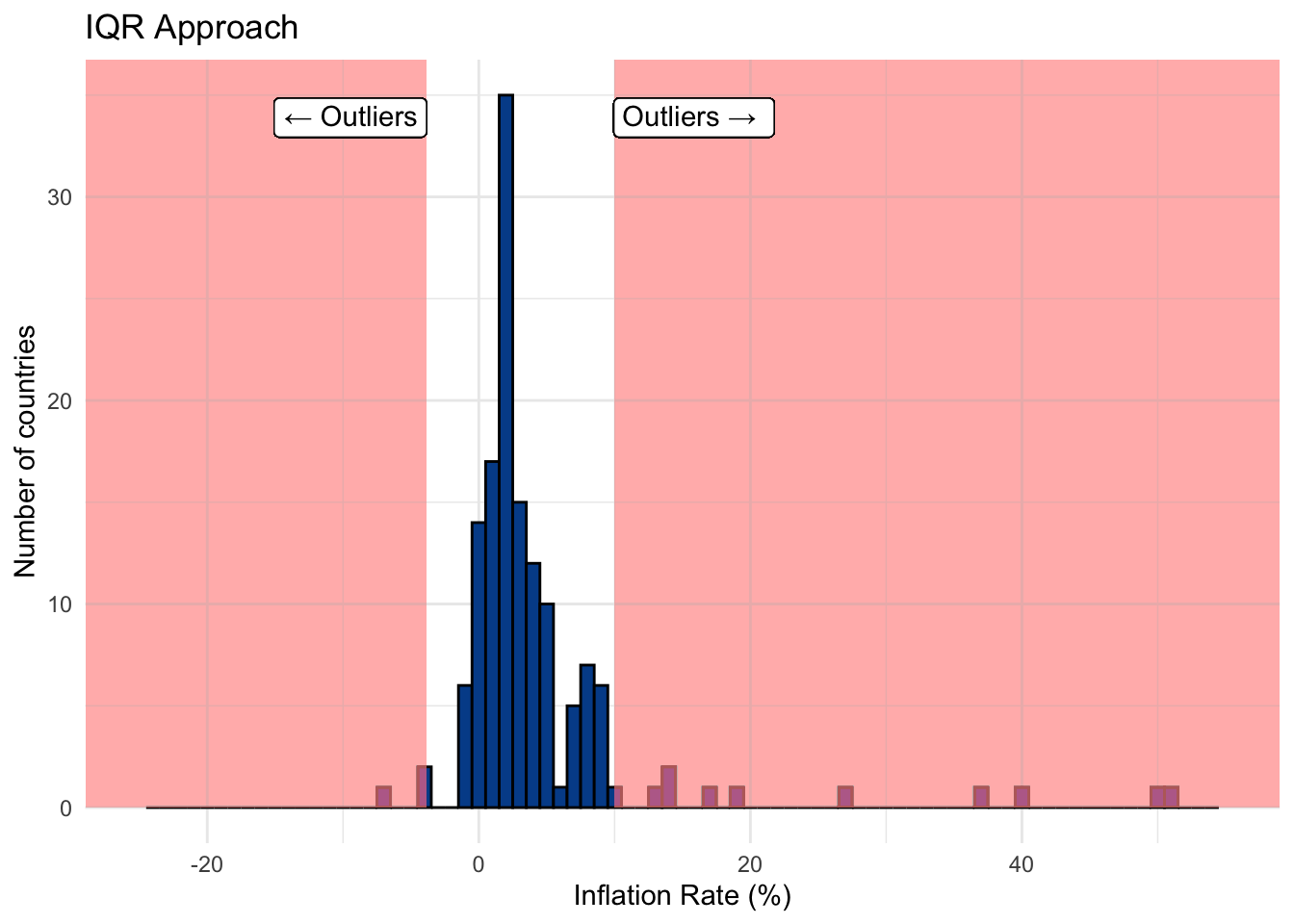
Approach 1: Using the IQR
We mentioned that the IQR is a robust estimate in the sense that extreme observations tend not to impact it too much, especially when there is a large number of observations.
Calculation steps
- Create a lower bound for which any value that falls below will be tagged as an outlier.
\[\text{Lower bound = 25th percentile - (1.5 * IQR)}\]
- Create an
upper boundfor which any value that fallsabovewill be tagged as an outlier.
\[\text{Upper bound = 75th percentile + (1.5 * IQR)}\]
Essentially, this approach says that values far removed from the IQR are outliers. We can use the lower and upper bounds to create decision boundaries shown on the chart below with values in the shared portion of the histogram tagged as outliers.

Approach 2: Using the standard deviation
Using the standard deviation is an alternate approach that requires fewer steps. It works well if the distribution is approximately normal.
Calculation steps
- Create a lower bound for which any value that falls below three standard deviations from the mean will be tagged an outlier.
\[\text{Lower bound = (3 * standard deviation) * -1}\]
- Create an upper bound for which any value that falls above three standard deviations from the mean will be tagged an outlier.
\[\text{Upper bound = 3 * standard deviation}\]
This approach relates to the 68-95-99.7 rule, which says we expect 99.7 percent of observations to fall within three standard deviations of the mean. In this case, outliers exist beyond that threshold.
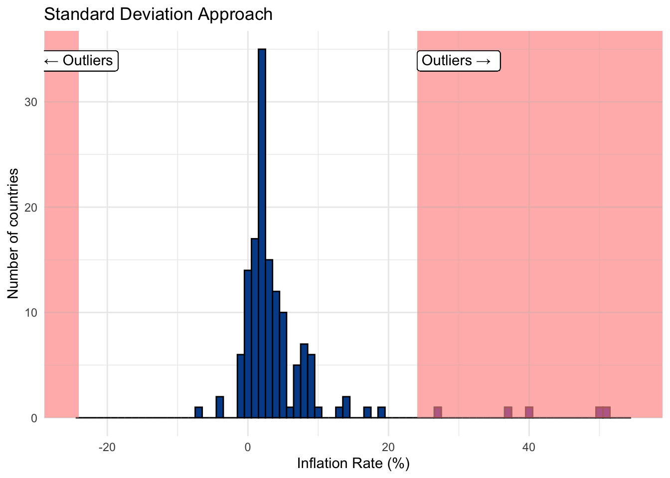
Examining the outliers
We compare the two approaches and observe that the standard deviation approach yields significantly fewer outliers with our inflation data. The table below shows countries with inflation outliers from either approach. It uses binary notation where 1 indicates that the inflation value was tagged as an outlier and 0 indicates it was not.
The IQR approach identified 13 outliers compared with just 5 from the standard deviation method. You can follow along with the calculations in our example spreadsheet.
Next steps
Once outliers have been identified, there are more decisions to make. We’ll cover these next.
6.4.2 Impact
Let’s say we were content with the 13 outliers labeled through the IQR approach — the observations located in the shared area of the chart below.
Robust vs. non-robust statistics
Recall that one of the primary issues with outliers is that they have undue influence on some frequently used summary statistics. We can separate everything we have learned so far into:
Robust summary statistics
Measures that are less influenced by the presence of extreme values or outliers.
- Median
- 25th percentile or 1st quartile
- 75th percentile or 3rd quartile
- Interquartile Range (IQR)
Non-robust summary statistics
Measures that are more influenced by the presence of extreme values or outliers.
- Minimum
- Maximum
- Range
- Mean
- Standard deviation
The difference is made clear when we look at the summary statistics for inflation with (1) all the original values and (2) the values with the outliers removed.
Notice how large the percentage deviations are for the non-robust statistics when compared with their robust counterparts. This is why outliers can have such a significant impact on summary reporting and modeling.
What should I do with outliers?
Once you’ve identified outliers within your dataset, there are several potential decisions you could make, each having a different set of consequences. The choice you ultimately make might come down to a starting question. Do you believe that the outlier is the correct value or is it a mistake?
Error detection
Sometimes outlier detection is a method of catching errors in the data. For instance, a data set filled with percentages in the formats 0.66, 0.42, and 0.59 might also have one value of 74.00. Is it more likely that the correct value is indeed 7,400 percent or was it a data collection issue that should have stored it as 0.74?
Here the solution might be as simple as dividing any number above 1 by 100 to put it into percentage form. These decisions require a combination of exploratory analysis and business context. The larger the dataset, in terms of both records and variables, the more challenging this becomes.
If there isn’t a clear fix, say the percentage column in question had one value that was 19864726 or said cat instead of a numeric value, there are other options to consider.
Removal
You can choose to remove the value itself (e.g., the cell) or the entire observation (e.g., the row) if you don’t trust any of the values associated with the record.
If you only remove the value, you must decide to leave it blank, something data people call missing, or put something in its place.
Imputation
If you don’t think removing the entire observation makes sense because the other values look valid, and you don’t want to leave the specific value blank, then you can replace it with an imputed value.
One reason to use imputed values is that there are analytical models and approaches that won’t work when missing values are present.
An imputed value is just some logical method for filling it in. For instance, replacing the questionable value with a summary statistic from the remaining values (e.g., mean, median, 46th percentile, etc.).
This decision helps settle the summary statistics and avoids algorithm errors when running more advanced models.
Leave them in
Is it usually better to leave outliers in the dataset if you believe them to be accurate? These edge cases, if real, are both interesting and part of the observed data.
This is the case for our inflation variable. Sometimes countries have deflation — negative inflation values — and sometimes they experience hyperinflation — rapid increases in average prices.
If you choose to let the accurate outliers remain in the dataset, just remember they are there and lean more heavily on robust summary statistics where you can.
6.5 Missing data
So far we’ve focused on a very clean dataset with information on 142 countries and 14 differentiating variables, from which there is a valid value associated with each record.
In the real world, data isn’t often so clean or complete. In fact, the dataset we’ve been using is a subset of this messier table that we’ll call CountriesAll.
You should notice a few things:
- The variable column names are exactly the same.
- There are now 216 countries, 74 more than the clean version.
- Several cells across the table have missing values as seen by blank cells.
There are two key questions to ask regarding missing data.
Do I have missing data?
You can use the following formulas in Microsoft Excel and Google Sheets to determine the amount of missing data.
=COUNTA(range of data): Counts non-blank cells or valid data points within a range.=COUNTBLANK(range of data): Counts blank cells or missing data points within a range.
To find the percent of missing data for each variable simply divide the number of missing data points by the total number of rows or expected observations.
The table is sorted to highlight the variables with the most missing data. The variables gini, unemployment, and college_share are the ones with the greatest proportion of missing values.
What should I do about missing data?
Let’s take the unemployment rate as an example. We start by identifying which countries have the most missing unemployment data to see if any patterns or justifications emerge.
##  [1] "Aruba"                     "Andorra"
##  [3] "American Samoa"            "Antigua and Barbuda"
##  [5] "Bermuda"                   "Curacao"
##  [7] "Cayman Islands"            "Dominica"
##  [9] "Faroe Islands"             "Micronesia, Fed. Sts."
## [11] "Gibraltar"                 "Grenada"
## [13] "Greenland"                 "Isle of Man"
## [15] "Kiribati"                  "St. Kitts and Nevis"
## [17] "Liechtenstein"             "St. Martin (French part)"
## [19] "Monaco"                    "Marshall Islands"
## [21] "Northern Mariana Islands"  "Nauru"
## [23] "Palau"                     "San Marino"
## [25] "Sint Maarten (Dutch part)" "Seychelles"
## [27] "Turks and Caicos Islands"  "Tuvalu"
## [29] "British Virgin Islands"    "Kosovo"
It appears that many of the countries without unemployment data are relatively small island nations. Perhaps they don’t formally report labor market data to the large intergovernmental organizations. Or perhaps their employment metrics don’t follow the required guidelines to be included.
Regardless of the reason, what can you do?
1. Try to find the missing data points
Even if the dataset you have is missing certain values, it is possible that you could find the real data elsewhere. For example, you could search for unemployment rate estimates by looking at alternative sources such as the IMF instead of the World Bank or visiting national government websites directly.
2. Decide to leave the missing values as they are
There is no rule that says you need to do anything about the missing values once you identify them.
For most spreadsheet tasks, such as calculating descriptive statistics, missing data won’t slow you down as the pre-defined functions automatically control for the missing values.
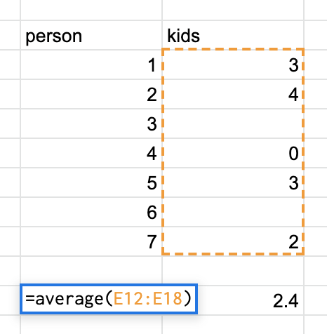
For instance, Google Sheets knows that there are two missing records in the image above. So, when it calculates the mean, it divides the sum of the known values (12) by the number of valid observations (5) to find the accurate result of 2.4. If it didn’t ignore the missing observations it would have calculated the mean as 1.7 (12/7).
Missing values can become more of a problem as you progress into advanced techniques. Although this is especially true in machine learning applications, it would also impact something as simple as scoring observations based on their values. In the latter case, a missing value would likely give an observation the lowest potential value for that component. But is it fair for a missing data point to be penalized? How do we know that Aruba doesn’t have a very low (e.g., good) unemployment rate?
3. Remove observations with missing values
You may decide that missing values are just too much of a headache, especially if there is a high level of missing data across all variables of interest. If that is the case, and you feel that you have a sufficient amount of complete data, you can choose to filter out observations with one or more missing values.
Such action doesn’t make sense in our example because only a few of the variables have substantial levels of missing data. The variable gini has 52 missing records, but we don’t want to remove all the associated countries only to throw away good data at its expense.
4. Impute the missing values with estimates
Similar to what we discussed in the outliers section, you can also replace missing data with imputed values. An imputed value for missing data is a best-guess method or algorithm for filling in the blank.
A good place to start is the summary statistics for the known values, in this case unemployment.
##    Min. 1st Qu.  Median    Mean 3rd Qu.    Max.    NA's
##   0.100   3.425   5.400   7.042   9.550  28.500      30
We see the 30 missing values that we want to replace. Your decision on what to replace or impute them with can be crude (e.g., all missing values will be replaced with the average) or complex (e.g., use regional median values that are further adjusted for population size).
Let’s keep it simple but use the median instead of the mean as we know it is the more robust estimate.
After swapping in the median value of r med_ue for the 30 missing records we return to the summary statistics for unemployment.
##    Min. 1st Qu.  Median    Mean 3rd Qu.    Max.
##   0.100   3.800   5.400   6.814   8.800  28.500
There is now valid, numeric unemployment data for each country. Some of our updated summary statistics change slightly when the imputed data is included. This isn’t surprising considering that 14% percent of the data series was adjusted in this case.
If you want or need a complete dataset with no missing records, you can follow the same process for all variables that contain missing values.