9 Tracking change
As soon as you communicate a finding, it won’t be long before someone asks, “How has this changed?” This section starts with ways to measure change over time and ends with techniques for forecasting the future based on historic data.
We will primarily focus on a time series version of the countries dataset.
9.1 Percentage change
The percentage change between two data points is the most common way to express growth, stagnation, or decline. Surprisingly, it is still not known by all working professionals.
\[\text{Percentage change = }\frac{\text{new value - old value}}{\text{old value}}\]
The top of the formula is the absolute change, the distance in original units between the new and old observations. Although this by itself is a useful summary point, it can be difficult to compare with other metrics that have different scales (e.g., revenue in millions and number of customers in thousands).
To calculate the percentage change you take the absolute change (new value - old value) and then divide it by the original value. This results in a standardized percentage of growth* if the result is positive or a percentage of decline if it is negative. The percentage change is also referred to as relative change.
Percentage growth
Let’s say you launched a new product at the beginning of the year. If its revenue grew from $200,000 in Q1 to $350,000 in Q2 you would determine its percentage growth with the following steps:
\[\frac{\text{350,000 - 200,000}}{\text{200,000}}=\frac{\text{150,000}}{\text{200,000}}= \text{0.75 or 75%}\]
Revenue grew 75 percent from Q1 to Q2, an encouraging start for the new product.
Percentage decline
In contrast, if a product nearing the end of its life cycle earned revenues of $175,000 in Q1 and only $150,000 in Q2, then we can find the rate at which it declined.
\[\frac{\text{150,000 - 175,000}}{\text{200,000}}=\frac{\text{-25,000}}{\text{175,000}}= \text{-0.1429 or -14.3%}\]
Although the percentage change formula is generally used to calculate change between time periods, it really just calculates a standardized distance between any two points.
Tracking change over multiple periods
We are often interested in seeing how one or more variables change over long-ter, horizons. Let’s use the population for Japan from 1991 to 2018 as an example to visualize:
- Actual values: The total population by year in a line chart.
- Absolute change: The year-over-year change in total population in a column chart.
- Percentage change: The year-over-year percentage change in total population in another column chart.
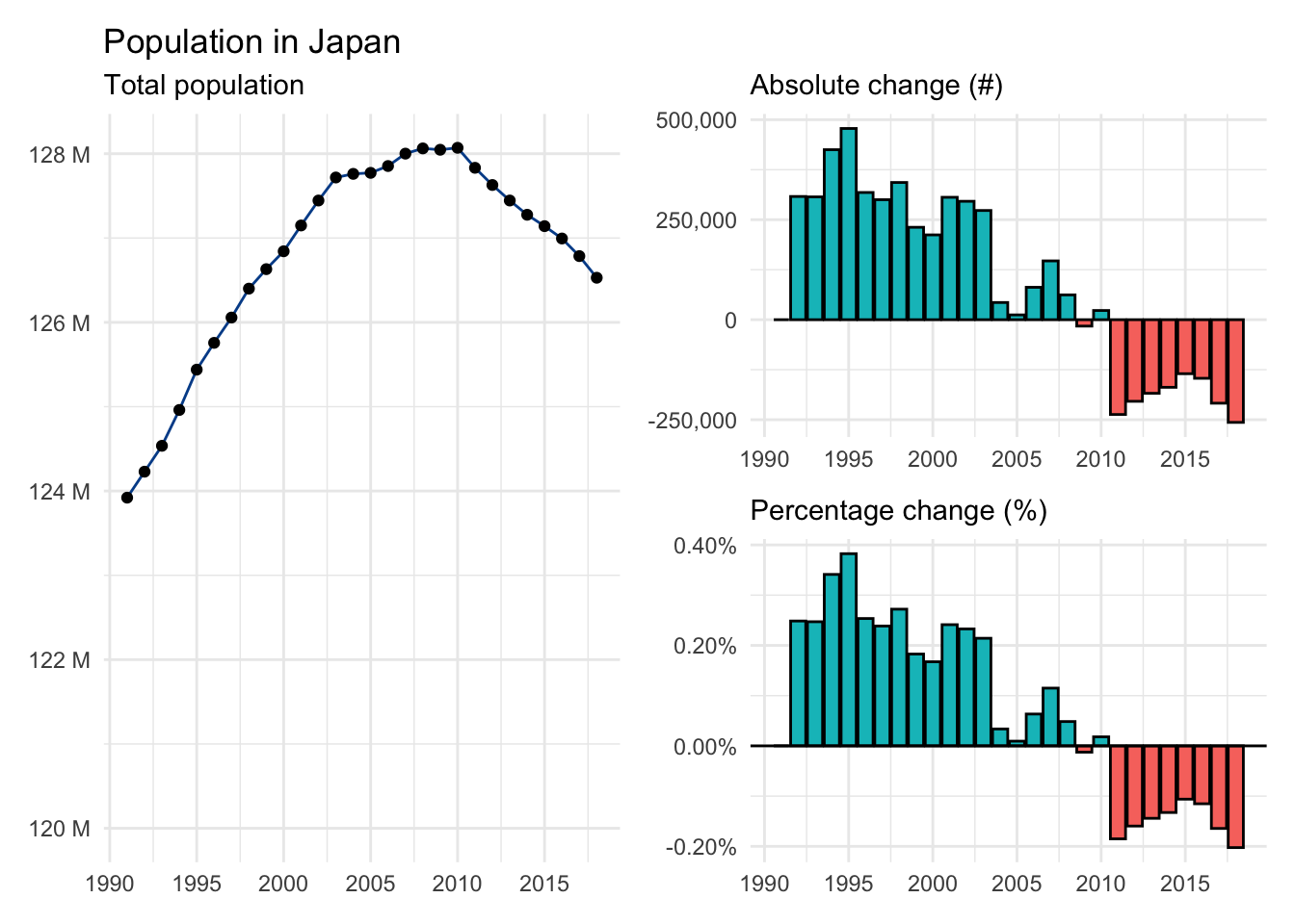
Although population will always be a positive number, the absolute and percentage changes can take both positive and negative values. We see that Japan’s population was increasing around 0.25% for much of the 1990s before slowing in the 2000s and eventually becoming negative for most of the 2010s.
We also see that a relatively small percentage change applied to a large number such as total population can be meaningful as Japan’s apparently modest population rate decline is translating into nearly a quarter of a million fewer people each year.
9.2 Average growth
Another important aspect of time series analysis is summarizing growth or decline over multiple periods. We’ll look at two distinct approaches.
Average annual growth rate
The more common technique for this task is to calculate the average annual growth rate, sometimes abbreviated AAGR. The average annual growth rate (AAGR) represents the mean of all observed percentage changes during a given period. Although the name includes annual, the formula will work for any time period (e.g., quarter, month, week, etc.).
\[\text{AAGR = }\frac{\text{sum of all growth rates}}{\text{number of growth rates}}\]
The AAGR is a simple average that incorporates all known growth rates. As such, its value can be distorted by periods that experienced unusually large growth or decline.
Let’s use gdp from Zimbabwe as an example. Here is a visual summary with available data from 1991 to 2018. Notice the periods of significant economic distress in the 2000s and the subsequent rebound during the 2010s.
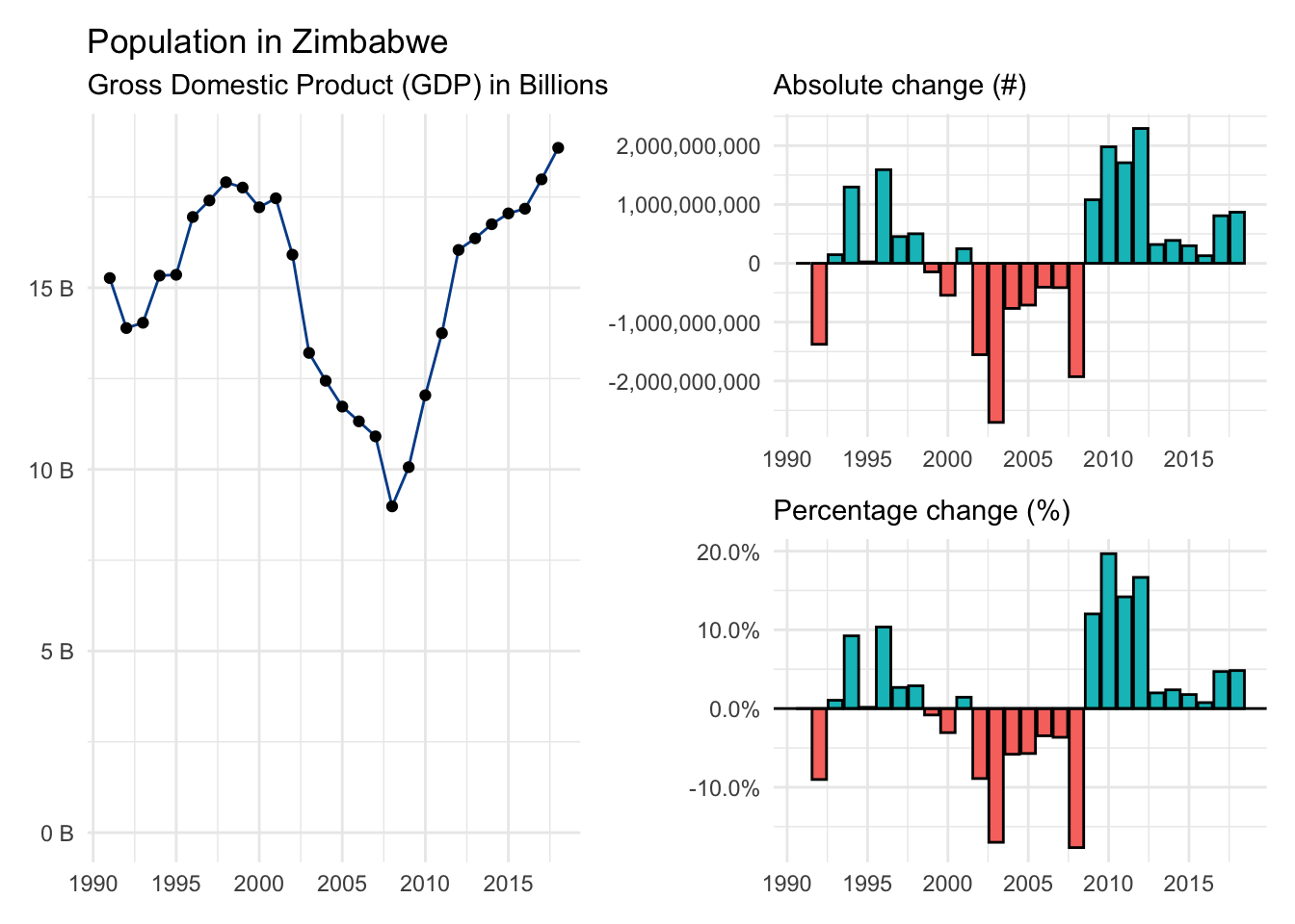
When you add up the 27 individual gdp growth rates you find 0.32. Plug these values into the AAGR formula to find:
\[\text{Zimbabwe AAGR = }\frac{\text{0.32}}{\text{27}} = \text{0.011747 or 1.17%} \]
GDP in Zimbabwe grew 1.17%, on average, between 1991 and 2018 according to the AAGR approach.
Compound annual growth rate
The compound annual growth rate or CAGR only requires the first and last observations. It fits a straight line between these points and then calculates the average change required to connect the starting point with the ending point.
\[\text{CAGR = }(\frac{\text{ending value}}{\text{starting value}})^\frac{\text{1}}{\text{number of periods passed}}-1\]
This more complex formula ignores any volatility experienced during the journey and is generally the preferred growth metric in the finance world.
For our Zimbabwe example we only need to grab gdp figures from the base year (1991) and the final year (2018).
\[\text{Zimbabwe CAGR = }(\frac{\text{18,854,228,494}}{\text{15,268,541,649}})^\frac{\text{1}}{\text{27}}-1=\text{0.0078433 or 0.78%}\]
Comparing AAGR and CAGR results
The CAGR for Zimbabwe is 0.78%, nearly a half percentage point lower than the AAGR — a big difference in terms of economic growth when spread across many years. So, which approach should you use?
Like many techniques we have learned, it is up to you. As long as you are aware of the differences and potential limitations discussed above, choose whichever best fits your workflow in terms of data availability and analytical process.
Finally, let’s make direct gdp growth comparisons between AAGR and CAGR for all countries in our time series dataset. It reveals only small differences for most countries.
9.3 Smoothing
Time series analysis seeks to identify directional trends in the underlying data. It is often challenging to separate trend from noise given the inherent volatility of some variables. Smoothing approaches, including the moving average, can help reduce such noise.
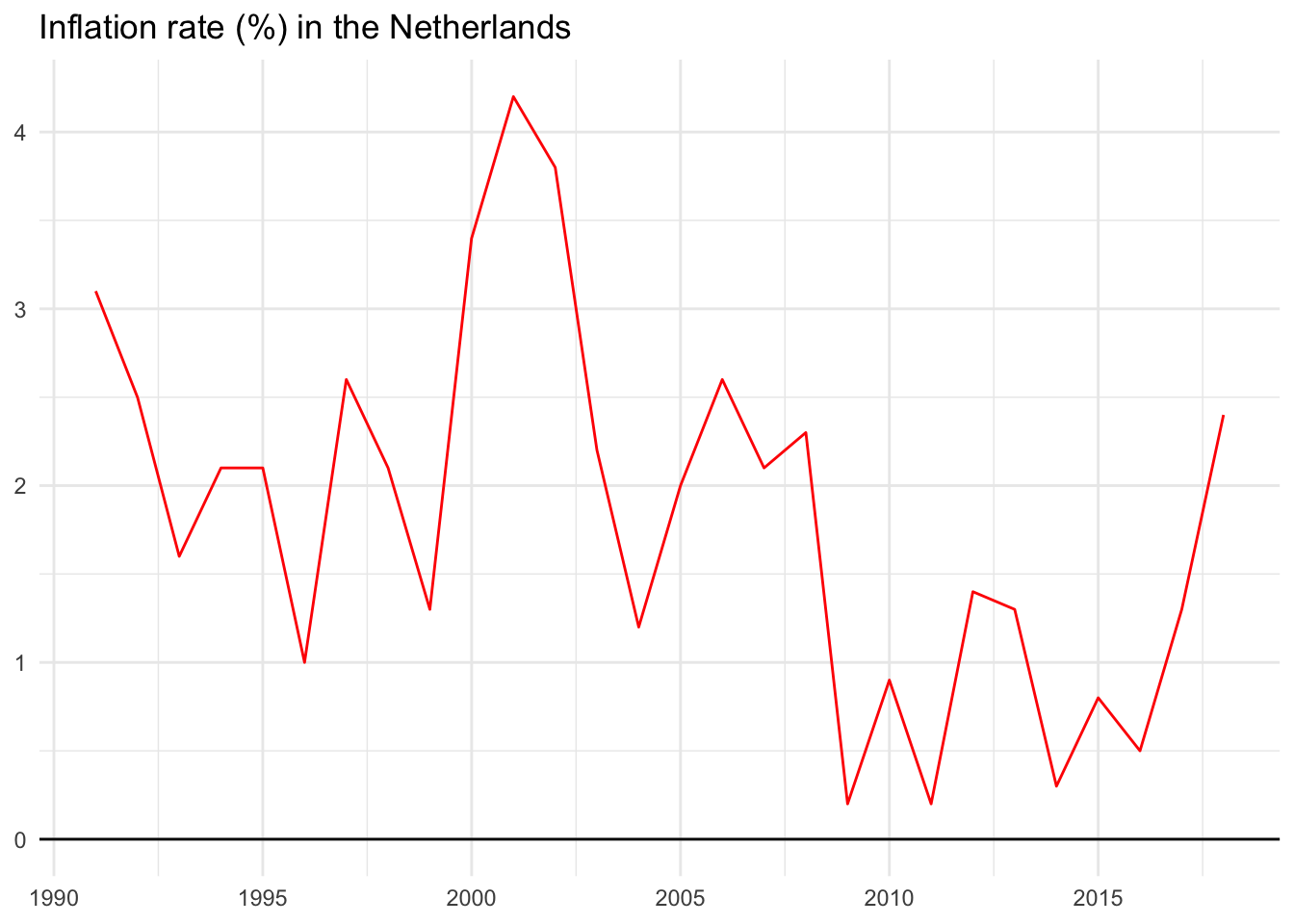
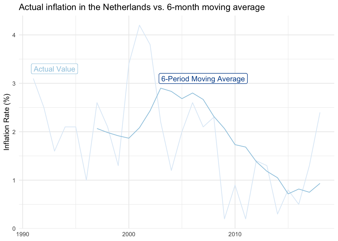
We’ll explore using the inflation rate in the Netherlands as an example.
The original data series
Below are actual inflation values for the Netherlands from 1991 through 2018. Notice how it isn’t uncommon for the rate to increase or decrease by as much as two percentage points in any given year. This jumping around makes it somewhat difficult to identify a clear trend or specific inflection points.
2-period moving average
We’ll use a moving average approach to help smooth the series. This can be set up in a few different ways, but we’ll define an n-period moving average to be the average value from the previous n periods.
Before we turn to the real data, let’s use a smaller example with an individual’s weight over time:
| Year | Weight in pounds | 2-period moving average |
|---|---|---|
| 2000 | 100 | can’t show a value because we don’t have two-previous points |
| 2001 | 120 | can’t show a value because we don’t have two-previous points |
| 2002 | 115 | 110 (the average of 100 and 120) |
| 2003 | 105 | 117.5 (the average of 120 and 115) |
| 2004 | 125 | 110 (the average of 115 and 105) |
| 2005 | 120 | 115 (the average of 105 and 125) |
The moving average dampens annual volatility. The original range is from 100 to 120. The smoothed range is from 110 to 117.5. This isn’t necessarily a good thing, and in some situations, smoothing models can eliminate — or be slow to recognize — meaningful shifts in the data.
Limitations of moving average models
- If significant underlying growth, moving averages will underestimate.
- If significant underlying decline, moving averages will overestimate.
- If significant seasonality, moving averages will likely be extremely inaccurate. We’ll adjust for seasonality to avoid this in a later example.
Multiple moving average periods
Going back to the inflation data, we calculate a variety of moving averages for the Netherlands and include 2, 4, and 6-period variations in the table below.
As we add more periods into a moving average, we (1) have more blank cells at the beginning of the time series because there isn’t sufficient data to calculate comparable estimates and (2) find that year-to-year volatility becomes much smaller.
The raw data has an average absolute annual change of 0.83 percentage points, many times higher than the 6-period moving average of 0.19. You can find the moving average calculations here.
Visualizing the smoother lines
Each additional period added to the moving average approach further smooths the data series. The smoothed visual on the far right is easier to communicate than the raw-value visual on the left.
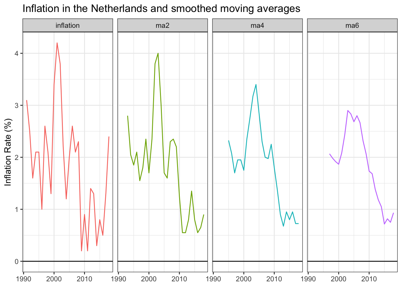
Inflation moved from around two percent in the 1990s to closer to three percent in the 2000s before dropping near one percent in the 2010s. The decade-long downward trend is much easier to see, although at the expense of missing the inflation uptick during the two most recent years. Time will tell if those points are noise or the start of a new period with higher inflation levels.
You get a full sense of the smoothing impact when the 6-year moving average is overlaid against the original data series.
Other approaches
We chose to use the previous n-periods to calculate moving averages so that upcoming forecasting applications are more intuitive. If your goal is purely to smooth existing data, your 2-period moving average could take the current and previous period instead. This will give you back a data point at the beginning of the series and have each moving average value likely be closer to the actual value for that period.
To better mimic the trend, you could also take periods before and after each respective observation; for instance, a 5-period moving average that includes the previous two values, the current value, and the subsequent two values. This smoothed series would better anticipate where a trend is heading.
9.4 Seasonality
We saw that annual volatility obscured the overall inflation rate trend for the Netherlands and that moving averages helped smooth out these observations.
Seasonality is a more predictable form of volatility that can arise when we break time series data into smaller units. For example:
- Ice cream sales revenue during summer months
- Number of travelers during holiday periods
- Wake up time on weekdays versus weekends
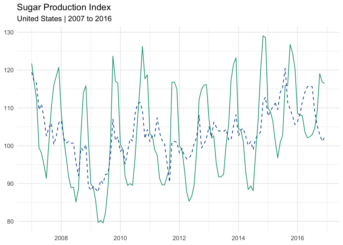
Sugar production index
Let’s use a new dataset that shows monthly sugar production levels in the United States from 2007 through 2016.
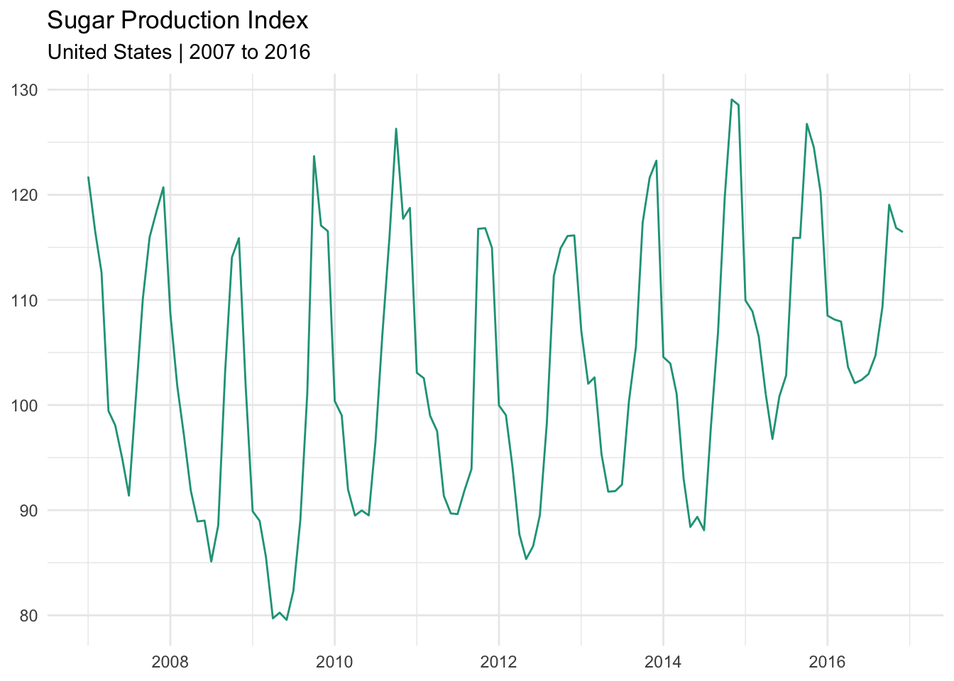
A telltale sign of seasonality is the recurrence of peaks and valleys at similar intervals within a longer set of observations. The chart above matches this description and is evidence that the data series is impacted by seasonal fluctuation.
Moving average approach
One way to control for this volatility would be to use a 12-month moving average. This eliminates the monthly seasonality by focusing on what has occurred over a rolling 12-month period and leaves us with a clean annualized trend.
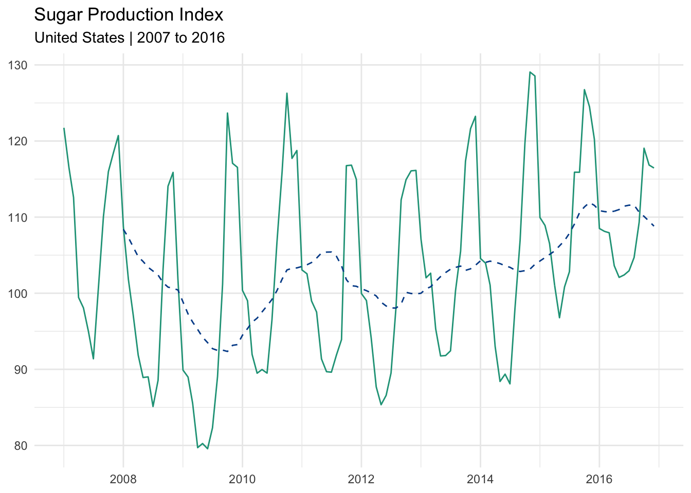
The dotted line is the 12-month moving average. It reveals a more structural trend over the ten-year period. Sugar production fell during the great recession, recovered somewhat, and then began a longer expansion around 2012.
Dissecting seasonality
We have the ability to look more closely at the underlying seasonality and use the observations to quantify typical low and high moments. We start by taking the average production index for each month across all years in the database.
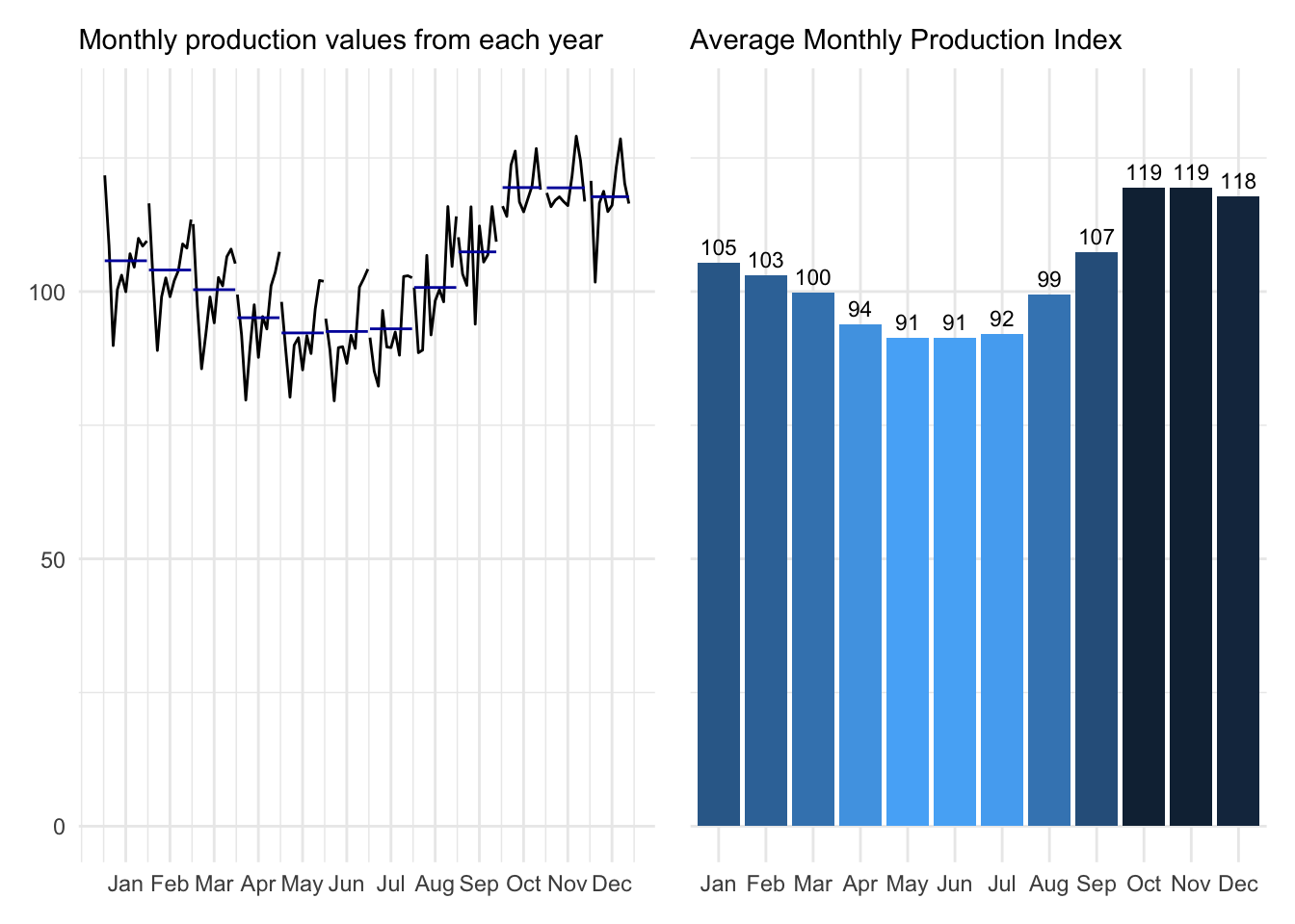
These charts show what has happened by month (left) and report the average monthly value (right). It is clear that sugar production typically increases during holiday months before decreasing over the summer.
Calculating seasonal factors
Seasonal factors are found by dividing the monthly averages by the overall mean.
\[\text{Seasonal factors = }\frac{\text{Monthly mean}}{\text{Overall mean}}\]
Applying the formula to our dataset (shown below):
Deseasonalizing the trend
Finally, we can remove seasonality from any given datapoint with this deseasonalization formula:
\[\text{Deseasonalized data = }\frac{\text{Original observation}}{\text{Appropriate seasonal factor}}\]
Applying these seasonal factors to the appropriate month enables us to deseasonalize the entire data series. Notice that volatility is greatly reduced.
The seasonal adjustment calculations can be found here.
Comparing results
When we plot the original series (green) against the deseasonalized series (dotted and in blue), we see that the extreme seasonal fluctuations have been reduced. Although it is not a straight line or as smooth as the 12-month moving average, it is much easier to see the directional trend.
Decomposition of the observed data
Although we are getting beyond the scope of this program, it is interesting to show that we can break down the original observations into three components:
- Trend: The underlying structural shift in our data.
- Seasonality: The quantified seasonality making individual points appear noisy.
- Randomness: What isn’t explained by either the trend or seasonality decompositions.
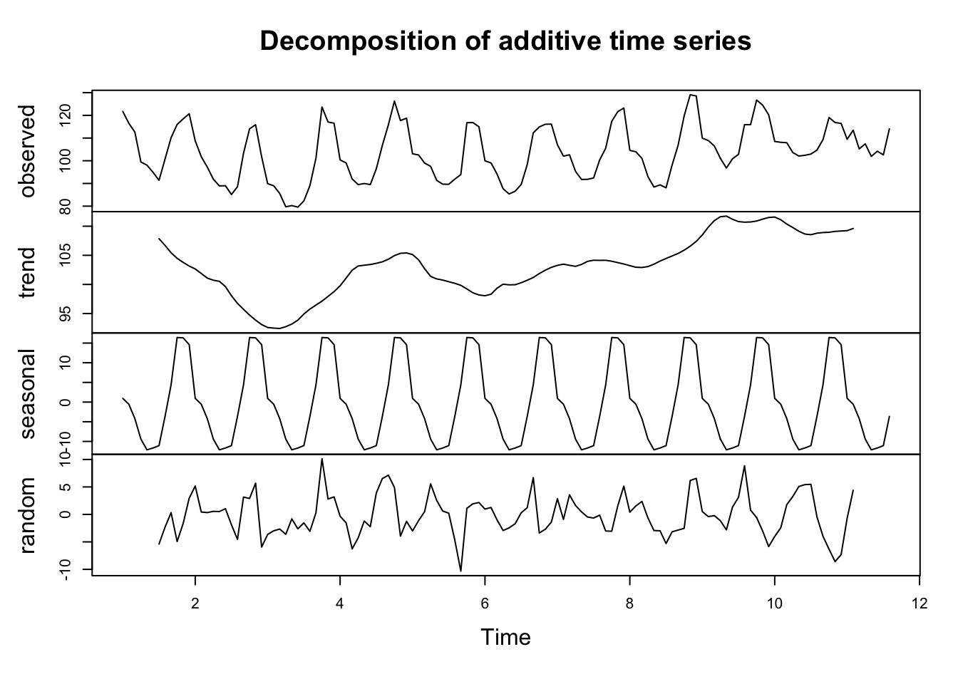
These collective insights will make it easier for us to make informed predictions about production levels in subsequent periods.
9.5 Forecasting
“All models are wrong, but some are useful.” ― George Box
Predicting the future is hard. Thankfully, there are many approaches to help you build a model that is least wrong.
9.5.1 Simple moving average forecast
A moving average (MA) looks back in time to calculate an average based upon a defined number of periods. A 3-year moving average calculated for 2003, for example, takes the average of observations from the years 2000, 2001, and 2002.
We can therefore consider a moving average estimate as a prediction for the new year and then evaluate its accuracy by comparing against the known value.
Model comparison
We’ll use the observed inflation values from Canada as an example.
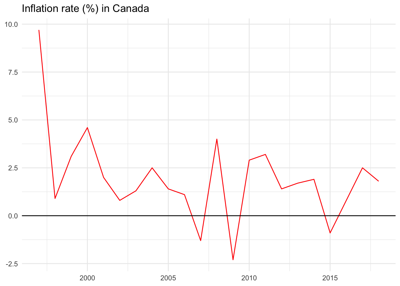
The inflation rate in Canada has fluctuated widely year-over-year ranging from negative 2.3 percent in 2009 to positive 9.7 percent in 1997.
Let us consider three simplistic forecast models to predict the inflation rate:
- Model 1: Predict that inflation in the next year will be the same as the previous year (prev).
- Model 2: Predict that inflation in the next year will be the moving average of the previous two years (ma2).
- Model 3: Predict that inflation in the next year will be the moving average of the previous six years (ma6).
Model 1 prev: Using the previous year to forecast the next year
First, we will make a model that simply uses the previous year’s inflation rate to predict the new year’s value. Imagine going to the year 2000, for instance. In hindsight we know that the inflation rate was 4.6 percent. Imagine that it was December 31, 1999 and we used the final 1999 inflation value of 3.1 percent as our best guess for the coming year. We write it down and wait until the end of 2000 to evaluate it against what actually happened — the 4.6 percent figure.
There are several evaluation metrics we could use to summarize how good or bad our model performed:
Forecast error: Actual value minus forecast value. (4.6 - 3.1 = 1.5)
Absolute deviation: The absolute value of the forecast error. This will be helpful when summarizing model performance since positive and negative values won’t cancel each other out in mean calculations. (abs(1.5) = 1.5)
Squared error: The squared value of the forecast error, again removing the impact of negative values and further penalizing bad forecasts. (1.5^2 = 2.25)
We could follow this process for each year.
In some years, such as 2013 and 2014, our forecasts would have been very good as seen by their small error values. In others, such as 2008 and 2009, our forecasts would not have turned out so well.
Now that we have annual forecasts and their performance evaluations, we can summarize how the prev model performed over the entire time period using two new concepts:
Mean absolute deviation (MAD): The average of the individual absolute deviation values. (2.55).
Root mean square error (RMSE): The square root of the average squared errors. (3.55).
The MAD is easiest to interpret. On average, our prev model was off by 2.55 percentage points over the entire data series.
Let’s build a second model to compare this against.
Model 2 ma2: Using a two-year moving average to forecast the next year
The ma2 model has a MAD of 2.19 and an RMSE of 2.81.
Model 3 ma6: Using a six-year moving average to forecast the next year
The ma6 model has a MAD of 1.82 and an RMSE of 2.47.
Comparing model results for Canada
Comparing MAD and RMSE for each model reveals that the six-year moving average model, ma6, outperforms the others for Canada. On average, the inflation estimates from ma6 is off by 1.82 percentage points. The RMSE stands at 2.47, also better than the competing models.
This doesn’t mean that ma6 is the best possible forecast model or even the best possible moving average model. It just says that it outperforms the other models that were built and evaluated.
Spreadsheet calculations
You can find all calculations above in this Google Sheet example.