13 Modeling data
We introduced simple forecast models with a quote from George Box stating that, “All models are wrong, but some are useful.” As noted in R for Data Science, he goes on to say…
“Now it would be very remarkable if any system existing in the real world could be exactly represented by any simple model. However, cunningly chosen parsimonious models often do provide remarkably useful approximations. For example, the law PV = RT relating pressure P, volume V and temperature T of an”ideal” gas via a constant R is not exactly true for any real gas, but it frequently provides a useful approximation and furthermore its structure is informative since it springs from a physical view of the behavior of gas molecules.
For such a model there is no need to ask the question ‘Is the model true?’. If “truth” is to be the “whole truth” the answer must be “No”. The only question of interest is ‘Is the model illuminating and useful?’”
George Box, 1979. “Robustness in the strategy of scientific model building”, in Launer, R. L.; Wilkinson, G. N. (eds.), Robustness in Statistics, Academic Press.
We shall try our best.
13.1 Linear regressions
Linear regressions are popular and straightforward models to quantify linear relationships between two or more variables. Before we discuss the details, let’s define some common terminology.
- Response variable,
y: The variable that we want to model or predict. Sometimes called the dependent variable. - Explanatory variable(s),
x: The data used to explain the values observed in the response variable. Sometimes called the independent variable(s).
A linear regression uses available data to model the relationship between these variables as a linear function. Remember y = mx + b from elementary math? It is the equation for a straight line, which will be an output from our model.
The ultimate goal is to approximate relationships between variables with the best fit to capture as much variability in the response variable as possible. It is unlikely that any model will fully uncover the complex relationships seen in the real world and that is okay.
13.2 Simple linear regression
A simple linear regression attempts to explain a response variable based on just one explanatory variable. The stronger the linear correlation between the two variables, the better the regression model will perform.
Office commute example
Suppose you are an employer and believe that the length of commute times in minutes is dependent upon the distance from the office in miles.
One goal might be to develop a model to predict commute times so that you can define a new company benefit that helps people with longer expected commutes. You collect commute times and distances around the office from a random sample of employees.
The goal of our linear regression will be to model this relationship to define commute time as a function of distance from the office.
- Response variable,
y: Commute time in minutes - Explanatory variable(s),
x: Distance from the office in miles
We will use spreadsheet software to help run the linear regression.
Step 1: Plot the data
The first step in a simple linear regression model is to make a scatter plot of the two variables to confirm there is a clear correlation. If so, then a linear function is likely the best choice to model the relationship.
Here is the visual for minutes and miles.

We see what appears to be a linear relationship. As the number of miles away from the office increase, the time it takes to get to the office in minutes also grows. The correlation between the variables is 0.77, indicating a fairly strong positive relationship.
Step 2: Add a trendline
In Microsoft Excel, you can right click on the scatter plot to select Add Trendline. In Google Sheets, you can right click to select the Series and then scroll down the menu to select the Trendline checkbox.
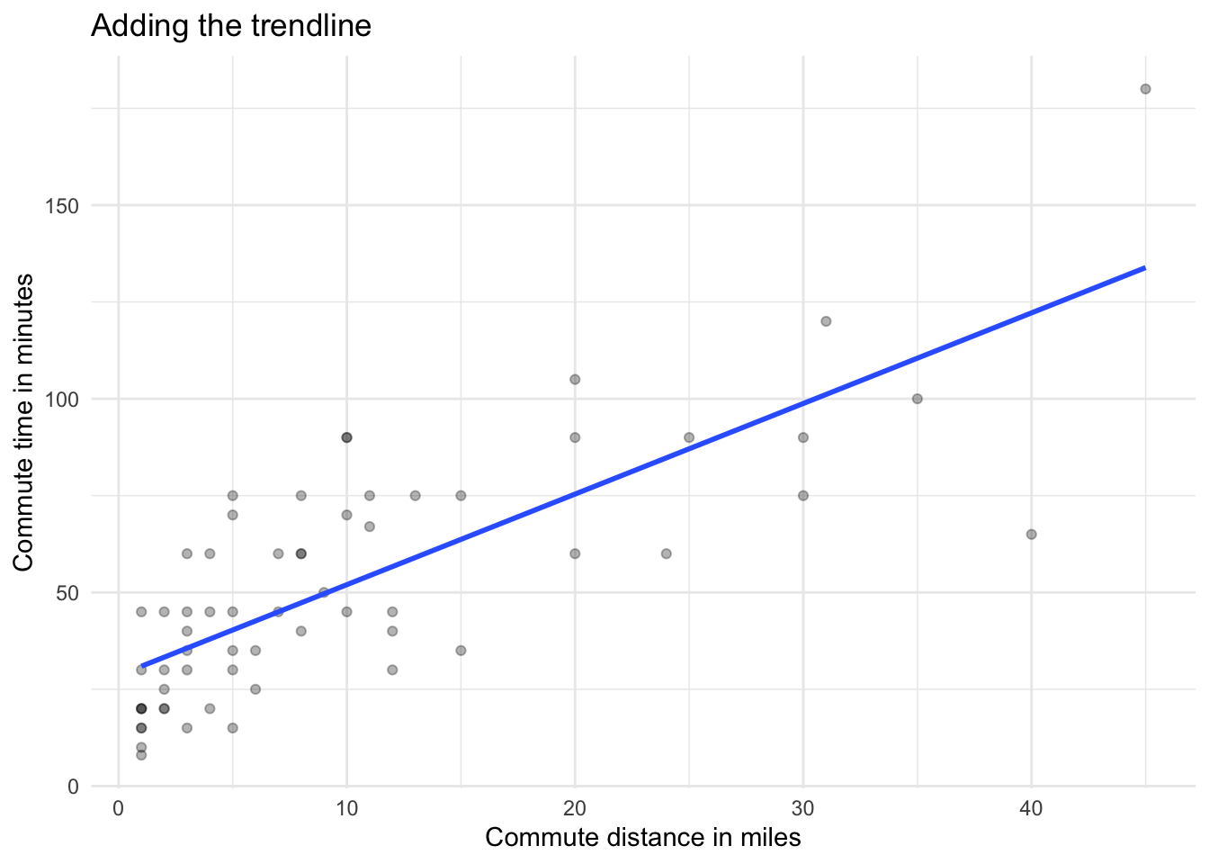
These steps add a straight line to the scatter plot. You may not know it, but the line is actually the regression line as calculated by the spreadsheet using an approach called ordinary least squares (OLS). This process found the optimal place to put the line that minimizes squared differences from it and the observed values. If the line was placed in any other position, the “fit” would not be better.
Step 3: Add the linear equation
Next, we would like to display the full linear regression equation. In Excel, select the trendline and right click to choose Format Trendline. This should open a menu from which you can choose a checkbox to Display Equation on chart.
In Google Sheets, find the Label section of the same menu you used to add the trendline. Open the dropdown menu and choose Use Equation.
The linear regression equation for our data is y = 2.3394x + 28.607. This matches our y = mx + b formula for a line, where 28.607 is the intercept (b) and 2.3394 is the slope of the line (m). To translate this back to our original variables, arranging the intercept first, we have the following model:
\[\text{Commute minutes = 28.607 + 2.3394 * (distance in miles)}\]
The slope tells us how much the response variable, time in minutes, will be impacted by longer commute distances. From our estimated values, we can state that for every additional mile from the office, we expect an increase of approximately 2.34 minutes in commute time.
Step 4: Add R-squared value
We also want to include an R-squared value in our scatter plot. The R-squared value measures the proportion of variability in the response variable that is explained by the explanatory variable.
The R-squared value can range between zero and one. A larger value indicates a better model fit as it is able to explain a larger amount of the variation.
To add R-squared in Excel, simply click the Display R-squared value on chart. In Google Sheets, select the Show R^2 checkbox.
Your final chart should look something like this:
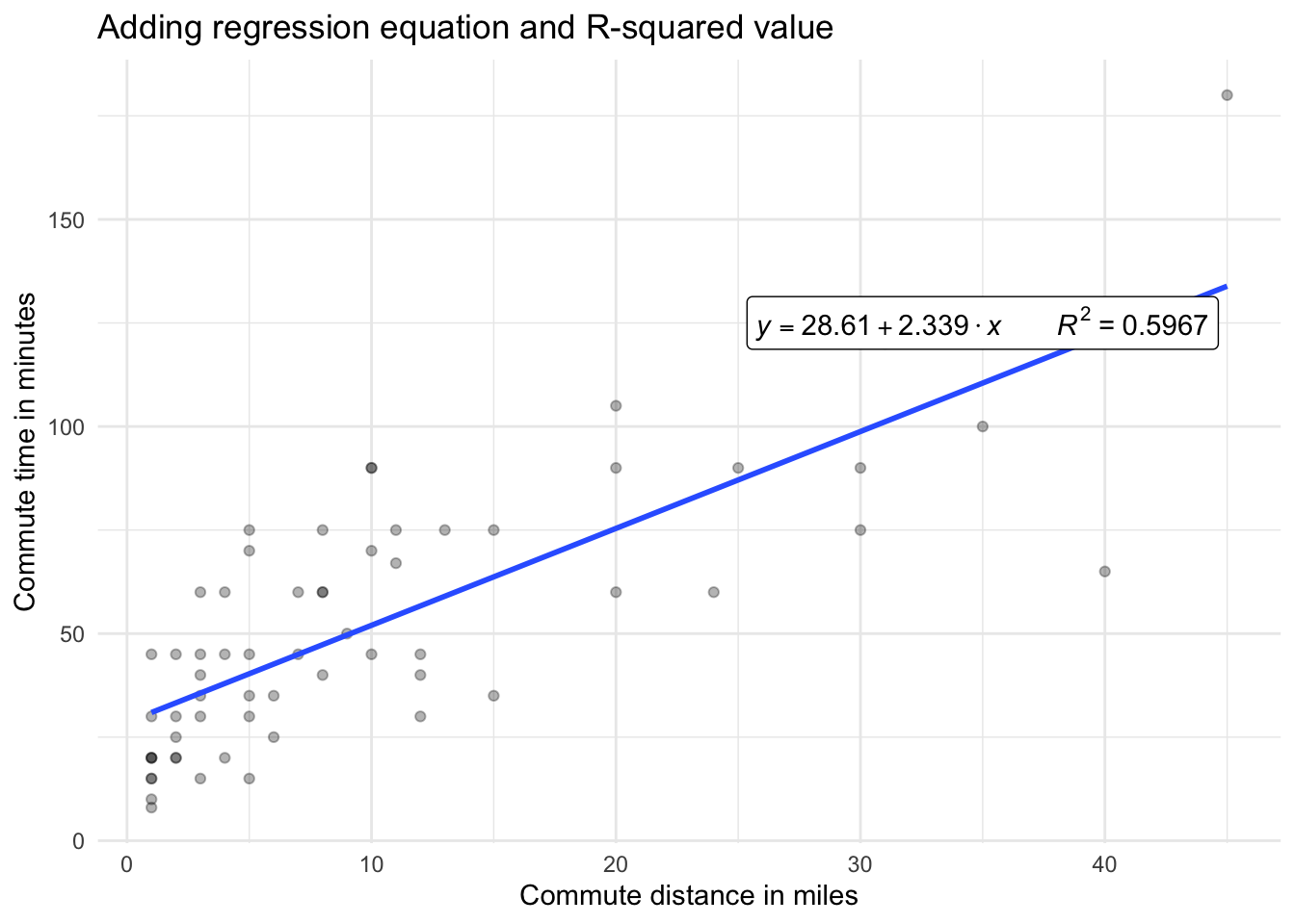
For our linear regression model, we have an R-squared value of approximately 0.6. This means that the model explains 60 percent of the variability in commute minutes. Not bad considering all of the other factors that might be influential such as weather, transportation type, speed preferences, and time of day.
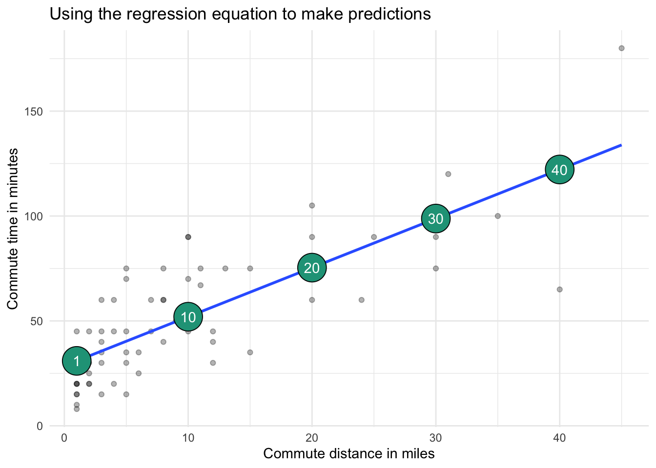
Step 5: Make predictions
Now that we have obtained our linear regression equation, we can use it to make predictions for distances that did not appear in our original dataset.
In general, it is best to only make predictions of commute times for values of miles that are similar to the original range of data used to fit the model. Going outside this range, known as extrapolation, sometimes leads to unexpected and questionable results.
In terms of our example, the model can generate commute time estimates for new people joining the company based on their home address. This information could potentially influence default benefit packages, accordingly.
To make a prediction, simply plug in a new commute distance into the regression equation. The model will then calculate a predicted commute time.
These predictions are simply the spot on the regression line that crosses at a given number of miles, shown in large green circles on the chart below.
You can find calculations from this section here.
13.3 Multiple linear regression
The approach for multiple linear regression is very similar to simple regression. The main difference is that instead of having only one explanatory variable, you include two or more with the goal of capturing even more of what drives the response variable.
It is difficult to conduct multiple linear regressions in spreadsheet software, although add-ins such as the Analysis ToolPak in Excel can help get the job done.
For now, we will just explain how to extend our commute time example into a multiple regression and evaluate outputs from its model.
Adding a second explanatory variable
We first modeled the impact of commute distance in miles on commute time in minutes. The R-squared value was 0.6, meaning that around 60 percent of the variation in commute time can be explained by commute minutes alone.
Perhaps we can do better by adding another explanatory variable to the mix.
The survey of employees also asked if a car was their primary mode of transportation. It is recorded in our dataset as 1 for car and 0 for other. If we add this driving_car variable to our model, we now look to explain commute minutes in the following way:
\[\text{Commute minutes = Function(distance in miles, driving a car)}\]
Below are the visual relationships with commute time for both commute distance and car usage.
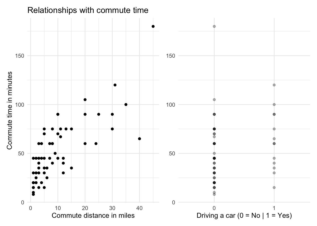
The average commute time for people driving a car is 63 minutes compared with 49 for those not driving a car. It is likely that commutes are shorter for people not driving because they are closer to the office and might walk, bike, or take local public transport. Later, we’ll look at model assumptions to see if this relationship might add bias to our model.
Running the multiple regression
We get the following results when running the multiple linear regression model with both explanatory variables. The regression output comes from the analysis, which was conducted in R.
##
## Call:
## lm(formula = minutes ~ miles + driving_car, data = commute)
##
## Coefficients:
## (Intercept)        miles  driving_car
##      27.275        3.262      -36.832
## [1] "R-squared = 0.73"For now, we are only interested in two things:
1. The coefficient values
These guide our regression equation into the form:
\[y = 27.28+3.26\times\text{number of miles}-36.83\times\text{driving a car (1 if yes, 0 if no)}\]
Since driving_car is a binary variable, meaning it only has values of zero or one, the equation reveals just how important this new variable is. According to the model, if we drive to work (e.g., driving_car = 1), we would expect our commute to be reduced by nearly 37 minutes.
This conflicts with the fact that people who drive, on average, have longer commutes. The relationship between miles and driving_car is having an interesting impact on the coefficient. This is likely due to multicollinearity, which we’ll ignore for now.
2. The adjusted R-squared
In a multiple regression, we focus on adjusted R-squared. This value adjusts for the number of explanatory variables in a model, which artificially increases the standard R-squared measure. The adjusted R-squared value of 0.73 indicates that nearly 73 percent of the variation in commute times is explained by commute distance and using a car or not.
Making predictions
As with our simple regression, you can use the equation from a multiple regression to plug in new explanatory variable values to predict commute time in minutes. The model itself generates a series of predictions or fitted values for the original variables that we can further explore.
Some predictions were good, some not so good. The first row’s actual value is only half the predicted value. The third observation is spot on, while the sixth is again way off.
Next, we’ll look at ways to use these errors to evaluate model performance beyond the R-squared metric.
13.4 Model comparison
We’ve now built two models to help explain commute length in minutes:
Simple linear regression:
commute time = commute distanceMultiple linear regression:
commute time = commute distance + driving a car (yes/no)
How do you tell which model is better?
There are several summary metrics to help evaluate which model to choose.
1. Compare R-squared values
The adjusted R-squared value from the multiple regression model was 0.73, higher than the R-squared value of 0.59 from the simple regression. This is typically the primary method of model evaluation for linear regressions. Since the multiple regression is more successful at explaining variation in commute times, we would select it as the better model.
2. Examine the model errors or residuals
R-squared values are not the most intuitive for non-technical audiences to grasp. We can also evaluate the model’s residuals to reveal more interpretable summary measures.
\[\text{Residual = Actual value - Predicted Value}\]
Residuals are the distances between the actual values and the predicted values from a regression. This is a measure of error that shows how far away a prediction was from reality for each observation included in the model.
It is easy to visualize these distances in a simple linear regression.
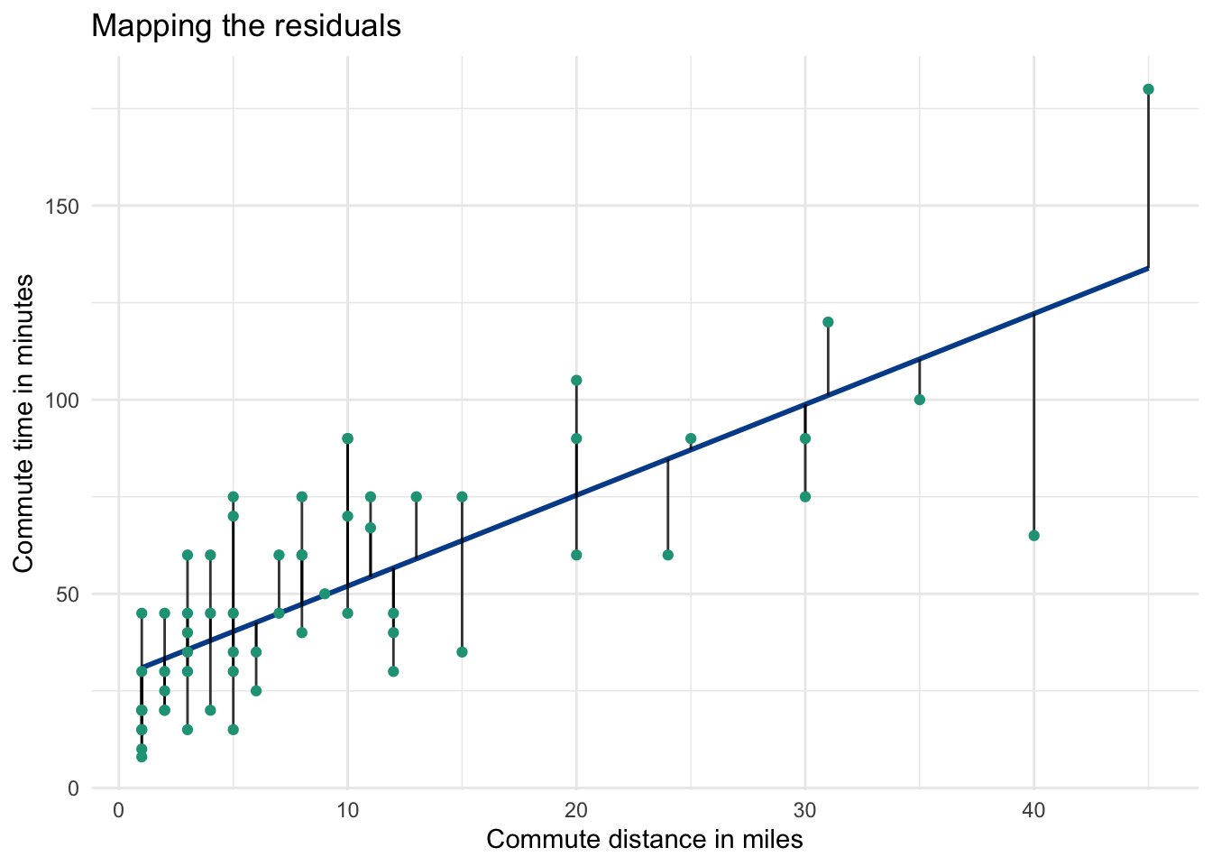
Each time you run a regression, you will notice that some observations are above their predicted values, and some are below. The green dots are the actual observations and the distance from each dot to the regression line is the residual.
We can use these distances to calculate the following metrics.
Mean absolute error
Since the sum and mean of all residuals will equal zero, we will explore the absolute value of each residual to see how far off the predictions are, on average. This mean of all absolute residuals is known as the mean absolute error (MAE).
Here, we calculate it for both the simple and multiple regressions.
The MAE is found by taking the average of the columns with the absolute residuals. It is 16.3 for the simple regression and 12.61 for the multiple regression. Larger average errors are worse than smaller ones, so once again the multiple regression model with two explanatory variables looks to outperform the simple version that has only one.
Mean absolute percentage error
The mean absolute percentage error (MAPE) standardizes the MAE by examining the percentage errors associated with the residuals. The absolute percentage error for each observation is:
\[=abs(\frac{Actual - Predicted}{Actual})\]
The MAPE is the average of those values. Be careful when using MAPE, it only works when the possible values from the response variable are all positive.
MAPE is calculated by taking the average of columns with the absolute percentage errors. It is 45.2% for the simple regression and 38.5% for the multiple regression. Even though the multiple regression model again outperforms the simple regression model, its predicted values, on average, are still off by 38.5%.
Whether this is good enough or not depends on your situation and the availability of better models.
Root mean square error
A final metric we’ll explore is the root mean square error (RMSE). This approach squares each residual, making all the resulting values positive and more significantly penalizing large residual values (e.g., bad predictions).
The RMSE is the square root of the average values in the residual squared columns. It works out to be 19.78 for the simple regression and 15.93 for the multiple regression. Once again, the multiple regression model has a lower error measurement.
Summarizing model evaluation metrics
It is useful to put all of these evaluation metrics side-by-side for each model. We can see that the multiple regression has a higher R-squared value and lower average error metrics for each approach.
Assuming data is available for minutes and driving_car, the multiple regression model seems like the best choice as it explains more of the variance in commute minutes with lower error rates.
You will find calculations for residuals, MAE, MAPE, and RMSE here.
13.5 Logistic regression
Our simple and multiple regressions attempted to explain, and ultimately predict, the commute time in minutes, a numeric variable, based on explanatory variable inputs.
Logistic regressions model categorical variables with two outcomes. These are often events where success can be labeled 1 and failure 0. The output generated from a logistic regression is the probability that the response variable will qualify as a success.
Predicting if someone drives a car to work
We can use the driving_car and miles variables from our commute dataset to model the likelihood that a given employee drives a car to work based on their distance from the office.
\[\text{p(driving a car) = number of commute miles}\]
A logistic regression in this case may be able to tease out useful predictions given the observed relationship between the two response variable categories.
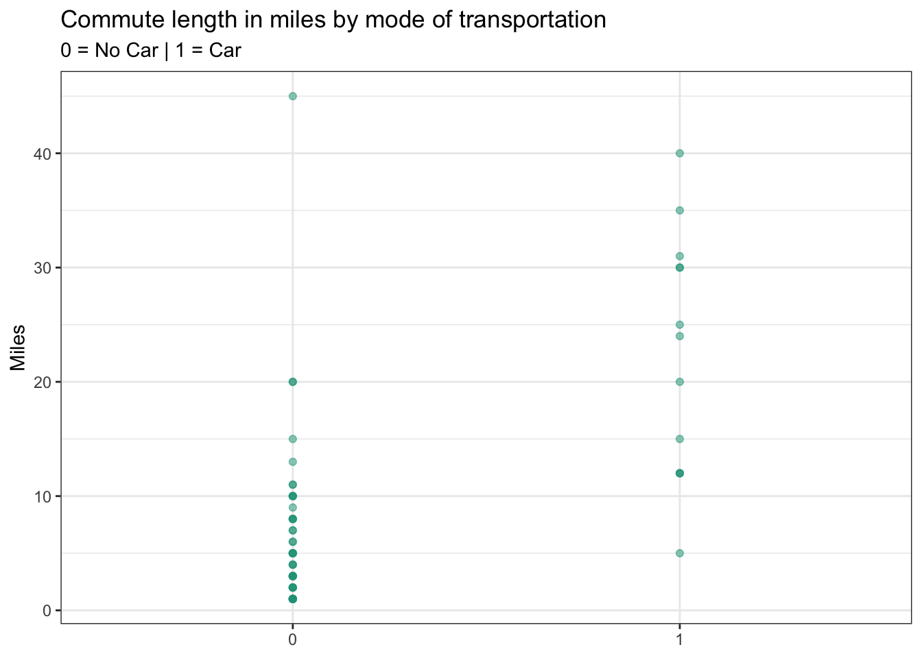
People who have longer commutes appear more likely to drive cars. In fact, the average commute distance for those not driving a car is 6.6 miles, several times less than for those driving a car, which stands at 22.4 miles.
Logistic regression outputs
Because running a logistic regression in a spreadsheet is a challenge, we will once again just focus on the model output and then evaluate its effectiveness in Google Sheets.
Step 1. Turn the coefficient values into a predictive equation
## (Intercept)       miles
##  -3.3070723   0.1603879
The model calculates coefficient values for the intercept and explanatory variable, miles, just like with linear regressions. If you apply the model to the known values, your raw predictions look like this:
You may notice that the raw predictions don’t look like probabilities or the actual values from driving_car. This is because the generalized linear model (GLM) behind logistic regressions requires a transformation in response variable to calculate a range of meaningful probabilities. Although beyond the scope of this program, the raw predictions ultimately need to be transformed back using this formula.
\[\frac{e^\text{intercept+coefficient x number of miles}}{1-e^\text{intercept+coefficient x number of miles}}\]
You will find the calculations to this transformation here. The transformed prediction values now reflect probabilities ranging from a minimum of zero to a maximum of one, which is much more informative.
Step 2. Review the Akaike information criterion
## [1] "AIC: 44.88"Instead of an R-squared value, with a logistic regression we turn to an Akaike Information Criterion or AIC score. The AIC measures the goodness of fit for a model. Although the standalone value itself isn’t meaningful, comparing it against competing models will indicate which model is likely to make better predictions. A lower AIC score relative to other models is an indication of better fit.
Making predictions
The predicted values from our logistic regression follow an s-curve pattern with two inflection points wherein the probability of a success (e.g., someone driving a car) increases more rapidly.
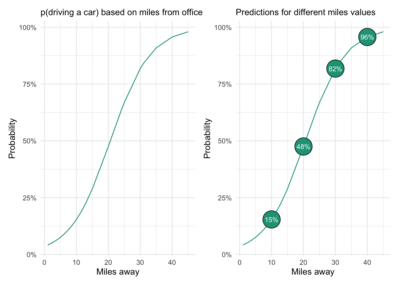
The chart on the right shows the probability of driving a car based on four possible commute distance values. The model predicts that someone living ten miles from the office only has a 15 percent chance of driving a car to work. In contrast, someone who is 40 miles away has a 96 percent chance of driving.
Model evaluation
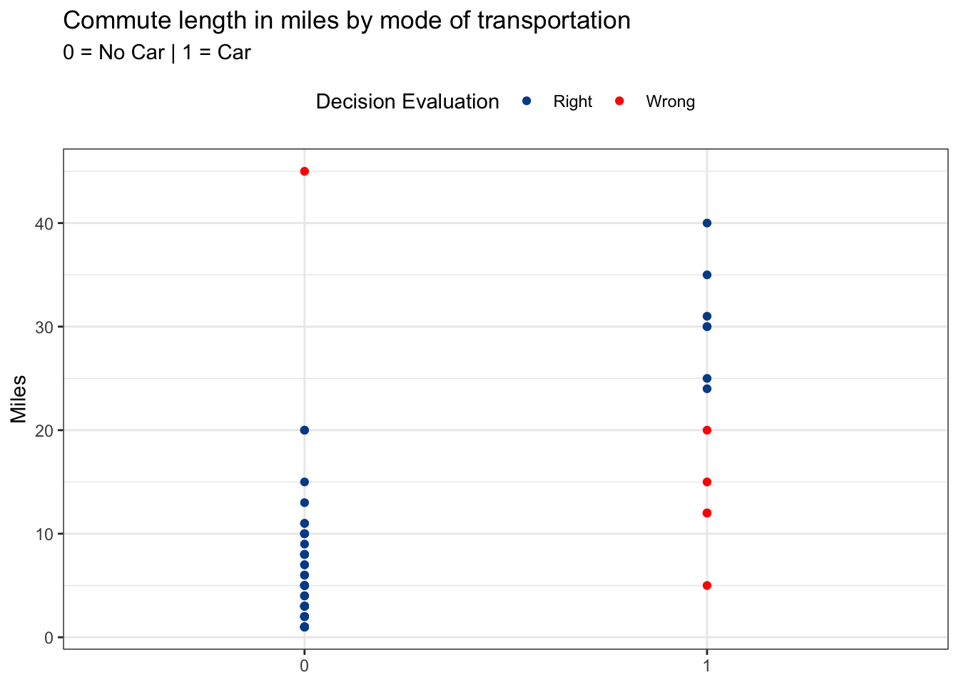
We could create a decision rule based on our model output to evaluate its performance. Ideally, we would test the accuracy on new data (i.e., not the values used to make the prediction equation). But for demonstration purposes, we’ll use what we have and set the following decision rule:
- If the predicted p(driving a car) is greater than 0.5 –> assume they drive a car.
- If the predicted p(driving a car) is less than or equal to 0.5 –> assume they don’t drive a car.
Red values in the chart below indicate the observations for which our decision rule was wrong. You can see that these mostly occurred for people driving to work who live relatively close to the office.
Evaluation metrics
There are several perspectives from which we can summarize the right and wrong predictions from the model. Here are the pure counts that show seven failed predictions — 6 times when predicting no car and 1 time when predicting car. The overall accuracy is 88.5 percent (54 successful predictions / 61 total predictions).
We can also look at performance based on the percentage of predictions that were right for each prediction type using column percentages. Here we see that 88.7 percent of no car predictions were accurate and that 87.5 predictions of car predictions were accurate.
Finally, we’ll look at row percentages to find the percent of accurate predictions by actual car usage. Although our model does quite well predicting car usage for people who don’t drive cars (97.9 percent accuracy), it was only 53.8 percent accurate at making predictions for people who do drive cars — slightly better than a coin flip. If we applied this model to new data, the accuracy rates would likely fall further.
If we want to do better than these summary metrics, we can turn to alternative models, perhaps with additional explanatory variables.
Logistic regressions predicted probabilities associated with two categorical outcomes. They are a practical method to determine the likelihood of something happening based on the observed relationships between a response variable and one or more explanatory variables.
With the exception of the logistic regression itself, calculations from above can be found here.