8 Finding relationships
In this section we cover how to examine and describe relationships between two or more variables. Specifically, we will learn techniques to work with numeric, categorical, or a combination of variable types.
8.1 Numeric
8.1.1 Correlations
Let’s begin with a way to describe linear relationships between two numeric variables through the correlation coefficient, usually denoted as lowercase r.
The possible values for the correlation coefficient range between negative one and positive one.
Possible correlation values
- 1: A perfect positive linear relationship. For every unit increase in one variable, the other variable goes up by an equal amount.
- 0: No linear relationship. A change in one variable is not associated with movement in the other variable.
- -1: A perfect negative linear relationship. For every unit increase in one variable, the other variable goes down by an equal amount.
The best visualization to see correlations are scatter plots, which display pairs of numeric values.
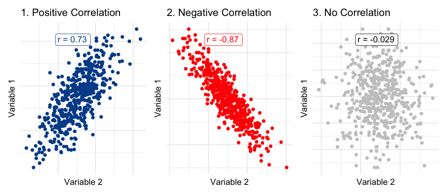
Graph 1 highlights a positive relationship between two variables with a correlation value of r = 0.73. In graph 2, we see a clear negative relationship, quantified by an r value of r = -0.87. Finally, in graph 3, it is difficult to identify any relationship between the two variables and the r value is very close to zero.
You can calculate the correlation coefficient with the following formula.
\[\text{r = }\frac{\text{Sum ((observed x - mean x) * (observed y - mean y))}}{\sqrt{\text{((Sum(observed x - mean x)^2) * (Sum(observed y - mean y)^2))}}}\]
It looks more complex than it is and you can see it worked out here in Google Sheets for gdp and population from the countries dataset.
But of course there are embedded spreadsheet functions that will take care of the calculations for you behind the scenes.
=CORREL(range for data series 1, range for data series 2)
When you pass two data ranges into the function above, the spreadsheet will calculate a correlation value between -1 and 1.
Non-linear relationships
A correlation value of zero does not necessarily imply that two variables are not related. We can only conclude that they are not linearly related.
This is why it is so important to look at the visual relationship in addition to reviewing correlation values. Take salary and years of work experience data as an example.
If you only look at the correlation value, you will find an r of -0.02, which indicates no linear relationship. Although the data points have a correlation value near zero, when you plot them, you clearly see that they are related in a non-linear way.
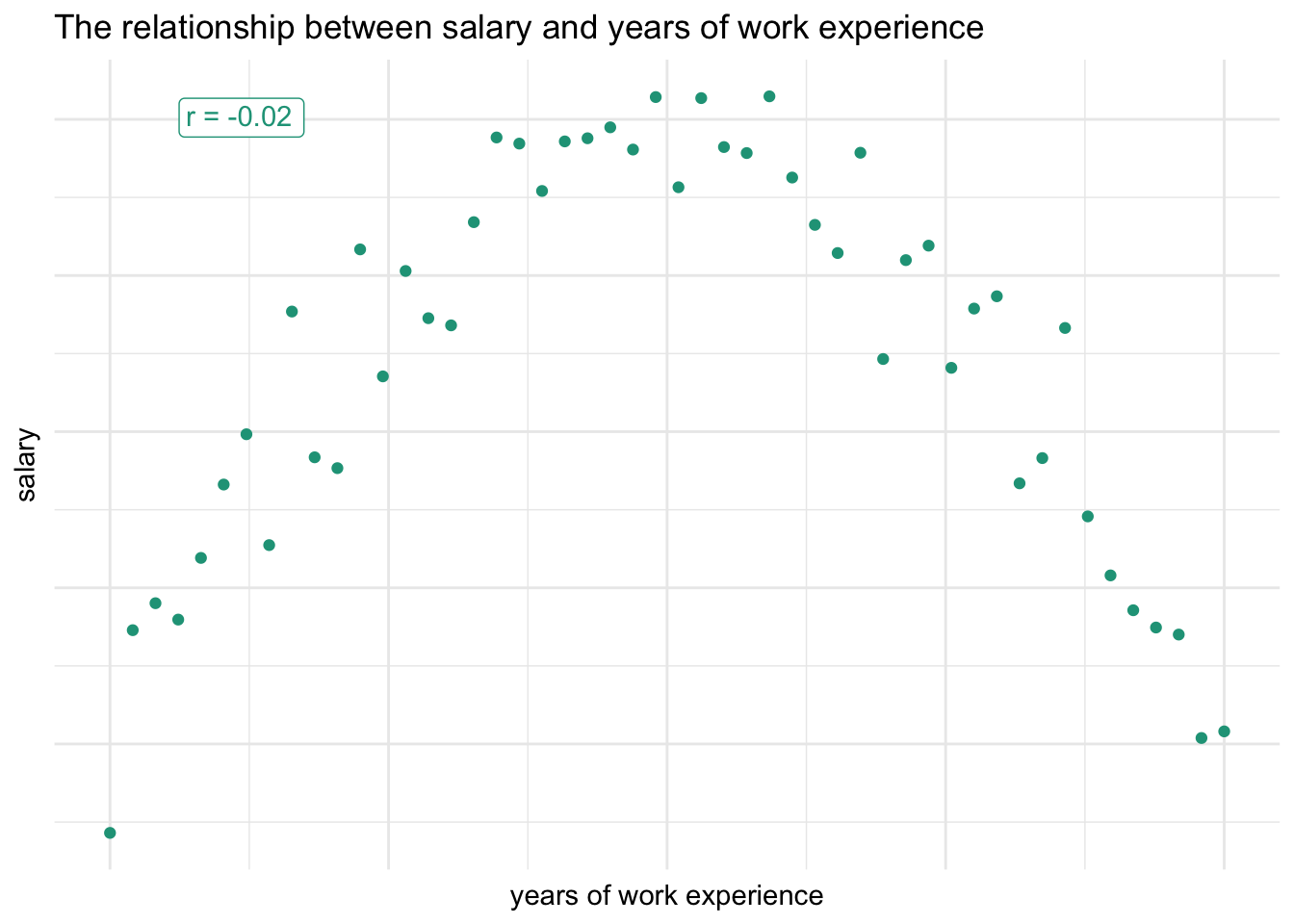
Income initially increases along with years of work experience before eventually declining as people wind down their careers.
It’s always a good idea to visualize variables when searching for relationships in order to spot such non-linear associations that would otherwise have been missed through the correlation coefficient alone.
Spurious correlations
Another important fact is that a strong linear correlation between two variables does not imply that one of them is causing a change in the other. This leads to the often used saying that correlation does not imply causation.
You’ll find many examples of spurious correlations on Tyler Vigen’s fantastic website. Give it a visit to see the tragic relationship between Nicolas Cage films and people drowning in pools.
Are Nicolas Cage film appearances causing people to fall into pools? Maybe, but it is highly unlikely!
Another amusing example shows the correlation between the divorce rate in Maine and the per capita consumption of margarine at nearly 1. Should we conclude that eating margarine causes people to get divorced? Of course not.
The main point is that causation can’t be determined from observational data alone. The only way to validate causation is through randomized, controlled experimentation.
8.1.2 Correlation matrix
It is useful to see all the linear correlation values for your dataset in one place, especially if you have a large number of numeric variables. A correlation matrix facilitates this by creating a table with all variables repeated across the rows and columns.
Each cell in the matrix represents the correlation coefficient, r, between the respective row and column variable combination. Down the diagonal of the correlation matrix you will typically find a value of 1, which represents the perfectly positive linear relationship between the same variables (e.g., inflation and inflation).
A correlation matrix like this can be created in spreadsheet tools such as Google Sheets through the use of =CORREL() and you’ll find an example from our countries dataset here.
In the spreadsheet, you’ll notice conditional heatmap formatting placed on the cells to draw readers’ attention to especially strong positive (blue) or negative (red) correlation values. This visual enhancement speeds up the identification of strong associations.
What is strong? What is weak?
It is natural to ask what levels of correlation values relate to different relationship strengths. So far all we’ve done is define a continuum from a value of negative one (perfect negative relationship) to a value of positive one (perfect positive relationship).
Although there are not exact cutoff points or widespread agreement, I’ve always liked this directional summary graphic provided in an undergraduate statistics course at Southeastern Louisiana University.
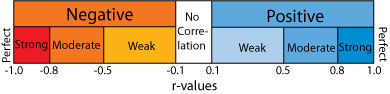
If you find the descriptive ranges helpful, you can group the variables accordingly.
Doing more
Although beyond the scope of this data literacy program, you should know that statistical programming software such as R and Python give you the ability to generate much more complex correlation visuals.
We made the following plot using library(corplot) in R. It shows the magnitude of the correlations in both color intensity and circle size.
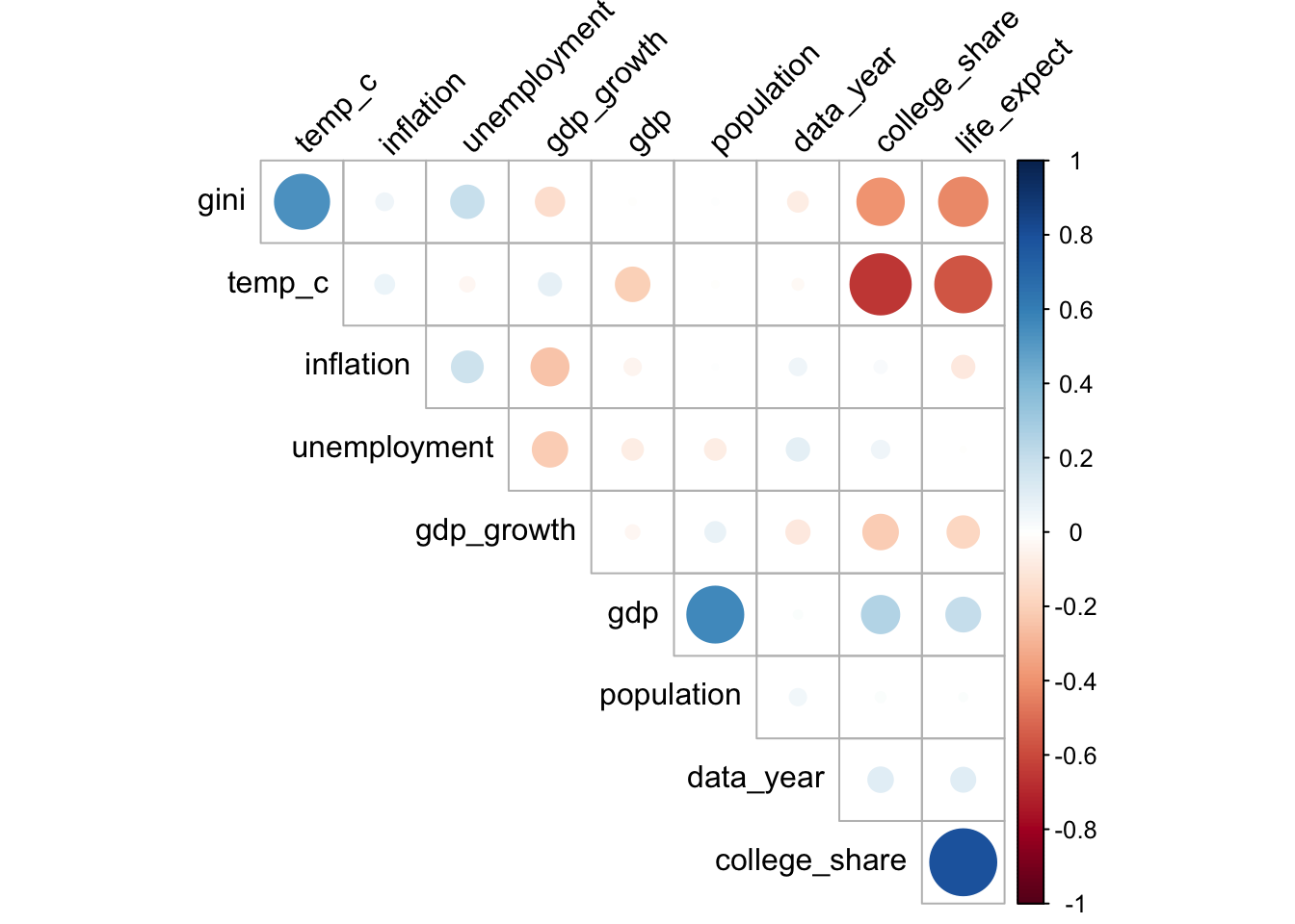
You could also choose to swap out the circles with the actual values.
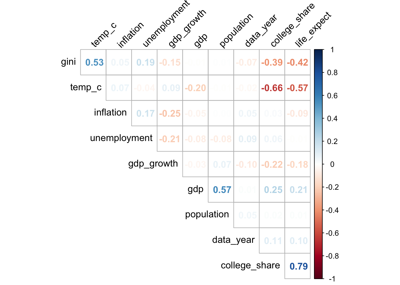
In either variation, you can likely determine relationships more quickly than in the basic matrix.
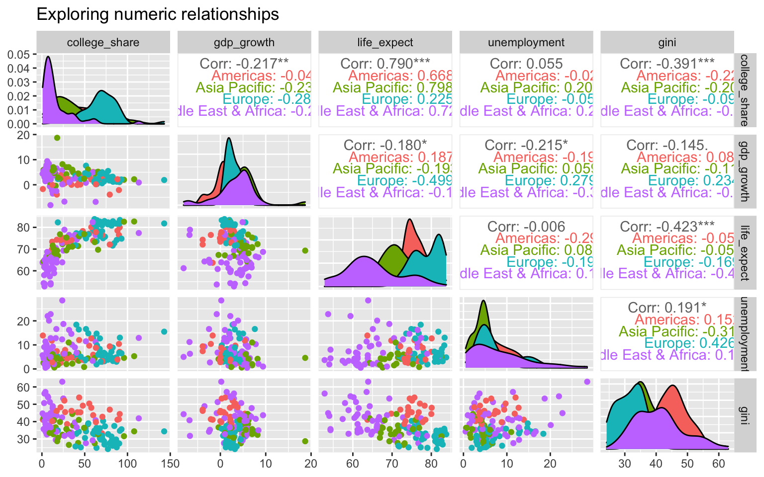
Incorporating categorical variables
With library(GGally), again in R, we can add even more complexity by visualizing the numeric correlations and distributions against a categorical variable, demonstrated here with region.
8.2 Categorical
8.2.1 Crosstab counts
We learned that frequency counts and percentages are the primary summary approach for both nominal and ordinal data. Simply count the number of observations within a variable that match a given value label to get a sense of how they are distributed.
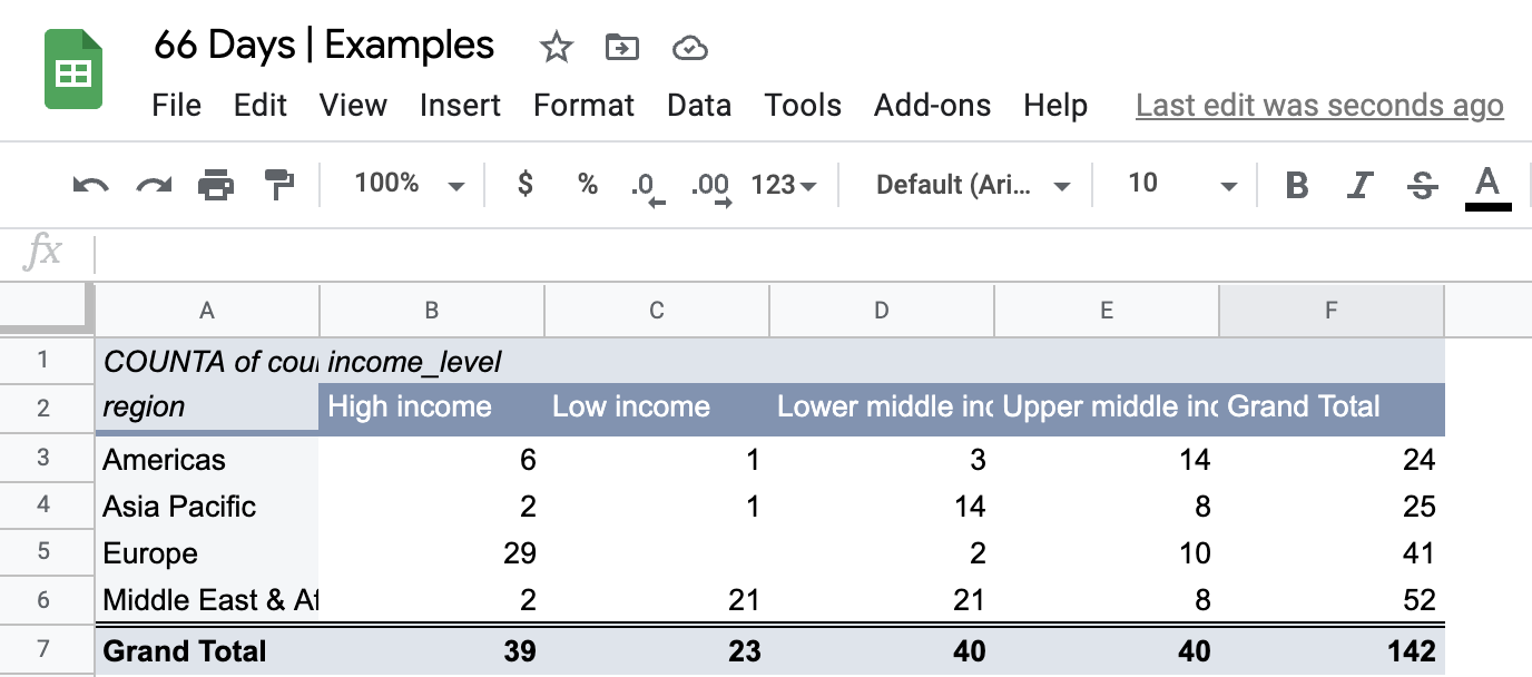
A crosstab or contingency table is the starting point when you need to summarize two categorical variables. Let’s look at region and income_level from the countries dataset. The pure frequency counts for the variables are as follows:
Crosstabs enable us to push these standalone summaries together to summarize the relationship between a pair of categorical variables.
The table displays the unique value labels on the vertical and horizontal headers and provides the frequency counts for all unique combinations in the center.
To build a crosstab for region and income_level we display their unique labels along the row and column headers, respectively.
Each combination in our data set is counted and displayed in the appropriate location. We can see that there are three countries in the Americas, for example, which are in the lower middle-income bracket.
It is also common to include column totals and row totals in crosstab tables. We end up with 25 distinct data points — a lot to potentially talk about.
Pivot tables
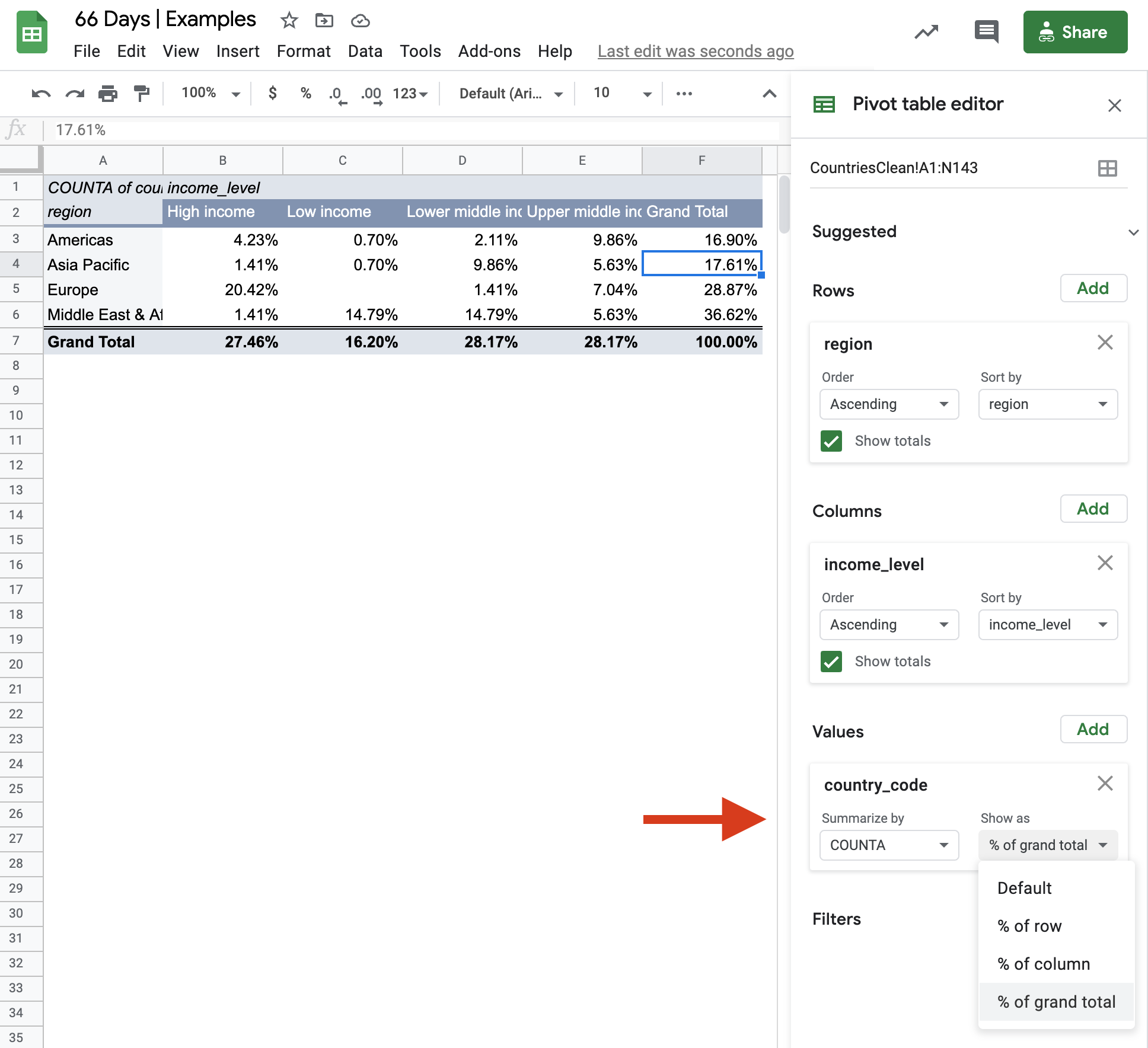
The most efficient way to build a crosstab in a spreadsheet is by taking advantage of pivot table functionality. Pivot tables significantly speed up exploratory analysis when compared with using multiple functions like =COUNTIF() to explore individual value labels.
Creating a pivot table in Google Sheets:
- Select all the cells from your table of interest.
- Click Data from the menu bar.
- Select Pivot table.
- Click Create.
- Click Add next to Rows in the pivot table editor window to include desired row variables.
- Click Add next to Columns in the pivot table editor window to include desired column variables.
- Click Add next to Values in the pivot table editor window to choose the type. of summary data to show. Hint: If you want counts, select any variable that has no missing data.
Following these steps will populate the table below, which can be further customized from a design perspective or have other variables swapped in.
Notice that the column order for income is different than in our initial table. This is because Google Sheets ordered the income level groups alphabetically. Although annoying, this can be overcome with some manual tweaks.
Visualizing two categorical variables
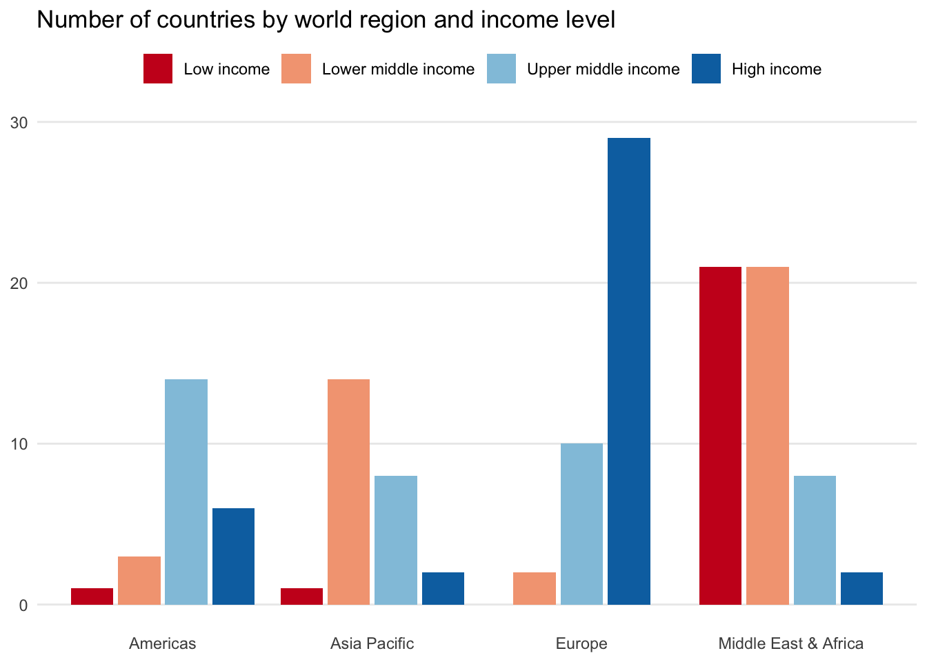
There are many approaches for visualizing multiple categorical variables. The standard starting point is a column chart, which enables us to split the first categorical variable by a second.
Here we see income levels split side-by-side and placed above their respective regions.
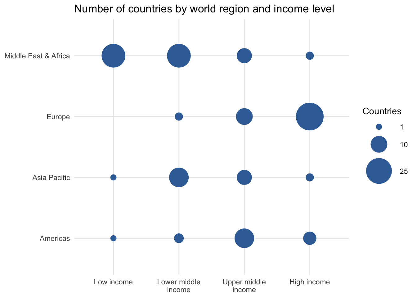
Another option is a bubble chart variant. It shows each categorical value combination in a similar way to the crosstab table, but with the size of the bubbles representing its frequency.
8.2.2 Crosstab percents
We can also transform a crosstab or contingency table to reveal more data perspectives by calculating relative frequencies or proportions from different cohort perspectives.
Let’s first revisit our crosstab between region and income_level that shows all combinations for the 142 countries in the dataset.
Percent of all
We will first modify the table by dividing each cell by the total number of countries. This calculates the proportion of each unique category combination.
The table shows us, for instance, that 9.9 percent of countries in the dataset are from the Americas and are upper middle-income. Through the row and column totals, it also reveals the relative frequency of each individual value label. For example, 16.2 percent of all countries are in the low income bracket.
Row percentages
Another perspective it to calculate row percentages based upon the total number of observations in each row.
Notice that in row percentage tables, the Total column has 100 percent values for each row. This is because we’ve calculated the proportion of each cell’s observations to that total row count. As an outcome, we can now say that 70.7 percent of countries in Europe are high income. The last Total row tells us that 16.2 percent of all countries in the sample are low income.
Column percentages
Finally, we can make the proportion calculations based upon the total observations in each column. In our case, this reflects the income_level groupings.
With column percentage tables we find 100 percent values for the final Total row of the table. This allows us to focus on the income_level variable as our unit of analysis. Among low income countries globally, 91.3 percent are located in the Middle East & Africa region.
So much to say
There are many potential data points to focus on across the four crosstab variants. What you choose to report or explore further likely depends on what the results in each table look like and who your audience might be. We’ll discuss data storytelling techniques in later lessons to help you make such decisions.
Calculating percentage crosstabs in spreadsheets
It would be tedious to make each total, row, or column percentage calculation in a spreadsheet. Thankfully, pivot tables have options to transform your table from counts to a desired percentage view.
You can toggle between the various options to mimic the approaches discussed above by selecting Default (i.e., pure counts), % of row, % of column, or % of grand total.
8.3 Mixed
We are not limited to summarizing only numeric variables or only categorical variables. We are able to mix and match variable types across the descriptive techniques discussed earlier. There are several ways to present such information.
Table format
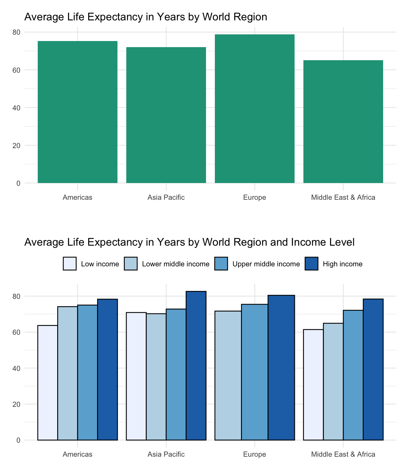
Let’s start by taking some common summary statistics for each unique region in the countries dataset.
We see that Europe boasts average life spans more than 10 years longer than those observed in the Middle East & Africa. At the same time the standard deviation for countries in the Middle East & Africa is more than double that of Europe, indicating that some countries will be quite different than the regional mean.
Two or more categorical variables
We can further drill down into the data by including both region and income_level. This looks like a crosstab table, but instead of focusing on counts or relative proportions, we’ll instead report the mean life_expect for each unique value combination.
The table shows that average life expectancy tends to be longer in higher income countries. This is true for each world region.
One thing to keep in mind when crossing categorical variables is the sample size or number of observations, typically denoted by the letter n. When you replace counts with other summary statistics, it is no longer evident how much data is backing up each cell. This n size can fall quickly as more variables are crossed against one another or the more unique values a given categorical variable may have.
Dealing with a small number of observations
When you know that there are a small number of observations you can decide to either:
Hide summary statistics for cells that have total observations below some threshold. Many data scientists will make this threshold 30, for reasons we’ll dive into later.
Show all the data but explicitly label the n sizes associated with each cell so that readers know to treat certain values with caution.
You could also choose a hybrid approach that hides cells below a threshold (e.g., 10 observations) while still showing n sizes for the remaining values. This makes our results look sparse.
Table Note: Data only shown for records with 10 or more observations.
A spreadsheet approach
Pivot tables once again make finding summary values across variables quite easy and avoid having to use several instances of formulas such as =AVERAGEIF().
Simply select a numeric variable from the Values field of the pivot table editor in Google Sheets and click the Summarize by drop down to select a desired summary measure.
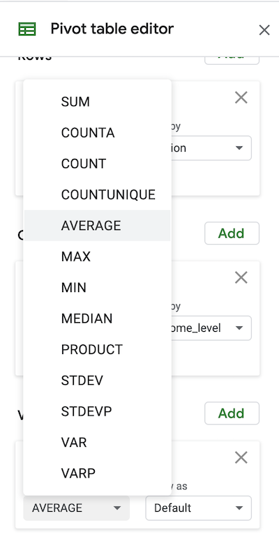
Chart form
There are many options to visualize numeric summaries for categorical variables. Here are two column chart examples for one and two categorical numeric summaries. A box and whisker chart would show more numeric detail, but is harder for many to interpret.
See the data visualization section for more detail.