11 Understanding distributions
11.1 What is a distribution?
Distributions are somewhat of a buzzword within the data community. Perhaps because the concept is both simple and complex, there tends to be anxiety when non-data people hear the term thrown around.
Let’s start with something that almost everyone understands. A series of data points. We can all envision that column in Excel filled with a long list of numbers.
A distribution is the visual shape of those numbers arranged from smallest to largest from left to right. Values in that range with many observations appear taller, while areas with few observations appear shorter.
It is a series of numbers that form a distribution and dictate what shape it will take.
Different distributions
Because numbers within a data series can be very different, distributions can look very different. Let’s say our data series had values ranging from zero to ten. Our distribution might look like this:
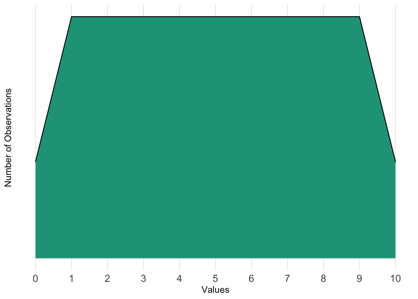
We can see that there are some observations at zero and ten, and a lot of observations from one to nine. The distribution helps us understand where values tend to be located across the range.
We can also think of it in terms of probability. If the distribution is based on a lot of data points and representative of something (e.g., typical snowfall in centimeters for a city), we can use it to see that the probabilities of being values one through nine are equal and higher than the likelihood of being values zero or ten.
What else might a distribution look like?
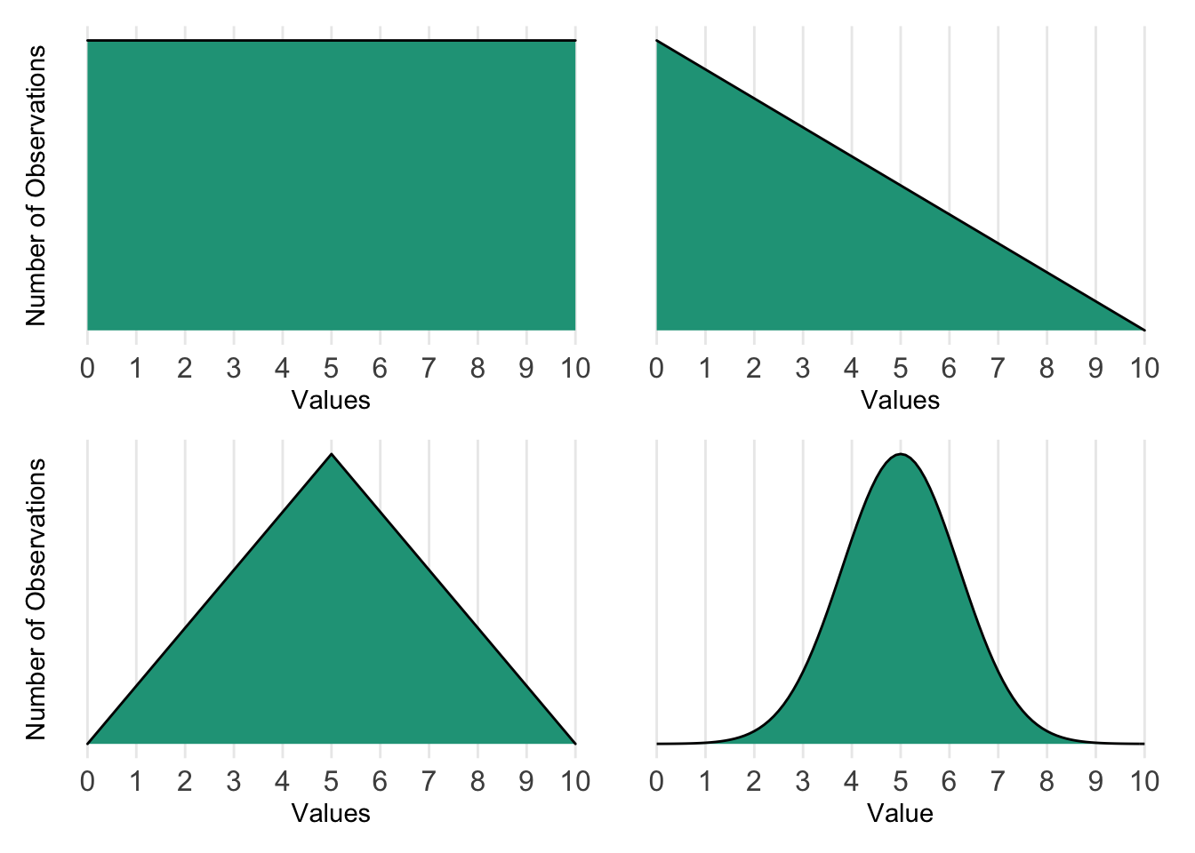
These distributions can be interpreted as follows:
- Upper left: All values occur at equal levels or probabilities.
- Upper right: Much more likely to find values closer to zero than closer to ten.
- Lower left: Five is the most common with fewer values as you approach zero or ten.
- Lower right: Most values occur in the center of the distribution with very few at the extremes.
The directional sense of an underlying distribution is very important. In the real world, there are certain distributions that are more common than others and that come with special properties. For instance, the chart on the lower right is the famous normal distribution, for which we’ll explore further.
11.2 Normal distribution
11.2.1 Establishing normality
The normal distribution may also be referred to as the Gaussian distribution or bell curve. It is characterized by being symmetric in shape with most values falling toward the center of the distribution, in which the measures of central tendency are approximately the same.
Normal distribution
Properties:
- Symmetric in appearance
- The mean, median, and mode are all the same or approximately the same
- The area under the curve equals 1 or 100%
Examples:
- Height of adults
- Scores on the Graduate Records Examination (GRE)
Let’s use business metrics from a help desk as an example. A three-person team receives support requests throughout the workday. They track the time it takes in minutes for someone to provide the first non-automated response to a given user. Typically, it takes around 70 minutes for this to occur, but it can be longer or shorter depending on how busy the day turns out to be.
Here is what response times look like for the previous thousand support requests.
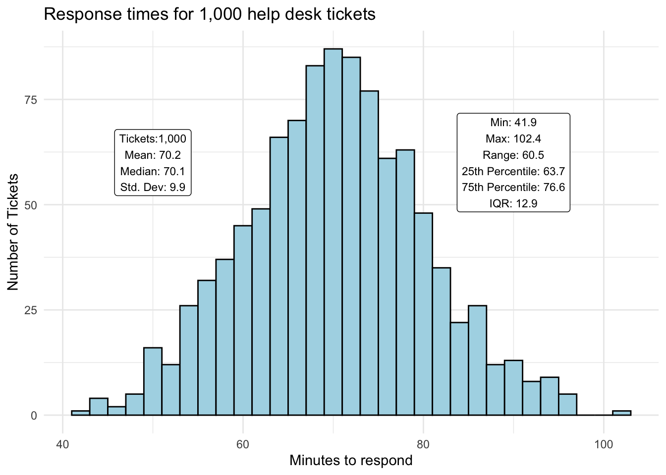
The support team averaged 70 minutes to send a formal reply to users. Its fastest time was 42 minutes, and its slowest time was 102 minutes. Half of the time — as shown by the interquartile range (IQR) — a response was sent between 63 and 77 minutes.
This distribution seems to meet the normal distribution characteristics described above. The mean and median are nearly identical, and it is rare to find values near the extreme points on either side of the curve.
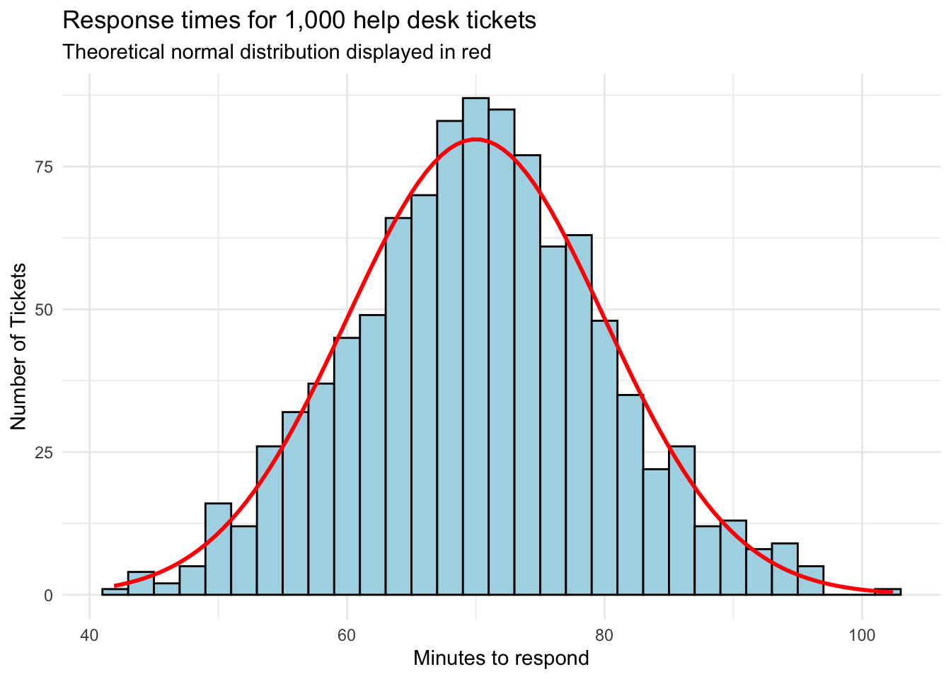
In fact, if we overlay a perfectly normal distribution curve, we see that our response times track quite closely.
How can I prove that my distribution is normal?
To address this common question let’s add a second distribution that is notably less-normal, the life_expect variable from our countries dataset.
Approach 1. Adding a theoretical normal distribution to compare visually
The first approach is simply eyeballing the observed distribution against the theoretical curve.
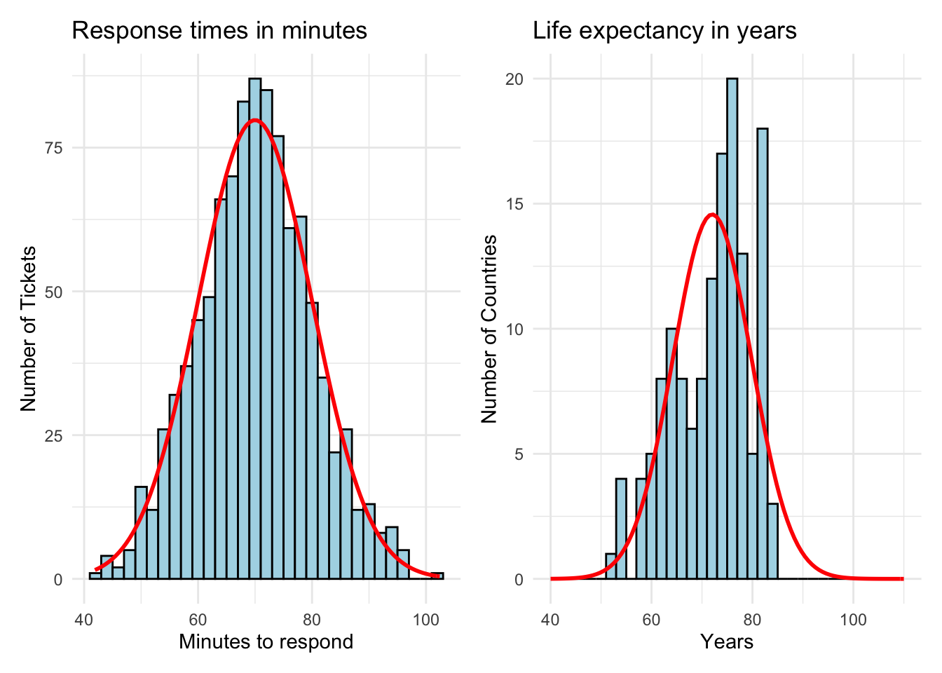
At first glance, the response times seem to fit the bell curve more closely. The life expectancy chart on the right is somewhat lopsided and doesn’t have the expected number of observations continue down the curve to the right in a smooth way.
Approach 2. Create a QQ plot
Statisticians also use a quantile-quantile (QQ) plot to examine these differences more closely. A QQ plot maps the observed values against the theoretical quantile distribution expected in a pure Gaussian curve. A perfectly normal distribution will have all points on the reference line.
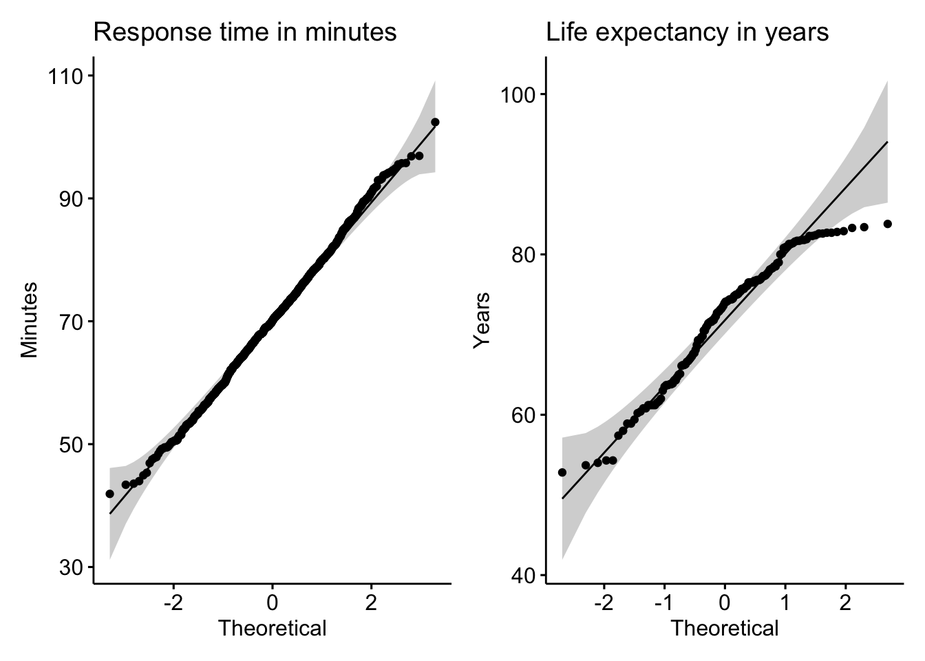
The observations seen in the QQ plot for response time fall within the shaded boundaries, further evidence for normality. In contrast, the QQ plot for life expectancy displays more volatility around the reference line and, especially at the top end of the distribution, even falls off entirely.
Approach 3. Running statistical tests
Finally, there is a statistical test called the Shapiro-Wilk normality test that can be deployed. It calculates a p-value, which is something we’ll define later. If the p-value calculated by the test is very small (e.g., less than 0.05), there is sufficient evidence that the distribution in question is not normal. If it is above that decision threshold (e.g., more than 0.05), we can be confident that the data series is approximately normal.
Shapiro-Wilk normality test results:
1. Response time in minutes: p-value = 0.4764686 –> normally distributed
2. Life expectancy in years: p-value = 0.0000732 –> not normally distributed
This result is a third validation that response time is normally distributed, while life expectancy is not. The statistical tests were run in R but there are also web versions available for you to experiment with.
So what?
We’ve looked at ways to tell if the data we have approximately follows a normal distribution. Next we’ll see why this is a useful characteristic for numeric data and examine what additional techniques can be applied.
Finally, if your data is not normal, it is sometimes useful to apply algorithms that transform the distribution to appear more normal, allowing you to still take advantages of data techniques that operate under the assumption of normality.
11.2.2 Analyzing normal data
The response time data from our help desk example was shown to be approximately normal. We keep saying approximately because you won’t find a perfectly normally distributed data series — and that’s okay.
When your data is approximately normal there are several useful analytical extensions.
68-95-99.7 rule
We defined the 68-95-99.7 rule earlier. In essence, if the data is normal, you should expect:
- 68 percent of observations will be within one standard deviation from the mean
- 95 percent of observations will be within two standard deviations from the mean
- 99.7 percent of observations will be within three standard deviations from the mean
Based on a response time mean of 70.16 and a standard deviation of 9.92, we find:
In the case of help desk response times, this rule works very well, a benefit of the data being approximately normal. Without having access to the full distribution, you can simply use the mean and standard deviation to learn a lot.
Turning distributions into probabilities
Another benefit of working with data sets that are normally distributed is that we can treat them as probability distributions. As all values must fall within our distribution, the visual is showing a hundred percent of the outcomes.
When you overlay a perfect normal distribution, you’ll likely notice that if we were to analyze the red curve instead of the actual distribution, our results won’t be identical.
There are some ranges that are slightly under the curve, and other areas slightly above. By assuming normality, however, we are saying that we are okay with these limitations as the benefits will outweigh the costs.
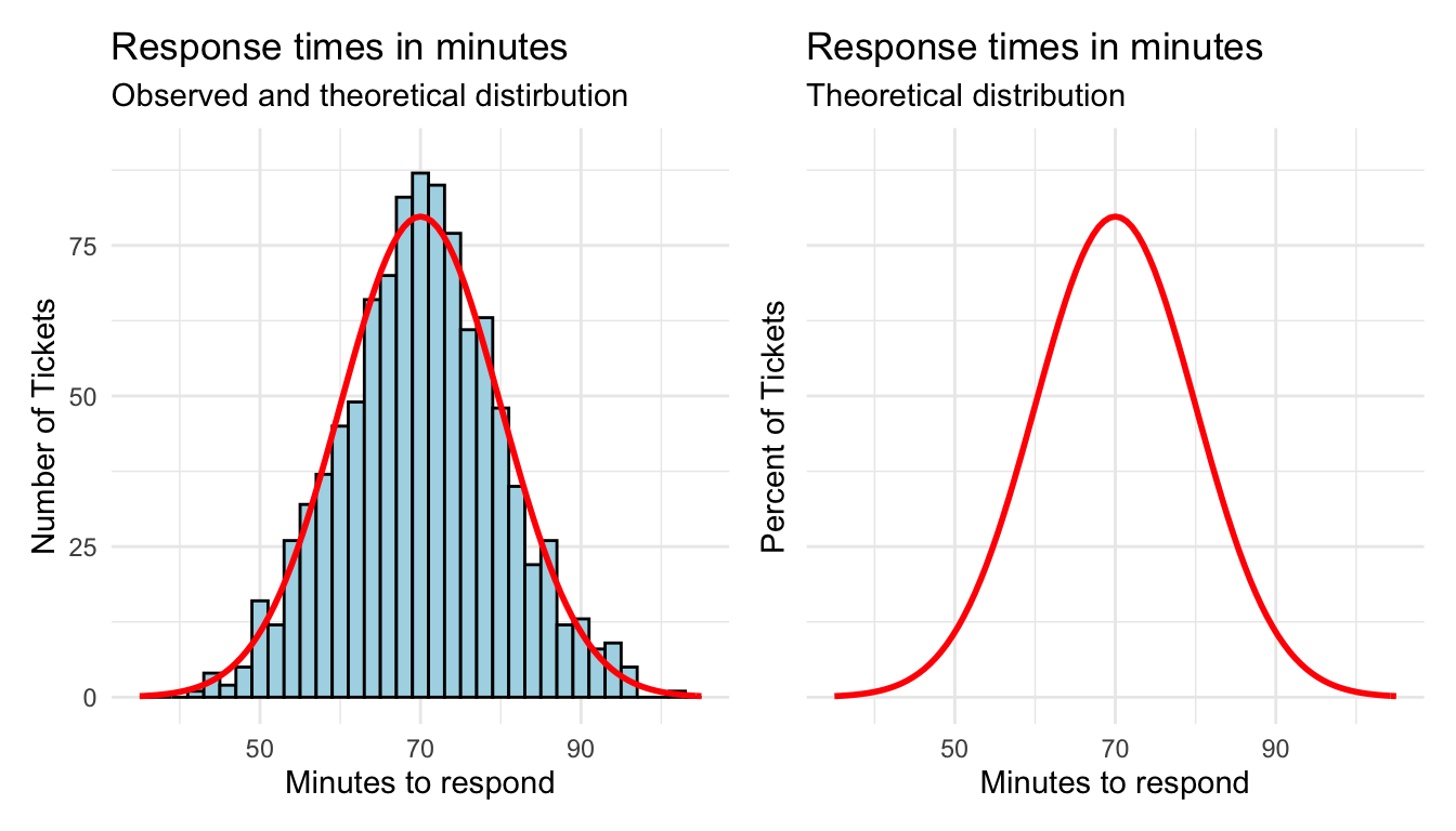
Again, creating a full distribution requires us to have all of the actual response time values. The theoretic distribution only requires the mean and the standard deviation. Underneath the theoretical bell curve represents 100 percent of the expected values.
We can use this understanding to estimate probabilities for given values occurring within the range. You can already tell from the visual, or from your 68-95-99.7 calculations, that most values occur from around 55 to 85 minutes. But what are the precise probability estimates for such values?
Probability of a specific value
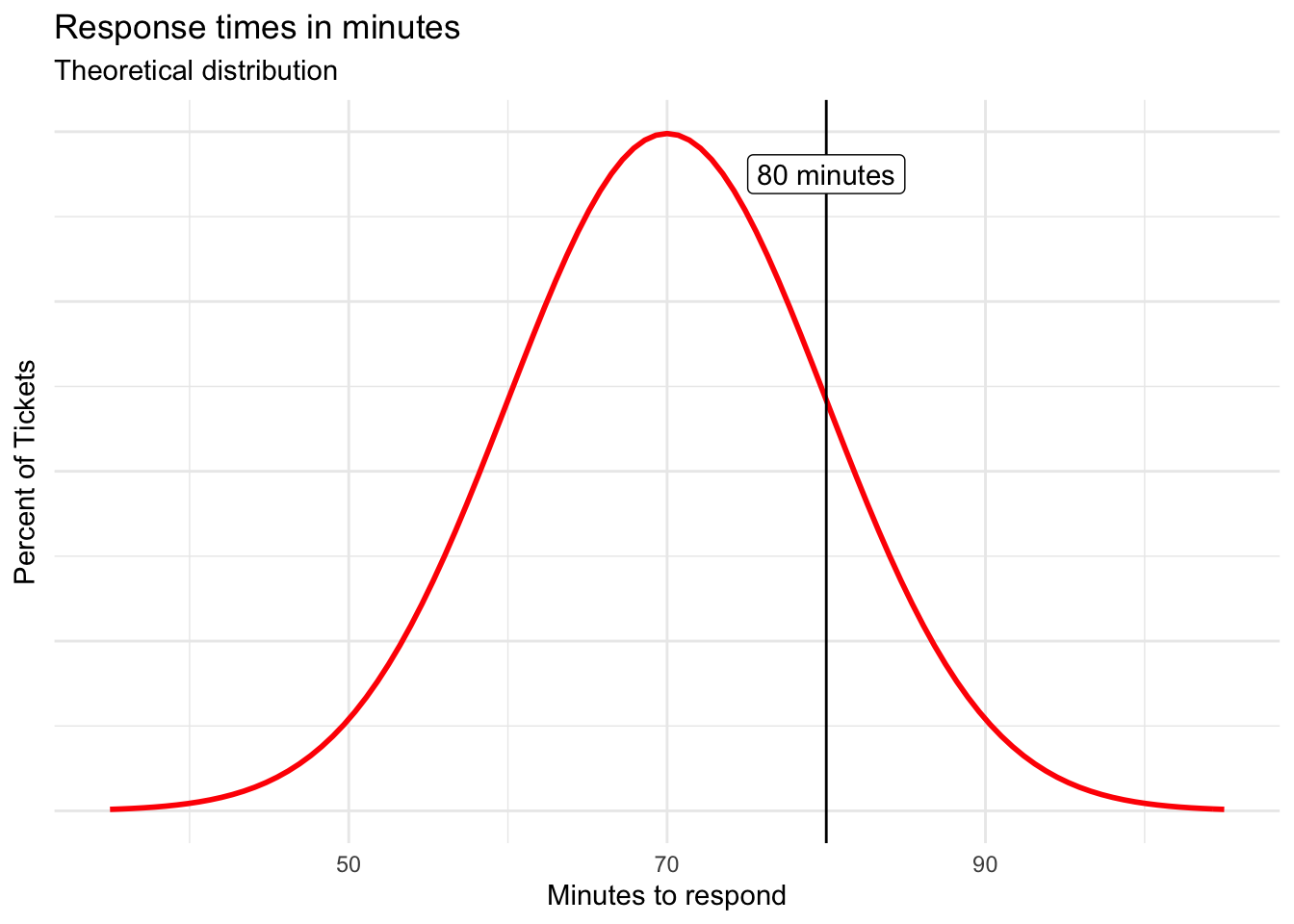
The probability density function (PDF) helps answer these questions by calculating the area underneath the curve for given value. We can use it to answer a question like, “What’s the probability that a response time for a randomly submitted help ticket will be 80 minutes?”
You can use calculus to determine the area underneath a curve, or you can rely on embedded spreadsheet functions to do so. In Microsoft Excel and Google Sheets, NORM.DIST() accomplishes the task.
=NORM.DIST(specific value, mean, standard deviation, FALSE)
The FALSE input at the end will calculate the probability for the specific value passed in. So, to calculate the probability of a response time being 80 minutes, use:
=NORM.DIST(80, 70.16, 9.92, FALSE)
This will calculate a probability of 0.0246 or 2.5%. Although interesting, that is a very specific number of minutes from within the range.
Probability of a given value or less
The cumulative density function (CDF) is often more useful. It calculates the probability of getting up to and including a given value. The formula is the same as for PDF with the exception of the final argument. Here, we use TRUE to calculate the cumulative probability.
=NORM.DIST(upper value, mean, standard deviation, TRUE)
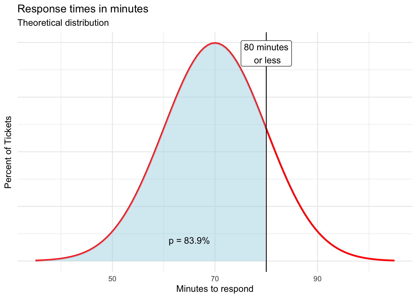
What is the probability of the response time to a given ticket being 80 minutes or less?
=NORM.DIST(80, r round(mean(response\(time_min), 2)*, *r round(sd(response\)time_min), 2), TRUE)
The calculated probability is 0.8394 or 83.9% and is shown visually by the shaded area in the chart below.
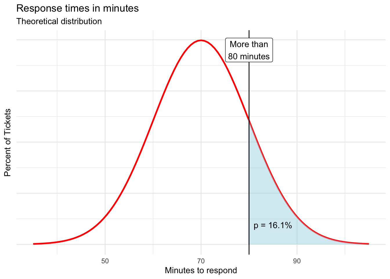
Probability of more than a given value
To find the probability of a help ticket response taking more than 80 minutes, simply subtract the previous result from one.
= 1 - NORM.DIST(80, r round(mean(response\(time_min), 2)*, *r round(sd(response\)time_min), 2), TRUE)
The result is 0.1606 or 16.1%.
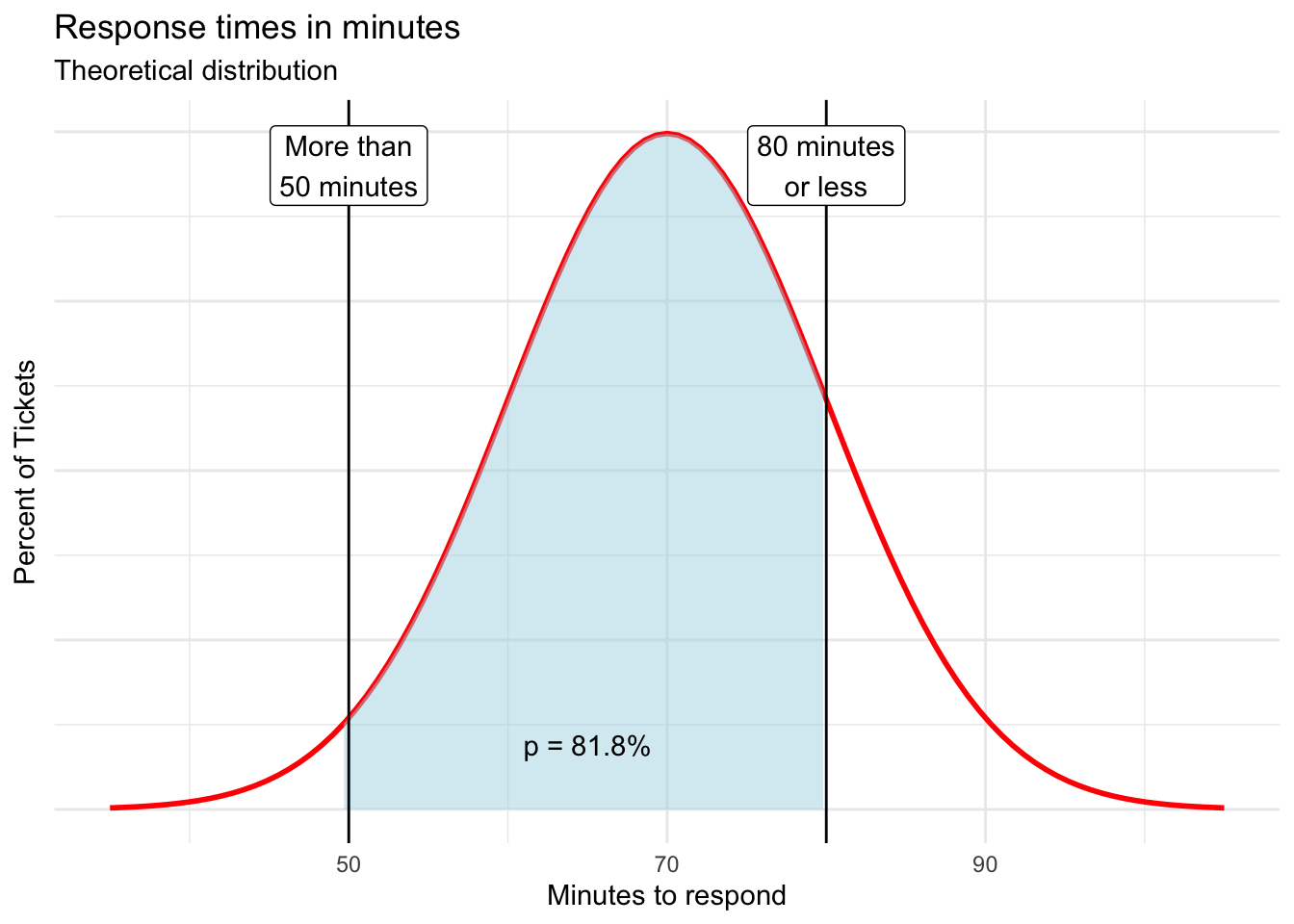
Probability between two points
Finally, we can use these functions to calculate the probability of a response time being between two values of interest by subtracting two CDFs.
Here, we find that the probability of a response time taking between 50 and 80 minutes to be 0.8184 or 81.8%.
= NORM.DIST(80, r round(mean(response\(time_min), 2)*, *r round(sd(response\)time_min), 2), TRUE) - NORM.DIST(50, r round(mean(response\(time_min), 2)*, *r round(sd(response\)time_min), 2), TRUE)
It is incredible how much we are able to deduce with only the mean, standard deviation, and the belief that the underlying distribution is approximately normal.
You will find all the probability calculations shown above in this worksheet.
11.3 Bernoulli distribution
We are often involved in win-lose events in which there are only two outcomes. The probabilities associated with a given success or failure are shown by the Bernoulli distribution, which is fairly basic.
Bernoulli distribution characteristics
Properties
- There are only two possible outcomes:
- Outcome 1: Success –> Something happened (p)
- Outcome 2: Failure –> Something didn’t happen (q = 1 - p)
- The probabilities associated with the two outcomes, p and q, add up to 1 or 100%
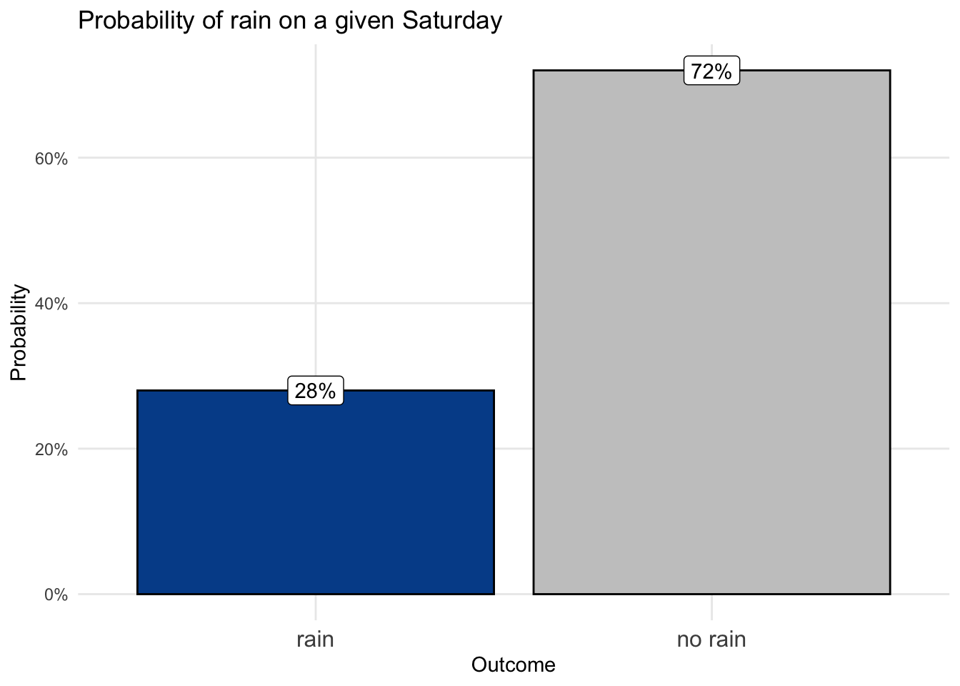
Let’s return to Gracie’s lemonade stand business and her expectations for rain, which has a negative impact on her expected number of customers.
Gracie’s research indicates that the probability of rain on any given Saturday is p(rain) = 0.28 or 28%. When modeled as a Bernoulli random variable, this probability of success is labeled p.
We already know that the probability of something not happening is one minus the probability of something happening. In a Bernoulli distribution the probability of failure is defined as q with q = 1 - p. So, q in our example is 1 - 0.28, which equals 0.72 or 72%.
We can visualize this Bernoulli random variable with a simple column chart.
By itself this isn’t terribly useful, but Bernoulli random variables set the stage for the geometric distribution and the binomial distribution, both of which pack plenty of practical relevance.
11.4 Geometric distribution
A Bernoulli distribution shows the probabilities of success or failure for a given event. A geometric distribution shows how quickly we should expect our first success based upon those values.
Not surprisingly, the higher the probability of success, the faster we should expect its outcome.
The geometric distribution calculates the probability of getting your first success on a given attempt.
\[\text{First success on attempt n = (1-p)}^\text{(n-1)}*p\]
For instance, you can find the probability of having rain on the first day from our lemonade stand example.
\[\text{First rain occurs on day one = (1-0.28)}^\text{(1-1)}\times0.28 = \text{0.28 or 28%}\]
Day one matches the underlying probability of rain. On the other hand, there is only a 1.5 percent chance that it rains for the first time on the 10th day of business.
\[\text{First rain occurs on day ten = (1-0.28)}^\text{(10-1)}\times0.28 = \text{0.0146 or 1.5%}\]
We can plot the distribution for the first 20 days, after which the probabilities approach zero.
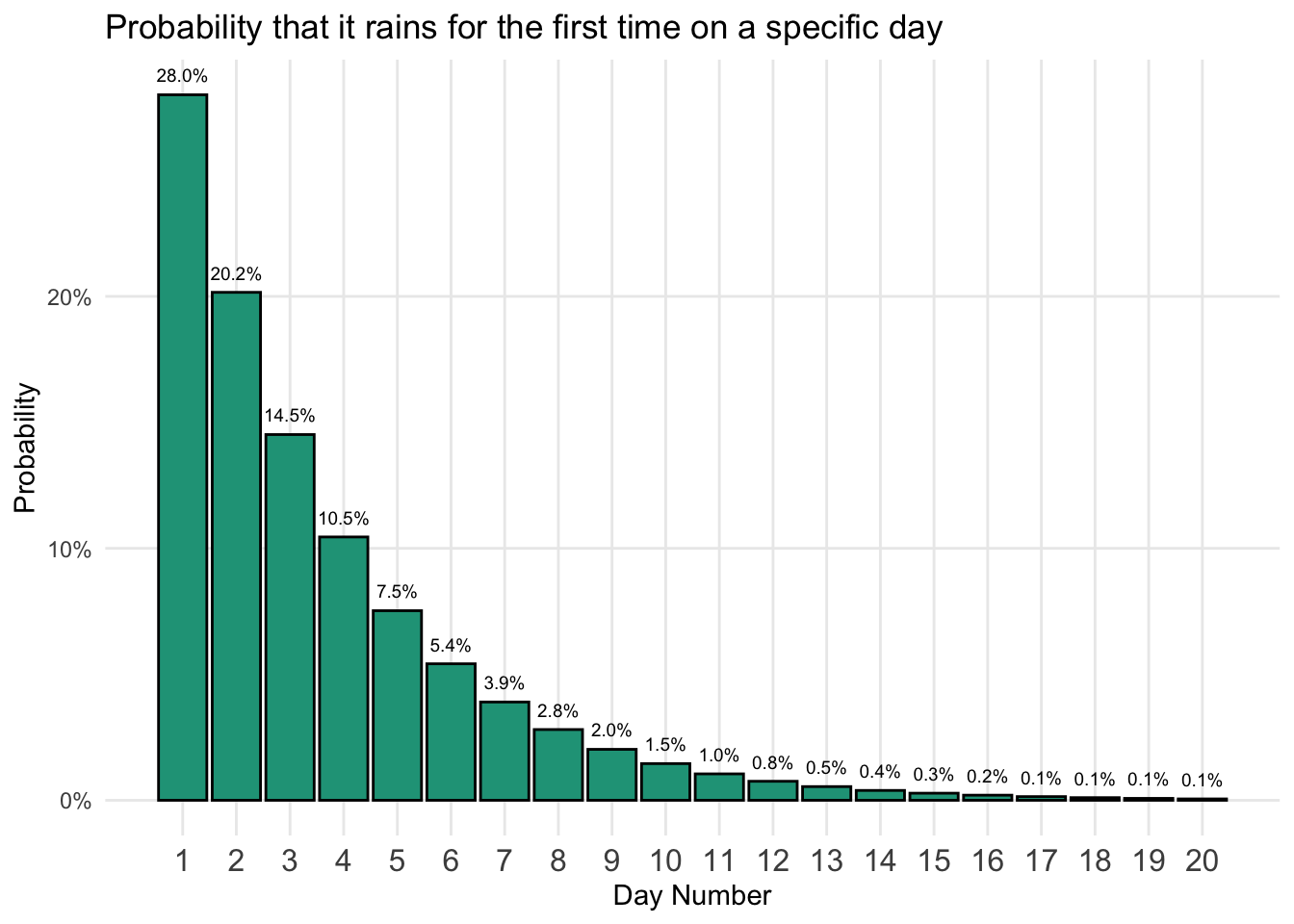
The chart highlights that given our probability of success, a 28 percent chance of rain, it is most likely we’ll get the first rain within just a handful of days.
We can also look at the cumulative probabilities from the geometric distribution by adding each probability with the sum of the previous probabilities for each stage.
Plotting the cumulative probabilities shows that expectations for the first day of rain grows higher as more days are taken into consideration.
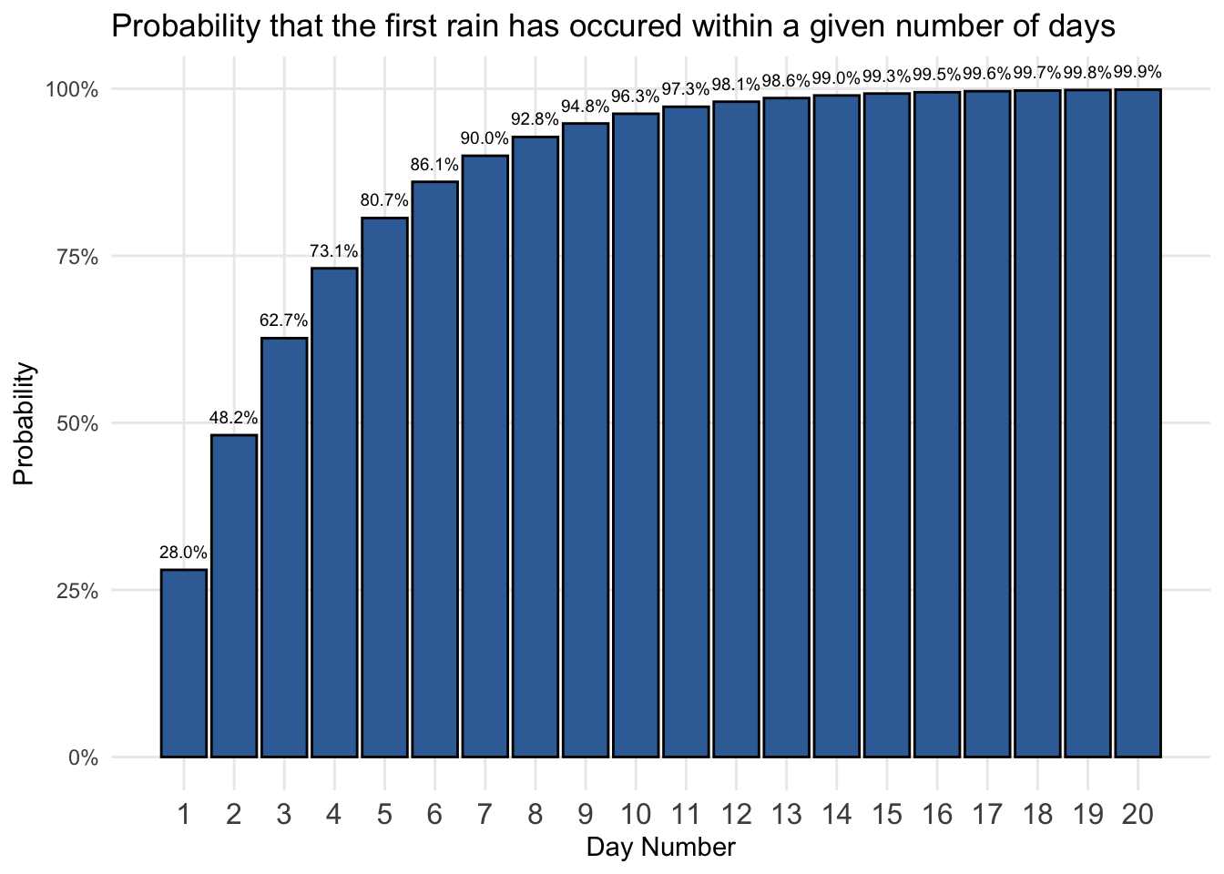
This tells us, for example, that there is a 96.3 percent chance that we will have our first rain by the 10th day. By the 20th day, having a first rain is a near certainty as the probability approaches 100 percent.
You can find the calculations for the rain example here.
Business conversions
The geometric approach works with any set of success-failure probabilities. In the business world, we often attempt to convert a wider audience into a lead or sale. Since the world is big, conversion rates are generally low.
Let’s say your conversion rate from online ads was only 0.4 percent, meaning that one in every 250 people who see the ad click on it and get redirected to your website. We can model this scenario as we did for the rain expectations.
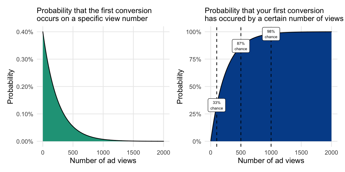
The chart on the right is especially useful because with a low probability of success there will be many sequential events that still have differentiated probabilities.
In this case, we can see that if a marketer only gets their ad in front of 100 people, there is only a 33 percent chance that a conversion will have occurred. The conversion probability more than doubles to 87 percent after 500 people have viewed the ad and approaches 100 percent by the one thousandth viewer.
These likelihoods are very useful to set business expectations when conversion rates are known and to quantify the impact of even marginally improving them.
11.5 Binomial distribution
The binomial distribution relates to the Bernoulli distribution in which we know the probabilities of success and failure for a given event.
Instead of just one occurrence or trial, however, the binomial distribution evaluates a certain number of trials that are denoted n. The distribution then shows the likelihood of getting a given number of successes, k, across all trials.
Binomial distribution
Properties:
- Displays the probabilities associated with a given number of successes (k) occurring within a certain number of trials (n) based on the probability of success (p).
Appropriate when each trial:
- Doesn’t impact the outcome of another (independence)
- Can be evaluated as a success or a failure
- Has the same probabilities associated with success-failure outcomes
Let’s continue with the lemonade stand example in which there is a 28 percent chance of rain on any given Saturday morning. How many Saturday’s throughout the year are expected to have rain?
We can model this with the binomial distribution formula.
\[\text{p(k successes in n trials) = }\frac{\text{n!}}{\text{k!(n-k)!}}*p^k(1-p)^{n-k}\]
A bit of a mouthful — thankfully, you will find spreadsheet shortcuts below. But if you did want to use the full formula, you could construct the following to estimate the probability of having 10 days of rain (k) during the 52 Saturdays in a year (n) with the 28 percent underlying chance of rain (p).
\[\text{p(10 rainy days from 52 Saturdays) = }\]
\[\frac{\text{52!}}{\text{10!(52-10)!}}*0.28^10(1-0.28)^{52-10}=\text{0.0477 or 4.8%}\]
Note that the ! indicates a factorial, from which you take the number shown and multiply it all the way down to one (10! = 10 x 9 x 8 x 7 x 6 x 5 x 4 x 3 x 2 x 1 = 3,628,800). This can also be done in a spreadsheet using =FACT(10).
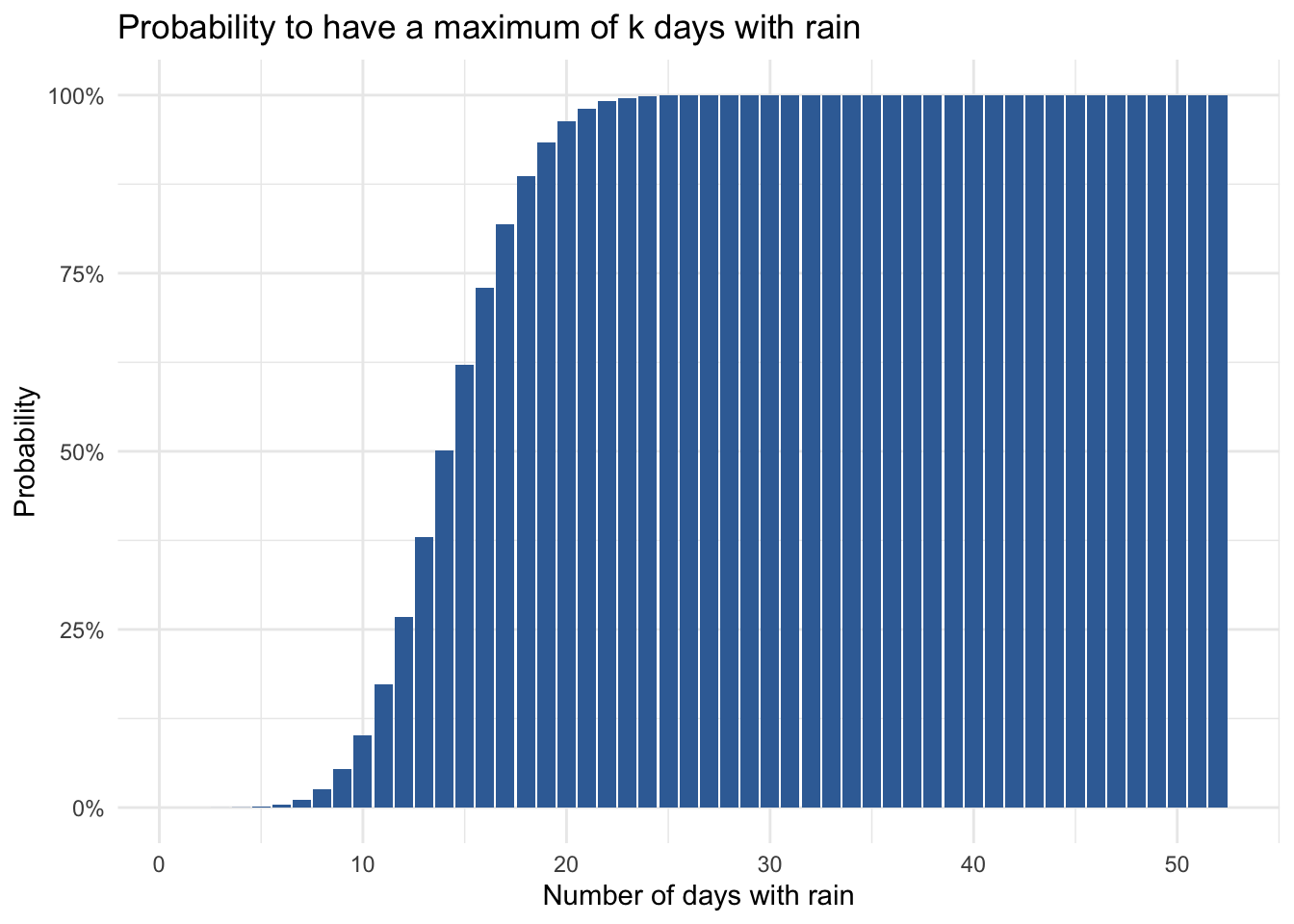
The binomial distribution is revealed when you apply the formula above to a range of possible success counts. Here are the probabilities of achieving k days of rain across the 52 Saturdays.
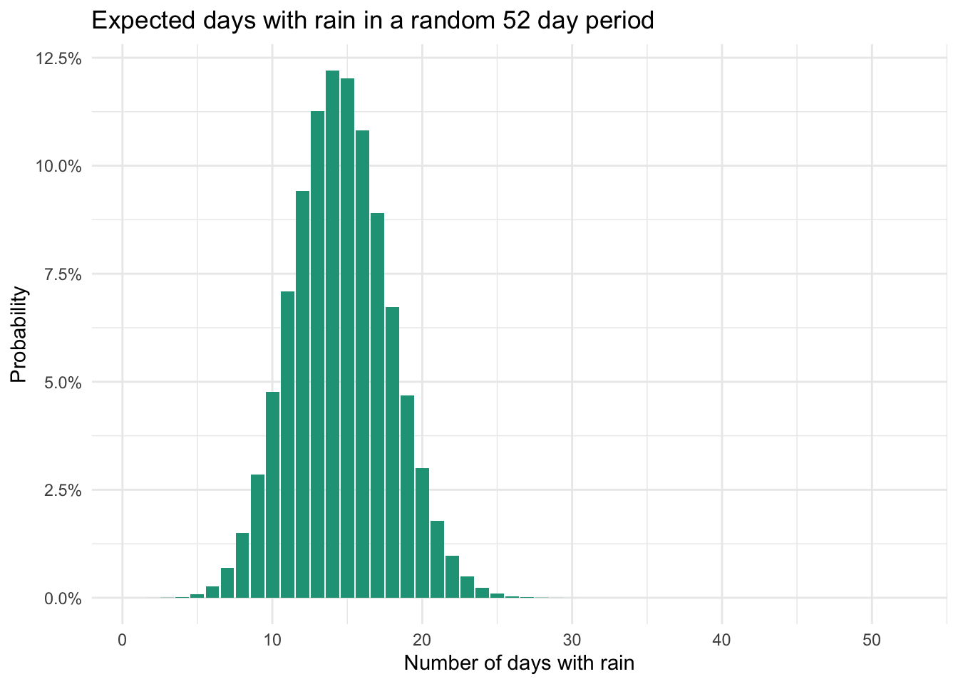
We find a symmetric distribution from which we can start building confidence for rain outcomes during the year. It appears that the most likely number of rainy days is between 10 and 20. In fact, if we look at the respective probabilities, we find a 91 percent chance that the number of rainy days will be in this range.
Specific number of successes
We can calculate the individual probabilities associated with a specific number of successes in Microsoft Excel and Google Sheets using BINOM.DIST().
=BINOM.DIST(number of successes, number of trials, probability of success, FALSE)
The FALSE input at the end will calculate the probability for a given number of successes based on the number of trials and the underlying probability of success. So, to calculate the probability that there are 10 days of rain within a 52-day period, use:
=BINOM.DIST(10, 52, 0.28, FALSE) = 0.0477 or 4.8%
You can find solutions to the spreadsheet approach here.
Maximum number of successes
The binomial cumulative distribution calculates the probability of getting at most a given number of successes within a certain number of trials. The only difference to the spreadsheet function above is the use of TRUE to calculate the cumulative probability.
=BINOM.DIST(number of successes, number of trials, probability of success, TRUE)
What is the probability that there is a maximum of 10 days with rain?
=BINOM.DIST(10, 52, 0.28, TRUE) = 0.1020 or 10.2%
Consulting capacity
Let’s explore another example.
You run a consulting business and work mostly with government organizations. These organizations have a short window at the end of each fiscal year to accept proposals and take a long time to make approval decisions.
Each year, you send proposals to as many relevant opportunities as possible. When a proposal is accepted you need to quickly assign a lead consultant to the new project. But the labor market is tight and it isn’t easy to find quality talent on short notice.
To combat this, you arrange for a certain number of vetted consultants to be ready to assist if needed.
How many consultants should you keep on retainer? It should depend on the number of proposals you are submitting and the probability that a given proposal will be accepted.
Historically, only five percent of proposals are accepted. This year you have sent 250 proposals for various opportunities.
You could multiply 250 by five percent to find the expected number of new projects, which is 12.5. Or you could use the binomial distribution to gain deeper understanding of the probabilities along the potential project count range.
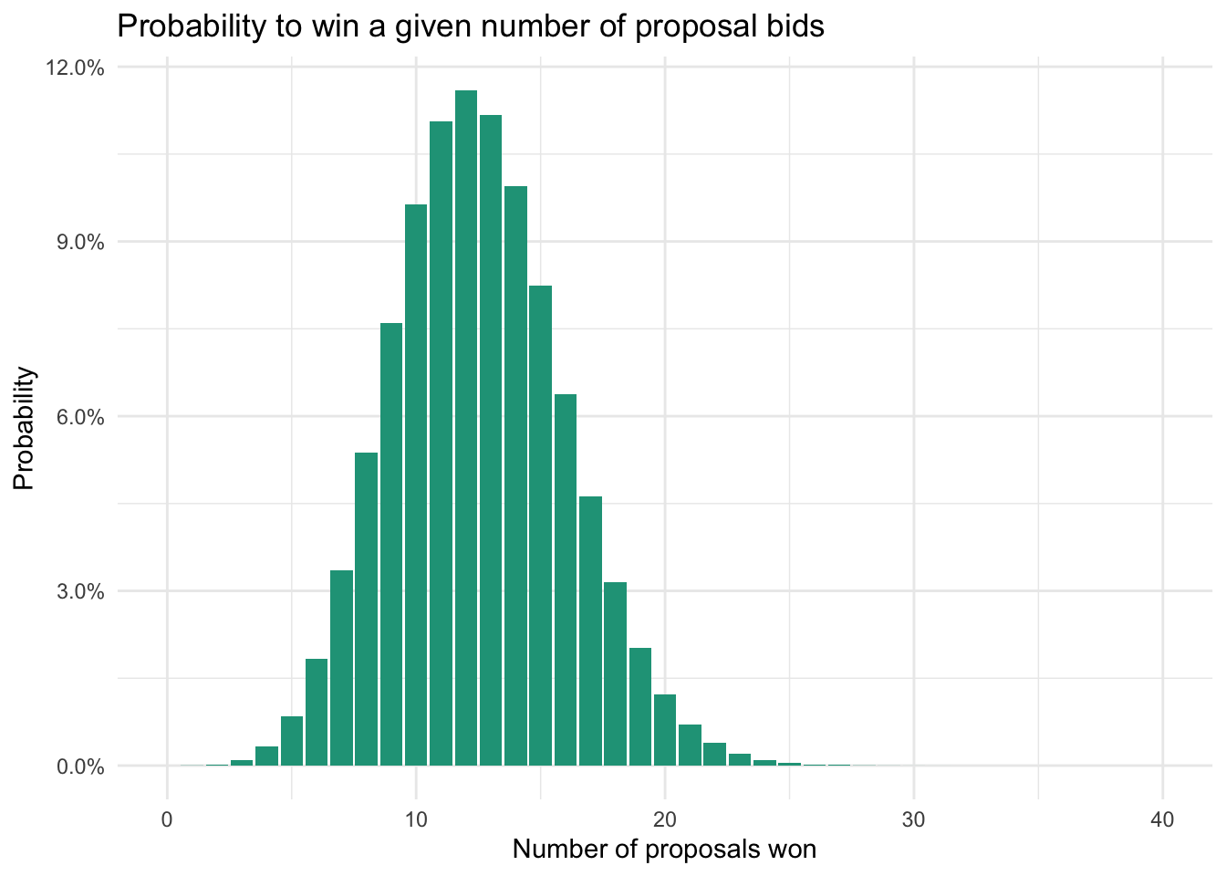
You now have a much better sense for making decisions on your retainer approach. There is very little chance (1.5%) that you’ll need more than 20 consultants. There is also a very good chance (86%) that you’ll end up needing between 8 and 17.
Your final decision will depend on (1) the cost of retaining talent that might go unused and (2) the missed financial opportunity to pursue a given project due to lack of resources. Either way, the binomial distribution adds a lot of information beyond the baseline expected consultant need of 12.5 (250 *5%).